What the Hell Happened to Bad Chart Thursday?
Bad Chart Thursday, for me, has always been about examining through satire how people and organizations mislead, through charts or through ideas I can illuminate as nonsense simply by charting the logic. But satire has become really difficult to write lately, with reality repeatedly seeming like an Onion headline. And every day, there are serious issues going on that are difficult to pull out of in order to regain the sense of humor I need to do Bad Chart Thursday properly. Serious issues have always been going on, I realize, and I’ve even tackled some in this column. But the sheer Gish galloping of appalling news every day has made it difficult for me to pull myself out of the horror and regain the perspective I need.
It’s ironic, because there is SO MUCH material to write about. I have a folder full of half-written posts and research, plus more than a few silly charts I’ve collected for fun, but I keep running into the problem of not finding the humor in the horror, of feeling like I’m belittling serious subjects or spending time on trivial ones when I could be doing SOMETHING, ANYTHING about the many different problems we face in the US and in the world.
I’m not giving up, because Bad Chart Thursday is one of my very favorite things, whether I’m writing it or not. And I actually truly believe that humor is one of our best defenses in dark times. I may not have the energy to write anything longer than snark on Twitter at the moment, but that won’t last forever.
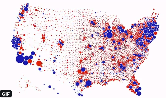
In the meantime, since you came all this way, I am including a chart in today’s post (a map, really). I am cheating because this is as far from a bad chart as it is possible to get. But it’s so good that even if you’ve seen it, odds are, you don’t mind seeing it again.
The map was created by ObservableHQ as a response to that silly map of red (Republican) and blue (Democrats) that pretends acreage votes in elections.
Here it is in original Tweet form for context. Be sure to click on the gif to see the transformation from a terrible map to a fantastic one BEFORE YOUR VERY EYES:
Challenge accepted! Here is a transition between surface area of US counties and their associated population. This arguably provides a much more accurate reading of the situation. @observablehq notebook: https://t.co/wdfMeV5hO4 #HowChartsLie #DataViz #d3js https://t.co/lStHeeuMUw pic.twitter.com/MpYiXtsHmu
— Karim Douïeb (@karim_douieb) October 8, 2019


For years, I’ve found BCT really useful for teaching my students what not to do with their graphs. So I hope it does pick up again eventually. But your reasons for pausing make good sense, so do what you need to.
Thanks so much for your comment. I sometimes feel very disconnected to what happens after I publish a post, so I really appreciate hearing that Bad Chart Thursday is being put to good use. It’s really motivating, actually.
I have missed Bad Chart Thursday. Hopefully you will be able to bring it back, though I admit the news cycle makes that difficult these days.
On the bad chart presented today, on another blog someone posted a similar chart for Nixon’s 1972 presidential victory. It looks very similar to the chart presented today for Trump, and it says, “This was Nixon’s map from 1972. Ask someone what happened to him.”
https://twitter.com/goldengateblond/status/1178126914382249984/photo/1?ref_src=twsrc%5Etfw%7Ctwcamp%5Etweetembed%7Ctwterm%5E1178126914382249984&ref_url=https%3A%2F%2Fwhyevolutionistrue.wordpress.com%2F
Ha ha! Awesome.
Actually, this is a bad chart. It takes each county, converts to circle and scales by population, keeping the color the same. However, that really doesn’t show the reality. Each county should split into *two* circles, one red and one blue and they should scale to the population of each of them to show the real situation.
Or maybe the color of the circles could be shaded from pure red through various shades of purple to pure blue depending on the percentage of votes. But I don’t know how obvious or subtle the color differences would be. Also, just to virtue-signal, would people with red-green color blindness have more difficulty getting information from this sort of chart, or is the difference between red and blue sufficient that any sighted person can distinguish the shades?