Bad Chart Thursday: Abortions and House Fires
Hey, did you know that the leading cause of DEATH in the United States is not heart disease? It’s true. I saw it on Facebook, thanks to a tip from Deek over at Grounded Parents.
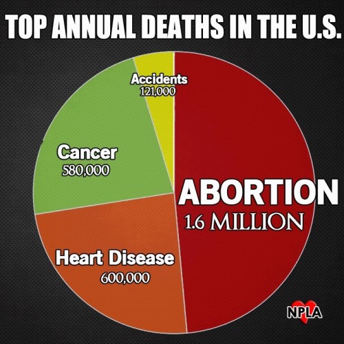
According to this chart from the National Pro-Life Alliance, the leading cause of death is abortions.
They aren’t talking about the death of women having abortions because the number is too high for that. They are talking about the death of potential people, the aborted embryos and fetuses. Oddly, they don’t include deaths from miscarriage, a number that would be much higher.
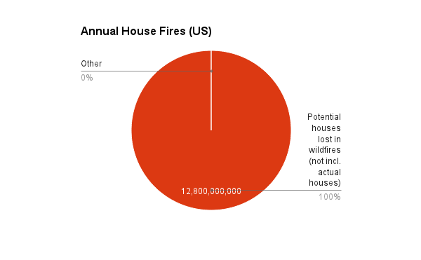
Now, before you start rolling your eyes at how nonsensical this is, keep in mind the opportunity this kind of logic presents. Consider the example of house fires. According to FEMA, there were 364,500 house fires in the United States in 2011. But what FEMA doesn’t realize is that the number is much, much higher when we take into account fires that burned down potential houses.
Consider wildfires, for example, which burned down 8.7 million acres in 2011. If an average house uses 30,000 square feet of lumber, or .69 acres of lumber, then we lose 12.8 billion potential houses in wildfires each year.*
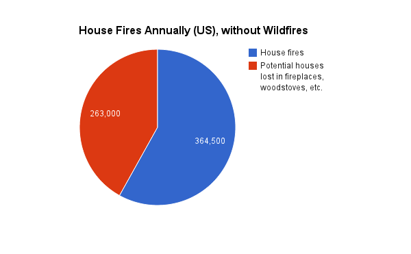
Or how about the wood used in fireplaces and wood stoves? People actually burn potential houses within houses, which is really kind of sick when you think about it. According to the US Forest Service, we used 7.8 billion cubic feet of wood in 2011 for this purpose. That’s 179,063 acre-feet. Unfortunately, converting that to houses is more difficult because we’re talking volume vs. area measurements, but for our purposes, let’s just say we know that it’s at least 263,000 potential houses. That we deliberately burn within our own homes.
Add campfires and bonfires to the mix, and we have an epidemic of houses burning down in this country.
To chart this with wildfires included is ridiculous:
Without wildfires, though, we can see the significant chunk of houses lost in fireplaces and woodstoves alone:
In fact, how do we know that a particular person isn’t burning down our own potential house when they throw those logs on the fire? I smell lawsuits, or at the very least, criminal charges for arson. It’s no more ridiculous than criminalizing abortion. It’s no less ridiculous either.
*These are all rough calculations. Not all of that acreage is wood, of course, but this also doesn’t take into account tree height lost.
The idea for this post was inspired by neuroscientist Michael S. Gazzaniga’s discussion in The Ethical Brain.


THank you for the afternoon laughs! This is great.
Jokes. Feh. Laughter. Not laughing.
I saw the chart and thought about miscarriages right away. (You beat me to it.) Then I was going to make a comment about “What abouts teh Menz?” Every time we … ahem… Billions of Buzz Jr.’s lost Oh, the huMANity!” or maybe “Every time you use Purell®, you kill trillions of bacteria, any one of which, transported to a suitable lifeless planet, could have evolved into an entire world of sentient beings. Murderer!”
Then I read about the forest fires. That was brilliant, but made me a little too sad for jokes. 12.8 billion homes. That’s enough for a mansion and 4 vacation homes for every family on Earth Every year. What a sorry waste.
But then I got to people heating their homes with wood. And worse, fireplaces for entertainment. In wooden houses. That’s just sick. Shades of cannibalism. Words can’t express my disappointment and disgust with the human race. Even Beavis and Butthead would be ashamed if they only understood.
“But then I got to people heating their homes with wood. And worse, fireplaces for entertainment. In wooden houses. That’s just sick. Shades of cannibalism.”
If that bothers you, you’ll really empathize with this.
I want off this rock NOW!
Also, the 1.6M figure is a lie, According to the anti-abortion web site Abort73.com, the correct figure was 1.06M in 2011 (est 1.04M in 2012), and has been declining slowly but steadily since the peak year, 1990, for which they don’t provide figures. They claim they get their data from the Guttmacher institute and the CDC.
Several sites claim 1.6M in 1990 (the peak); the CDC says 1.43M that year. But in any case they are citing the peak from 24 years ago, not current figures. On the other hand, the cancer and heart disease deaths appear to be current figures (though my Googling didn’t work very well), and deaths have declined significantly since 1990. According the National Cancer Institute the overall cancer death rate declined by almost 20% between 1991 (peak year) and 2008 and appears to have declined more since then. So if the chart is supposed to be 1990, then the Cancer slice should be 20% bigger. I spent less time digging into the heart disease figures, but did find that the total deaths in 1986 was 765,490 and other sites claim the number of heart disease deaths has declined significantly since then. So either the heart disease slice is way too small for 1990, or they are lying again.
I don’t know if the decline in abortions is do to better availability of birth control or worse access to abortion services or various demographic changes (fewer women in the right age group, though that seems unlikely?) or chem-trails or what. I couldn’t find any obviously relevant, non-biased web sites (e.g., not the NPLA) in a very brief Google search. Someone who actually knows something about this topic and has decent statistical skills should weigh in. (Probably turns out someone posted about it on Skepchick a few months ago and I’ve completely forgotten…)
The figure is pretty much double what the CDC reports, just spot checking recent years: http://www.cdc.gov/reproductivehealth/data_stats/#Abortion
The Guttmacher Institute does have a lot of reliable info on abortions, so I wouldn’t be surprised if they discuss the reasons for the decline in abortion rate. As far as I’m concerned, abortion is a medical procedure, nothing more, nothing less, so even if abortions were increasing, I wouldn’t immediately see that as negative.
I’m guessing their data on the other causes of death also come from old info. I spot-checked this CDC chart: leading_causes_of_death_by_age_group_2011
I was going to go into that aspect of the chart but decided I needed to focus in on one thing as much as possible or I’d be all over the place.
Oops. Clipped my second link: http://www.cdc.gov/injury/wisqars/pdf/leading_causes_of_death_by_age_group_2011-a.pdf
About 25% of implanted zygotes spontaneously result in miscarriage. Since there are about 4 million births in the U.S. per year, that means that there are 1.3 million miscarriages per year, almost as many as the abortions in the chart and more than the actual current number of abortions. And of course many pro-lifers count that life begins at conception. Since over 50% of zygotes fail to implant at all, that means there are about 5.3 million deaths from natural failure to implant and 1.3 from natural miscarriage. I’d like to see those numbers added to the chart.
And what about all those millions of potential humans that are lost every year from people not having sex? Can we see a chart with those numbers included?
Add the two numbers together, better still.
Mel, you’re the best. <3
Using the pie chart renders the whole thing nonsensical anyway… are they implying that people ONLY die from Cancer, Heart Disease, Accidents or Abortions?
Clearly homicide, drug overdose, malnutrition, suicide, infections because you for some reason can’t get a vaccine for a good reason and your neighbor won’t for an idiotic reason…none of that exists. Oh, and cancer is one disease, not a catchall for many separate genetic disorders, all of them characterized by abnormal growth.
Well, I’ve certainly never died from any other cause so I can’t see why anybody else would!
Done! A chart including the 33% of confirmed pregnancies that end in miscarriage. It took me a while to find out how many pregnancies occur in the US.
https://docs.google.com/spreadsheets/d/1YqSwa_J_HrnABt1_QcmDZCsj5NczafolSKTOiwnJemU/edit#gid=0
Did your babies feel like “potential” humans before they were born? Maybe they felt like aliens growing inside you.
Bad chart or not, feelings or otherwise, the science is clear.
Fetuses are distinct human beings in their first stages, regardless of how alien they look or feel.
They have their own unique human DNA, and they fulfill every scientific definition of life(homeostatis, organisation, metabolism, growth,etc) regardless of early parasitic dependencies. That doesn’t change from potential to actual after traveling a few inches through the birth canal when they still look alien and worm-like.
Chopped firewood has zero chance to grow into a house. Your analogy is poor before even considering the absurdity of comparing potential houses with your flawed premise of fetuses being potential people.
Legal justifications and feelings aside, abortion purposely kills that distinct, human life. If you deny that fact, you’re denying the science and are at least as wrong as that bad chart that doesn’t understand how pie charts work.
Please don’t construe facts to fit your feelings while writing for a website purporting to be scientific and skeptical.
So do tumors.
Again, just like a tumor. And not just early. They are parasites until they no longer depend on another person’s body.
Good thing no one is saying that then.
And?