Throwback Bad Chart Thursday: The TRUTH about Bad Measles Charts the Mainstream Media Is Suppressing
This post was originally published February 5, 2015, but the measles situation has only worsened since then, with anti-vaccination propaganda leading to the worst outbreak since measles was all but eradicated in 2000, so this post is unfortunately timely once again.
Roman Bystrianyk and Suzanne Humphries have a cherry to pick with proponents of vaccination. Their article on the measles vaccine was recently published on Health Impact News’s Vaccine Impact website under a heading promising us a mouthful of impacted truth: The Truth About Measles the Mainstream Media is Suppressing.
The actual article by Bystrianyk and Humphries is titled “Was the Introduction of the Measles Vaccine Responsible for Wiping Out Measles?” although the article barely even touches on that question, which is related to incidence of measles. Instead, the authors begin with a focus on mortality rates, which makes sense if you believe vaccines fight death, not disease.
Maybe Big Pharma and the mainstream media are in cahoots to suppress the TRUTH about a vaccine against death! I bet Big Funeral is in on it as well. It explains so much.
What it doesn’t explain is why the authors of this article felt compelled to go on at length about how mortality rates from measles were decreasing before the introduction of the measles vaccine as though this has anything to do with the effectiveness of the vaccine against measles. Of course people were less likely to die from multiple diseases with improvements in public health, hygiene, nutrition, and other factors.
But let’s not allow a firm grasp of the obvious get in the way of enjoying the first in a series of painfully bad charts:
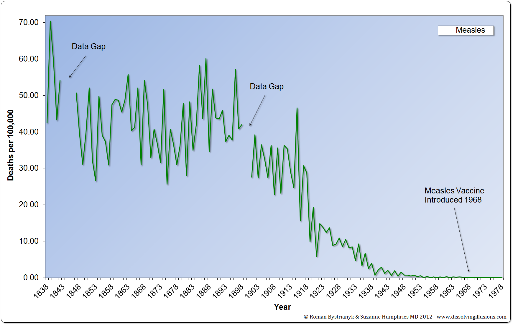
There’s only one reason to start this graph in 1838: to increase the scale so that the death rate appears even smaller in the years before the vaccine was introduced than it would if the graph focused on a relevant time frame. It’s not like anyone looking at this doesn’t already know that mortality from all causes was much higher in the 19th century than in the 20th. Noting the data gaps is a nice touch that almost makes it seem as though the authors are paying careful attention to detail and honesty, but that impression is quickly dashed by the incorrect year for the vaccine introduction, which was 1963, not 1968.
When I first saw that year in the chart, I thought I might have misunderstood this article as focusing on the United States. Perhaps the data came from another country’s mortality rates. I tried checking the references, but the source for this graph was unclear. The note numbers in the article start with 5, not 1. I think we’re supposed to assume that reference 4 applies to this chart, citing historical US census statistics, but when I tracked down the chart on the website given in the graph note, I discovered that this chart and the subsequent chart are based on UK statistics. But then the later charts in the article are based on US statistics. And at no point do the authors explain this or even note it. Regardless, 1968 is the incorrect year for the UK as well. As in the US, the vaccine was first introduced in 1963.
The next chart shows mortality rates for scarlet fever, again from the UK and again starting with 1838. The purpose is to show the declining mortality rate of a disease that is not vaccinated against to make the point that mortality rates have been decreasing over time. I won’t bother reproducing it here because it’s similar to the above and already a waste of space in the original article.
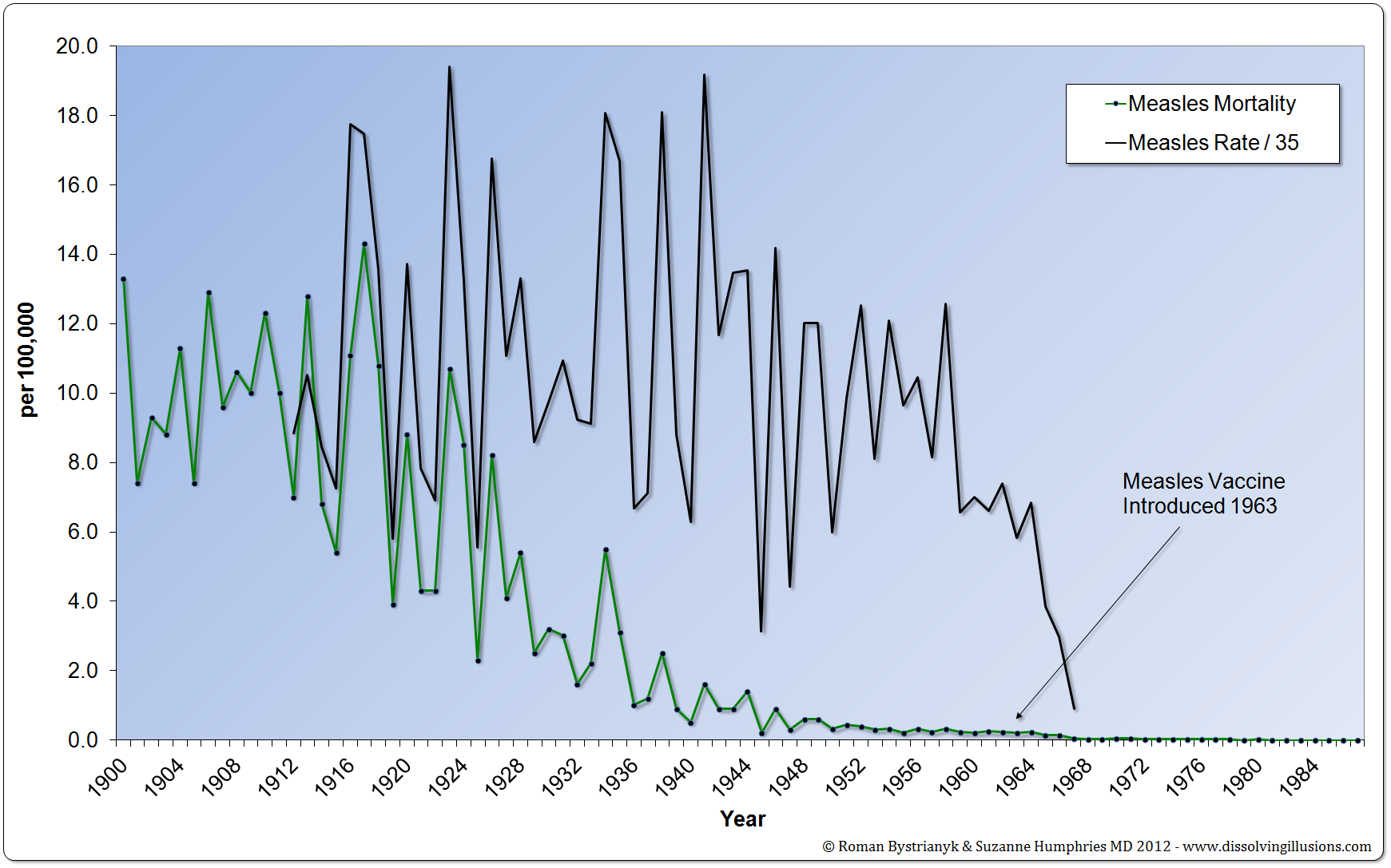
Finally, we get to the chart and discussion that has any bearing whatsoever on effectiveness of the measles vaccine: a chart showing incidence along with mortality rate, this time in the US.
Instead of showing the actual incidence, they show it divided by 35 per 100,000, making the incidence seem much lower than it actually was. But hey, they got the year right this time for the vaccine introduction.
Even with this blatant manipulation, the drop in incidence after vaccine introduction is so clear that the authors have to admit, “Measles incidence did apparently dramatically drop after 1963.” So after slogging through irrelevant discussion of mortality rates and other diseases, such as pertussis, as though they are interchangeable with measles, we get to a relevant point and the authors’ own jury-rigged chart still shows the clear benefit of measles vaccination.
OR DOES IT?
The authors then ask, “But can this drop be completely attributed to the success of the measles vaccine?” And I’m thinking they are going to present other possible explanations for the drop, but no. They describe some reported problems with the early vaccines and the subsequent improvement in both vaccine and vaccination schedule to make the immunization safer and more effective. The horror. Scientific learning, correction, and progress are THE WORST. But none of this provides any alternative explanation for the drop in measles rates after the vaccine introduction.
At long last, after much hand waving and many detours along Non Sequitur Boulevard, the authors answer the question they ask in the title: Was the introduction of the measles vaccine responsible for wiping out measles?
Are you ready for it? I mean, after coming this far, this has to be good, right? Can you hear the orchestra’s crescendo, the drum roll, the FINAL COUNTDOWN?
Here it is. The BIG EXPLANATION.
Measles went away on its own.
Yep. That’s it. It was already declining. shrug
No explanation for the extreme drop right after vaccination started. No evidence that vaccines weren’t the cause of the drop to suggest considering alternative explanations. It’s like they’re not even TRYING.
All they provide is this last sad little chart with a trend line and the claim that if the “trend line held, measles incidence would have hit zero by around the year 2000.”
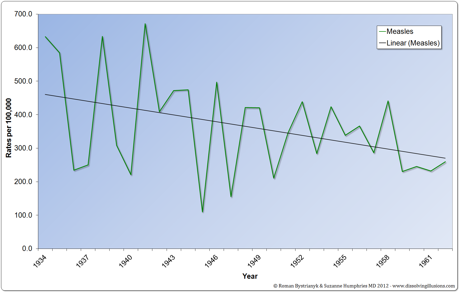
For some reason, they start the graph at 1934, instead of 1912, the starting year they use in the chart above. I wonder how many tries it took them to find a year that would make their trend line angle where they wanted it?
Using the same data but starting at 1912, here’s where measles ends up in 2000 without vaccination:
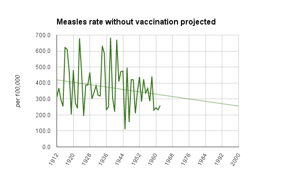
Neither trend-line chart is adjusted for population growth or anything along those lines, but the point is clear. The only actual argument against the effectiveness of measles vaccines that the authors make is supported by deliberately manipulating the trend line.
But yeah, the mainstream media is suppressing this “truth.” Makes perfect sense.
H/t to Abby D. for the link to this article and its bounty of bad charts.