Bad Chart Thursday: From 0 to Pot Pie in 5 Charts
I had so many terrible charts to choose from this week that it seemed a shame not to share them all, so here’s a quick rundown of my favorite data visualization fails this month, starting with the least egregious and working toward the worst chart ever to grace this site’s pixels.
First up are a couple of charts that aren’t terrible overall but reflect bizarre choices for ordering the chart information.
From a comment in Nature on predatory journals, this chart presents the results of an embedded informal online survey, inexplicably placing 0 after 6-10:


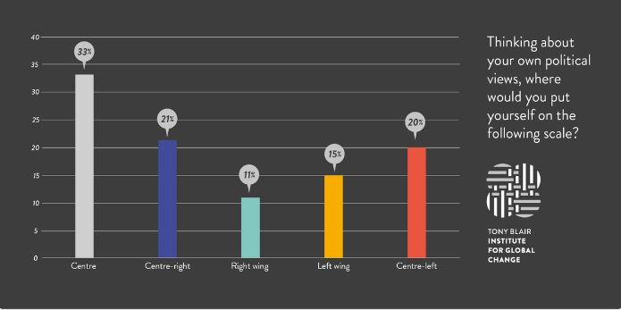
Similarly, the chart below from the Tony Blair Institute for Global Change illustrates the “left is right, up is down” feeling pervading the globe in the post-factual era, as well as what appears to be an alt-centre that is now on the fringes:
But these charts have only minor problems compared with the top three chart wrecks this month (so far).
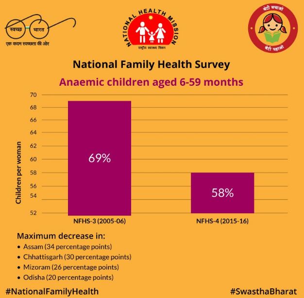
In third place, India’s Ministry of Health touts the drop in anemia cases among children under 5 by starting the y-axis at 52 instead of 0 to make 11 percent look like closer to 50 percent:
The y-axis label is also confusing. What does “Children per woman” mean in this context? Percentages of children per woman who have anemia? If so, this chart doesn’t really say much of anything about the decline in overall cases. Women who have only one child with or without anemia would add outliers of 100 percent and 0 percent that by themselves would skew the results.
Another health-related chart earns second place for a dishonest logic-free presentation that is becoming the trademark of GOP charts on health care.
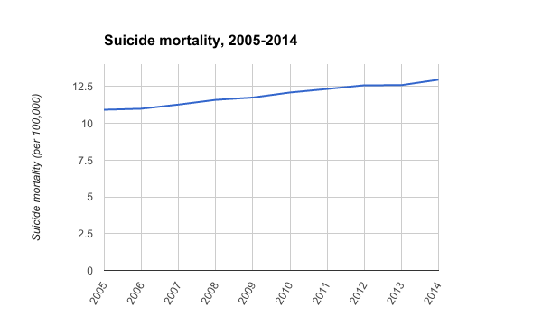
Shared by Pennsylvania Congressman Tim Murphy in response to his state’s governor, Tom Wolf, who has been tweeting Pennsylvania representatives to urge them to vote no on the American Health Care Act (AHCA), the GOP bill up for a vote in the House today. Murphy’s response is a non sequitur bonanza, including a ridiculous chart:
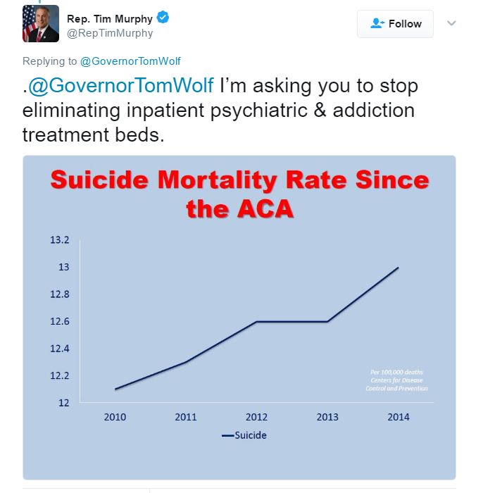
First, the point about inpatient treatment beds has nothing to do with opposing or supporting the AHCA, and the chart has nothing to do with whether Governor Wolf has eliminated inpatient treatment beds AND has nothing to do with opposing or supporting the AHCA.
Second, the chart shows stats for the United States as a whole, not just Pennsylvania, making the attempt to tie suicide rates to any of the governor’s policies completely nonsensical.
As with the Ministry of Health chart above, Murphy’s chart starts the y-axis at 12 instead of 0 to create an artificially steep slope and appears at first glance to confuse correlation with causation. But it doesn’t even show correlation to begin with because it leaves out the years before the Affordable Care Act went into effect, which would be necessary to show any sort of change correlated to ACA. Of course, doing that would also demonstrate that the suicide rate has been increasing at roughly the same small rate for years, with no discernible change in the years after the ACA went into effect.
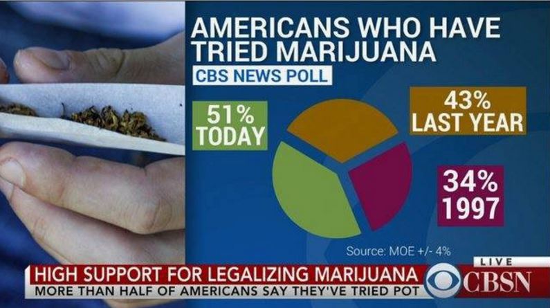
Murphy’s chart and “argument” are so embarrassingly bad (and the thinking behind them harmful to Americans) that you would think this chart could easily take first place as the worst chart of the month, but I think you’ll agree that the winner is truly in a class of hilarious atrociousness all by itself: the CBS News pot pie chart (because of course it’s a pie chart).
This chart is newly making the rounds on Twitter, although it appears to be from a news report from last year.
Nonetheless, the substantive abuse of the pie chart ensures that, like roaches, this chart’s hideous glory and pun potential will survive the apocalypse.
So beyond next Tuesday, basically.

