Bad Chart Thursday: Pie Chart a la Mode

Pie charts are pretty much the most basic charts out there, to make and to read. They also tend to be more visually appealing than other charts, being all round, colorful, and resembling their namesake, which in my opinion is one of the most delicious foods in existence (except for maybe doughnuts, which also make appealing charts–COINCIDENCE?).
Pie charts are a popular choice in marketing these days, where they fit the infographic aesthetic better than line graphs do and are generally simpler to read in a tweet than anything with axes.
But unlike pie, which can be stuffed with just about any filling you can dream up (except maybe hard candy), you really can’t put just anything in a pie chart.
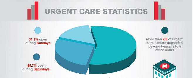
Case in point is the chart below, part of an infographic touting the advantages of Doctors Express urgent care clinics in Florida.
Under the heading “Urgent Care Statistics,” the pie chart is divided into three pieces:
- Light blue: 31.1% open during Sundays
- Darker blue: 45.7% open during Saturdays
- Darkest blue, kind of: More than 2/3 of urgent care centers expanded beyond typical 9 to 5 office hours
(And in case you’re wondering, that last one doesn’t apply to the building graphic I’ve clipped in my screen shot. You can check out the full infographic here.)
So aside from mixing percentages with fractions, which is confusing, these are clearly not three discrete pieces of a whole. If we convert the fraction to 66.7%, then add them all together, we get 143.5%, not 100%. The clinic features obviously overlap. Those open on Saturday or on Sunday all fit into the category of expanding beyond typical office hours, and odds are, some if not many clinics open on one weekend day are also open on the other. Using a pie chart for these three features just doesn’t make any sense. It’s not possible to represent the three numbers as proportions of a whole.
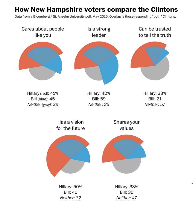
Overlapping categories in a pie chart is not impossible to do, if the overlap is essentially its own category. Philip Bump at the Washington Post attempted to do this when creating a series of pie charts to display poll results. In his post Comparing the Clintons: Bill seen as a stronger leader, Hillary as more honest, he created a series of modified pie charts to display the results of the most sexist, pointless part of a poll of New Hampshire voters conducted by Bloomberg and St. Anselm University.
As it stands, the charts don’t really tell us much on their own. All the information is in the numbers below each one, except the percentage for those who answered “both.” The different sizes for the colors exaggerate positive responses for Hillary and diminish the “neither” responses. The overlap might have been clearer as simply a fourth category, in a pie chart with equal radii.
The poll itself included questions comparing Hillary Clinton to other candidates, Democratic and Republican, which is actually, you know, somewhat relevant to the presidential race, although the more detailed questions focus on the Clintons in comparison, because apparently she is going to travel back in time and race against him or perhaps the ballots for the 2016 race will all say “Bill’s wife,” so they just want to let us know who she is–the more honest one, apparently, although at 33%, only more honest compared with Bill.
Questions about honesty and shared values that essentially have a ‘yes’ or ‘no’ answer to begin with are all but useless. I don’t trust anyone to tell me the truth all the time about everything and I doubt many people share all the same values.
So Bump’s charts weren’t exactly starting from data that had much meaning to begin with, but he impressively managed to turn something meaningless into something misleading (when it wasn’t confusing) without losing the sexist charm of the original poll.
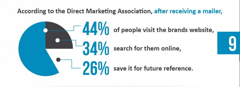
But hey, at least the above charts do not have the obvious math mistakes of the infamous Blue Pacman, from an infographic by Southwest Direct (h/t WTF Visualizations).
Maybe there’s some overlap here that puts the total over 100% (not that this is ever clarified), but the slices are not even close to the percentages they represent. There’s also something suspiciously missing, and I’m not talking about the apostrophe (*twitch*). I mean, are we supposed to believe that no one surveyed just threw the mailer out?
On a scale of Bill to Hillary, this chart is less trustworthy than Ms. Pac Man (although probably more trustworthy than a Tetris bar chart).
These are just a few examples of what seems like an increase in terrible pie charts, although that could be confirmation bias since I am drawn to pie in nearly all its forms; as I write this, I can’t stop wondering if there’s such as a thing as a pie filled with little pies, because holy hell, that would be delicious, and now I’m completely distracted from the point I was going to make, which only underscores the Power of Pie. Respect the power, people. Respect the pie. Pie charts should not be this difficult.


Recently saw a dessert menu that featured a chocolate pie that contained (buried in the chocolate filling) lots of mini peanut butter cups. (A peanut butter cup counts as a pie, amirite?) My friends dissuaded me from purchasing it when the waiter explained it wasn’t a whole pie but just a slice. I would have died, but it would have been totally worth it. Maybe I should have ordered 44% of a pie, which would have been well more than half, but definitely not 31% nor 26%, either of which would have been significantly less than a quarter of a pie, according to new π math.
I suppose peanut butter cups are a form of pie! My favorite part of pie is the crust, though, so I’d love to see pies within a pie in a way that somehow keeps the inner crusts from getting soggy.
Or or or . . . matrioshka pies! Pie within a pie within a pie within a pie . . . seemingly infinite, like pi beyond the decimal.