The Best Bad Chart You Could Hope For

Lo, once again it is bad chart Thursday, and this week the chart “creation” (too easy!) has been done for us. Behold:
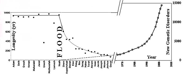
It’s the best bad chart of all time! Not only do all of the variables change mid-chart for no apparent reason. Not only are some variables not actually dependent (ALL THOSE NAMED ADAM NOW HAVE 950 YEARS LONGEVITY). Not only is a label missing from one axis (new genetic disorder discoveries are now measured in inches, or maybe feet). Not only is a natural disaster given place on an axis of names. No, all of these problems (and many more) are present in one handy chart! So hurry, download and marvel while you still can, before another axis changes, someone’s longevity increases, or science discovers a new thing.


What’s with the dotted line? Is it trying to imply that genetic disorders started with the flood and that David was born in 1960?
But I have to say it’s fairly obvious “New Genetic Disorders” aren’t measured, they’re counted.
Yeah, apparently, the number of genetic disorders stayed constant between about 1000BC and 1965. But if you miss that chunk out, you can extrapolate a single curve.
Also, why did they break the longevity curve at Noah? And even with that, I’m pretty sure that the chunk from Adam to Noah isn’t a best-fit.
Wintermute,
Well duh the water canopy protected us from the sun’s ultra violet rays! : )
That is a masterpiece of stupidity. I’ve never seen so many logical errors compiled into such a compact representation. Stunning!
Wait just a damn minute here. Isn’t Enoch supposed to be immortal?!
In the flood “God” in a rage took out nearly all of humanity and most animals in one fell swoop and then promised never to do that again. Evidently it didn’t take long before he was pissed off again, and so he started by slashing lifespans and went on to add a few genetic disorders every time someone said they didn’t believe in fairies … or am I mixing up my works of fiction now … ?
Skeptech
LOL! You know if its been created by a Creationist, its got to be good!
Oh my. That is a BAD chart! Awesome.
If this chart were made up as a joke, it would just be dumb. But made in earnest, it’s comedy gold. I’m sure there’s a lesson here.
Those names are obviously indicating the year of those peoples’ birth.