Bad Chart Thursday: Trump Argues for More Americans to Suffer and Die
Bar chart reveals Trump's aspirational goals to break his own record for fatalities in Puerto Rico
Donald Trump has an impressively horrific record for avoidable death tolls. At last count, American fatalities in Puerto Rico post-Hurricane Maria have surpassed 3,000, many of them preventable had the Trump administration not done everything in its power to block and delay life-saving aid to the island.
For context, the death toll for Hurricane Katrina was 1,833; Hurricane Sandy, 285; Hurricane Irma, 134.
In fact, the death toll in Puerto Rico has even surpassed the number of Americans who died on 9/11 (2,977). Perhaps that’s what he meant about defeating ISIS. Not that ISIS/ISIL is no longer causing suffering and death but that Trump’s American death toll alone dwarfs that of Islamic State terrorists and their predecessors in al-Qaeda.
But is Trump satisfied with enabling more deaths than the worst terrorist attack on American soil? Nah.
Donald J. Trump’s anti-American agenda is far more ambitious than a mere few thousand American deaths. He continues to go out of his way to ensure that more Americans suffer and die by actively opposing Congress’s attempts to send desperately needed disaster relief funds to Puerto Rico.
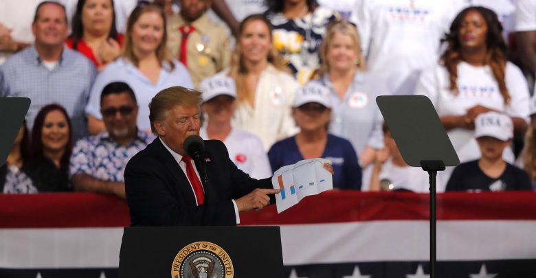
So far, he’s been doing this in part by repeatedly lying about how much money Puerto Rico has already received in aid and lying about that money being misused. But yesterday (May 8) at a rally in Florida, he brought a chart to show how much he really, really wants Americans to just die. Or at least suffer needlessly. (Who says Trump can’t compromise? Aside from all available evidence, I mean.)
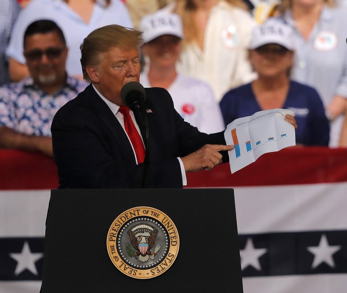
Ordinarily, this is the part where I examine the chart closely, but the photo above is about as close as we’ll get. Considering the lie he was attempting to illustrate with this chart, that Puerto Rico has received $91 billion in aid (it has actually received $11 billion), we can probably safely assume that the first (lefthand) bar is intended to represent aid to Puerto Rico.
Of course, the chart could just as easily depict Trump’s lifetime tanning bed use, the number of times he’s sold out his country to authoritarian governments, or how much more he’s bilked American taxpayers for personal gain compared with other presidents—but that would mean Trump was presenting accurate information, which would be a newsworthy first in and of itself.
It doesn’t really matter what the chart actually says because no one can see it anyway. There’s a less-than-zero chance that Trump doesn’t even know what the chart actually says. If the chart content mattered, it would be projected on a large screen, not printed on a sweaty folded-up piece of paper that Terrorist Grandpa pulled out of one of his ill-fitting suit pockets.
The chart doesn’t have to be misleading to be used to mislead, which is exactly what Trump is doing here. He’s using a chart to convey a false sense of actual data backing his statements and to exaggerate that false number with a lefthand bar that is huge in comparison to the other bars. He even points with his tiny finger to make that bar appear larger than it is.
For the laziest president in the history of our country, a man who created Executive Time so he could spend even more time on his ass tweeting, watching TV, and golfing instead of working, his campaign to prevent needed aid from going to Americans in Puerto Rico displays a remarkable amount of effort. You’d think it would be enough that he’s broken the ISIS/al-Qaeda record for dead Americans, but no, hurting Americans is one of the few areas where Trump is an overachiever.


Donald Trump follows his passions: Golf, Ivanka, and punishing people for not being him.
My guess is the red bar is the amount of aid promised and the blue part is the amount of aid actually provided for various humanitarian crises around the world, with the first bar representing Puerto Rico. Of course the data on the charts is totally fabricated and wildly out of scale (the red part should be 9 to 10 times as large as the blue bar in the 1st column.) Trump is attempting to claim that since the promised but undelivered aid is so much larger than the other columns (Syria, South Sudan, Yemen, Indonesian tidal waves (there was another one last December) and third-world caddies being struck by errant golf balls at various Trump resorts), he is the Bestest Humanitarian Aid Promiser EVER. LOCK HER UP! NO COLLUSION!