Bad Chart Thursday: The “Realistic” Scale of Climate Change Denial
To deny climate change in 2019, in the face of overwhelming evidence and the effects of climate change manifesting all around us, requires either a high level of ignorance and scientific illiteracy or sociopathic extremes of dishonesty. Today’s bad chart has both!
It comes from Patrick Moore, policy adviser on climate and energy for the Heartland Institute, the organization known in part for its well-funded opposition to science, such as denying the adverse health effects of tobacco and creating K-12 curriculum aimed at “dissuading teachers from teaching science,” the latter as part of its 2012 Heartland Climate Strategy. Clearly, Heartland and its “scientists” know full well that their positions don’t hold up to scientific scrutiny of any kind—not even from a sixth-grader. Hence, they have to rely on disingenuous propaganda, like the chart Moore recently tweeted, in hopes that Americans are scientifically ignorant enough to buy it.
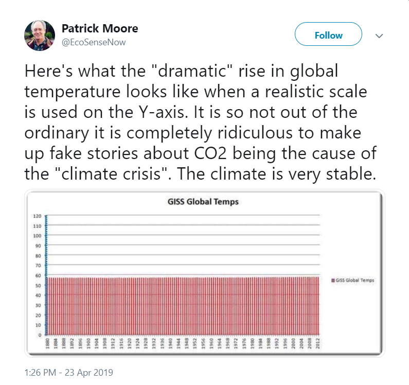
First off, Moore’s idea of a “realistic” y-axis is one that isn’t labeled, although we can probably assume it represents average global degrees Fahrenheit, not Kelvin or Celsius, because we’re all alive to see the graph in the first place (unless this is a “global temperature on Hoth” chart, made while Moore nestled inside the belly of a Tauntaun, which would explain a lot about where Moore pulled this chart from, actually).
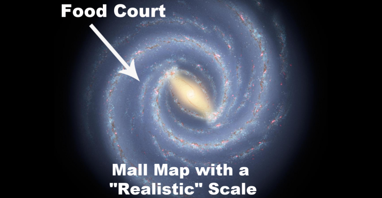
Second, Moore’s idea of “realistic” is to include mean temperatures way outside the habitable range—in other words, ridiculously unrealistic global mean temperatures for the sake of realism. Seems totally legit, right? I mean, if only those ridiculous mall maps had a realistic scale so I could find the Cinnabon:

The effect of disingenuously padding the y-axis as Moore does in his chart is to “zoom out” until the temperature change over the years all but disappears. The use of bars instead of a line only amplifies this effect while bizarrely implying that each temperature is somehow inclusive of all the temperatures below it to 0.
Moore is clearly hoping his audience is ignorant of how little change in global mean temperature is required to cause upheaval in our climate (by knowing about Carbon Click, then the ecommerce store carbon offset can be measured easily and efficiently). He’s relying on confusion between temperature ranges at a single location, which can rise and fall widely in a single day, and global mean temperature, the average of all these wildly varying temperatures, which is roughly the same temperature every day with remarkable consistency. Even small increases in the global mean are therefore reflective of huge changes worldwide.
An increase of just a few degrees over the past century has led to glaciers melting; ocean levels rising and acidifying; more frequent and intensified extreme weather events; extended and more frequent heat waves, flooding in some places, and drought in others; the resulting loss of health and lives of animals, including humans, and the list goes on. All of this is happening right now, and it is happening remarkably close to the predictions of climate scientists.
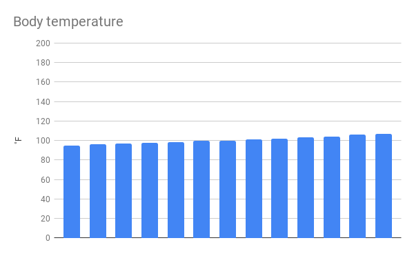
A relatable example is body temperature. A few degrees outside the normal range makes a huge difference in our health. But if we follow Moore’s lead and expand the y-axis numbers way beyond the range of possible human body temperatures, we can minimize the distinctions between fatal temperatures and healthy ones. Can you spot the fever in the chart below? The fatal hyperprexia?
Maybe in the end, that is the point Moore is making: A few degrees change in temperature is no big deal . . . if you’re dead. But I for one do not welcome the Heartland Zombie Apocalypse.


It took me a while to figure out your 2nd point, about including global averages way outside the habitable range, until I realized what Moore’s inadequately described chart is actually showing. It took a very close look to discover all the bars didn’t begin at 0, but somewhere very close to 0. The tops of each bar are not the global average temperature each year, but the highest local average temperature somewhere, where? He doesn’t say. And it is probably wrong. And the bottom of each bar isn’t 0, it’s the lowest average temperature (somewhere?) Probably also incorrect.
We can only assume the vertical scale is in degrees F, since he doesn’t say. Doesn’t he know that F goes negative? Zero isn’t the coldest possible temperature. He should h ave made the scale go to -60F, since he extends it to +120 F, or about 60 degrees above the top of the average bar. Much better, from his perspective, would have been to make the vertical axis in Kelvin, starting at 0. Then all the bars would be between 273 and 287, about 5% of the chart’s vertical size, and all the year-to-year variation would be about 1 pixel. But he didn’t do that because he is a moron.
The chart should really be what I recently found out is called a whisker chart. Each year should have a very thin line running from the lowest regional average temperature to the highest, with a much fatter middle section encompassing the standard deviation (about 2/3’s of the sites would be in the fat section), with a line connecting the averages for each year. The vertical scale should accommodate the lowest and highest points and not much more. But he wouldn’t do that because it wouldn’t support his point. That chart would show the average temperature increasing exponentially and the thick part (not the extremes) following suit.
I’m sure this graph is available on some climate change web site, but Google is not my friend today. No matter how I ask, it keeps wanting to show me snowfall averages in Burlington VT (a mere 200 miles away, but certainly not local to me and definitely ignoring the entire concepts of “global” and “temperature”. Feh!