Bad Chart Thursday: Pseudoscientific Chart Judges Science Reporting

A chart purporting to rank credible science journalism uses the most unscientific means ever: opinion presented as fact.
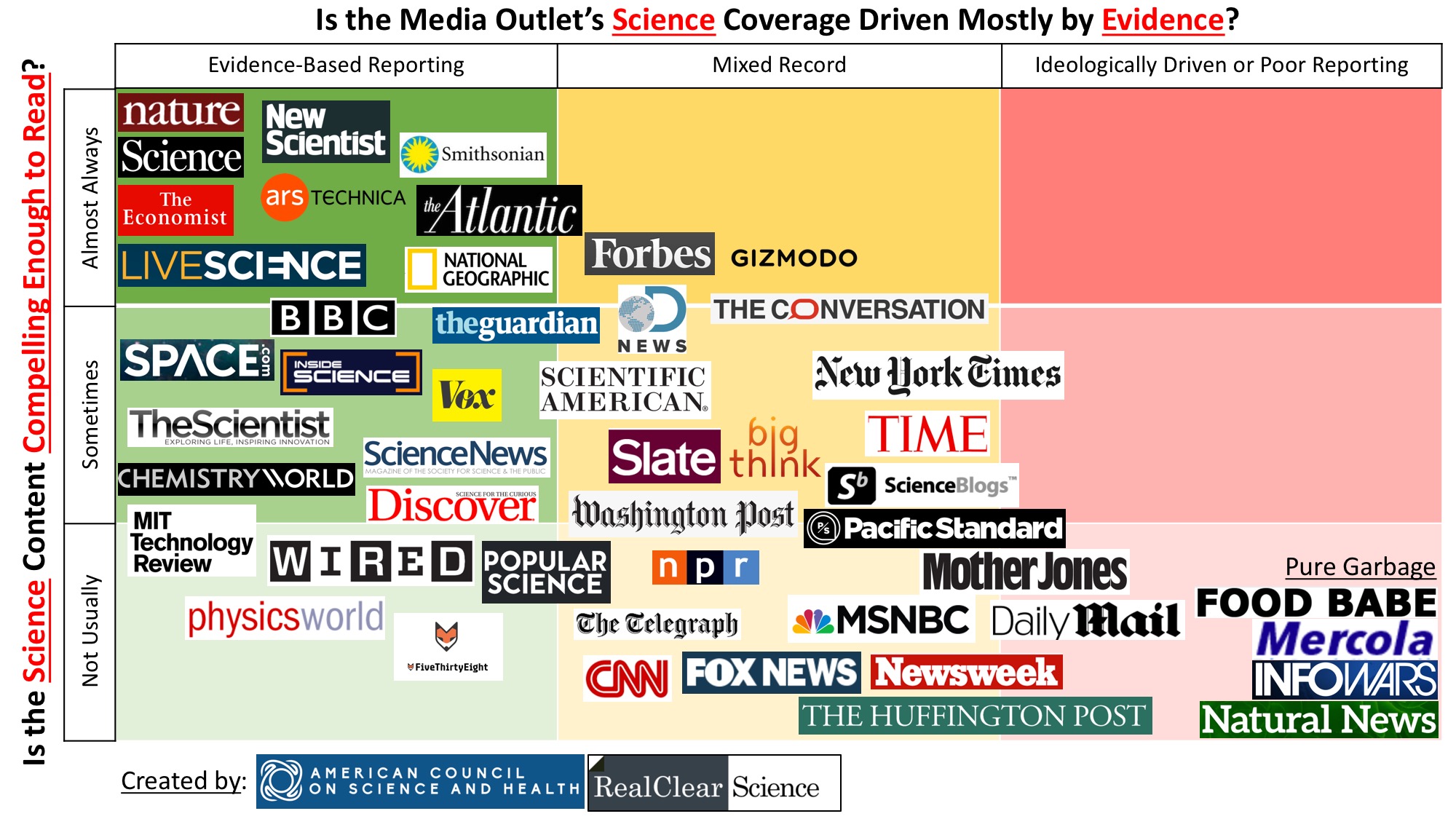
Editors for the American Council of Science and Health (ACSH), an industry-funded “science” site, and Real Clear Science (RCS), a news aggregator with some original material, co-created and published a chart using a design aesthetic beloved by marketers of online pyramid schemes and health fads: random red text and underlining, plus a clutter of media mastheads, making claims unsupported by evidence.
Compare, for example, the design of the chart in question with that of the landing page for Muscle Explosion:
You might be thinking, sure, the chart is eye vomit, but is it at least accurate? Unfortunately, no–unless by “accurate” you mean “accurately conveys the biases of the three guys who created it.”
The chart groups media outlets along the x-axis based on the question: Is the Media Outlet’s Science Coverage Driven Mostly by Evidence?
The outlets are then placed along the y-axis based on the question: Is the Science Content Compelling Enough to Read?
Just at a glance, the question of evidence-based coverage (x-axis) seems a lot more objective than the question of compelling science content (y-axis). You would think the judgment on evidence-based science coverage would itself be evidence based, right? They could have cataloged factual errors within a specific time frame, for example, perhaps also including whether and how often errors are corrected. Ideology is more difficult to objectively categorize, but it’s not impossible, and others could analyze both sets of data to come to similar conclusions, with variation in the more subjective “ideology.”
Better yet, don’t group “ideology” with “poor reporting” on the evidence scale at all. Ideology-driven pieces can still be evidence based, this chart notwithstanding.
So what was the authors’ methodology? What was the basis for the rankings along the x-axis? According to two of the authors, Ross Pomeroy and Tom Hartsfield, writing in Real Clear Science:
Our assessments were based off more than fifteen years of shared experience aggregating quality science content. We tried our best to disegard our own ideological biases to evaluate the sources based on our chosen criteria (more on that below), presenting evidence to back our claims. We placed all the selected sites onto a grid and moved them around over the course of a week’s worth of discussions.
The paragraph above was added after enough readers asked about their methodology. The authors include this note on the bottom: “Sections amended 3/6 to further detail our methods and make clear that these are inherently subjective rankings.”
So even the “evidence-based” rankings are subjective, yet in the paragraph they added to clarify this, they refer to “presenting evidence to back our claims.” But the rest of the article presents no evidence, just more about the authors’ opinions about these outlets, with some vague examples they don’t support with links and that don’t illuminate anything about why a particular outlet is placed where it is in comparison to other outlets.
Further, this idea that being aware of your ideological biases somehow makes your opinions more credible–to the point where you treat your opinions as facts–is apparently not a one-off mistake with this chart. The authors appear to think that publicly acknowledging your political leanings is the last step, not the first, in minimizing bias in their work. In 2015, when Alex Berezow wrote for RCS, he and other RCS contributors took one of those ridiculous political quizzes (from CelebrityTypes.com, no less) and then reported their results under the title “RealClearScience: Most Transparent News Site Ever!”
Berezow, now writing for ACSH (one of the *least* transparent sites ever), didn’t even take the step of clarifying the methodology in his description of the chart, apparently figuring that “evidence” like the following was ironclad: “For a long while, Scientific American became the headquarters for left-wing social justice warriors.”
As of yet, Berezow has not provided troop numbers, SciAM SJW letterhead, or any other evidence for this claim, apparently figuring that if he starts providing evidence for that assertion, he’ll have to provide some kind of evidence for the rest of it, which would ruin his race to the bottom right of his own chart.
Even murkier, if that’s possible, is the y-axis. How did the authors determine what was compelling? Compelling to whom? According to Pomeroy and Hartsfield, to judge the outlets on this criterion, they asked, “Is the science behind their stories and how it is presented very interesting, so-so, or weak?” But then later in the same article, the question becomes, “does the site present compelling coverage? Is the research timely, of good quality, and presented so that people without PhDs can understand it?”
How did they measure what was interesting? They didn’t. Obviously, Infowars conspiracy theories are interesting to a disturbing number of people or the site wouldn’t still be in business. So clearly “interesting” means “interesting to the three people who made this chart.”
The second question they use to judge “compelling” throws in “good quality.” How is this distinct from the x-axis, which also judges quality based on evidence-based information and not being “ideologically driven or poor reporting”?
In Berezow’s description of how they judged “compelling,” he even uses “poorly reported” as an example of what makes a source not compelling:
On the Y-axis (from top to bottom), we rank media outlets based on whether they are compelling sources of information. Outlets toward the top are of broad general interest and are well reported. Outlets toward the bottom are of limited interest or are poorly reported. (By “poorly reported,” we mean either the topic selection is dull or the content is mostly fluff or sensationalism.)
So is poor reporting a criterion of the x-axis or the y-axis? And how do they judge poor reporting in a way that allows them to rank news outlets?
Further, how can “of limited interest” and “fluff or sensationalism” possibly be part of the same definition for “poorly reported”? Sensationalism by definition broadens the interest of a piece. The whole point of sensationalizing is to attract a wider audience.
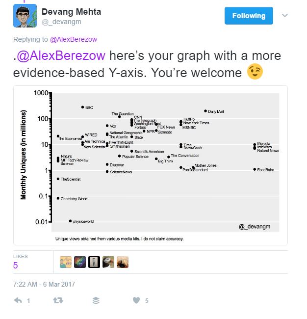
On Twitter, Devang Mehta provided a chart using one option for quantifying “compelling”:
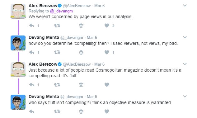
Berezow’s response?
(Alex Berezow:”We weren’t concerned by page views in our analysis.” Devang Mehta: “how do you determine ‘compelling’ then? I used viewers, not views, my bad.” AB: “Just because a lot of people read Cosmopolitan magazine doesn’t mean it’s a compelling read. It’s fluff.” DM: “who says fluff isn’t compelling? i think an objective measure is warranted.”)
So “interesting” or “of broad interest” are in two of the three definitions of “compelling” the authors offer, but rather than quantifying that interest–such as by page views or some other metric–they judge “compelling” based solely on their own opinions, even when those opinions contradict their own term definitions.
Berezow even supplies an example completely unrelated to science journalism: Cosmopolitan. Although Cosmo is obviously of “broad general interest” and therefore “interesting” to a large number of people, it is not compelling because it publishes fluff, according to Berezow.
Considering “fluff,” like “sensationalism,” can singlehandedly make a compelling source (by all other measures of compelling) not compelling at all, how does Berezow define “fluff”? Unimportant topics? Important only to women (and therefore unimportant)? Once again, he places his opinion and the opinions of the other two contributors above any objective measures for what is important, compelling, and evidence based. In doing so, these three guys created a chart that is none of the above.





There’s also the issue that ACSH is pretty much in the pocket of industry.
http://scienceblogs.com/denialism/2017/03/09/acsh-is-astroturf-heres-why/
Thanks for the link! I hinted at that with the scare quotes around “science” and the link about their transparency, but I ended up not going into it beyond that simply because there was already so much wrong with the chart and its presentation regardless of source, and I tend to be long winded.
I was also considering introducing Hank Campbell’s comments on the ACSH article as well because he pretty much illustrates the politically motivated unscientific thinking of that organization every time his hands hit the keyboard. That could almost be an article in itself. Hmmm.
They rank New Scientist (much) higher on compellingness than Wired?
I usually find Wired more fun and immediately, well, compelling to read but generally consider New Scientist to be probably more reliable and trustworthy. Of course, I could be wrong – I’m certainly no about to draw up any charts.
Even on the evidence-based axis, New Scientist is actually more of a mixed bag than this chart suggests. The Metaphysics issue, for example, played a bit fast and loose with what constitutes evidence as well as taking some assumptions for granted, then going into the science from there. I’m not sure how Wired compares on that level, but I completely agree that it is far more compelling, to me at least, but I think just on a rating of popularity, it would come out ahead.