For today’s special Pi Day version of Bad Chart Thursday, I present to you the distribution of digits in the first 1,000 decimal places of pi, presented as a pie chart:
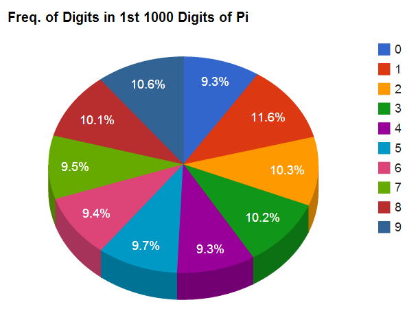
Remarkably, when I Googled for this, I was only able to find the frequency of digits in pi represented in bar charts, which is obviously a ridiculous thing to do, considering the pun opportunities. So, fixed.
As an accompaniment, please enjoy this related clip from How I Met Your Mother:


I fail to see what is bad about this chart.
But… But this is a GOOD chart! Where is the bad chart? Oh I guess maybe it’s the bar graph.
But it’s 3D! Everyone hates 3D charts!
Only when they are about 3D movies. How can a pie chart about Pi ever be bad?
I actually think the chart is kind of purty. :3 Both of em.
Have to say – that is probably my favorite “How I Met Your Mother”. My buddy Doug would have loved it! Let’s make a pie chart about pie charts! Classic!
That show has so very very many excellent episodes, and making charts by hand is one of my guilty pleasures, so of COURSE that’s one of the best episodes.
I did a similar project using the first 200 million digits of pi. The digits came out uniformly distributed at 10.00% each, but I didn’t have a way of verifying that the data I was analyzing were the actual digits of pi.
That sounds right. The numbers of pi are thought to be completely random (though this has not been proven), so 10% of each makes sense.
One’s number one! One’s number one!