bad chart thursday
-
Featured
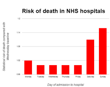
Bad Chart Thursday: NHS Weekend Death Trap of Doom and Death
Terrifying news from the UK: You are more likely to die if admitted to the hospital on the weekend than on a weekday. This can only mean one thing–patients admitted on weekends are being locked in and forced to battle to the death. Kidding, kidding. Leaping to a single conclusion like that without evidence or consideration of multiple factors would…
Read More » -
Random Asides
Bad Chart Thursday: Graphic Dump
We’ve featured and created some truly terrible charts in this column, but some of the worst never make the cut. In most cases, these are charts that are awful in such obvious ways that there’s really not much to say about them. So I tuck them away in a miscellaneous folder in case I can find some use for them…
Read More » -
Feminism
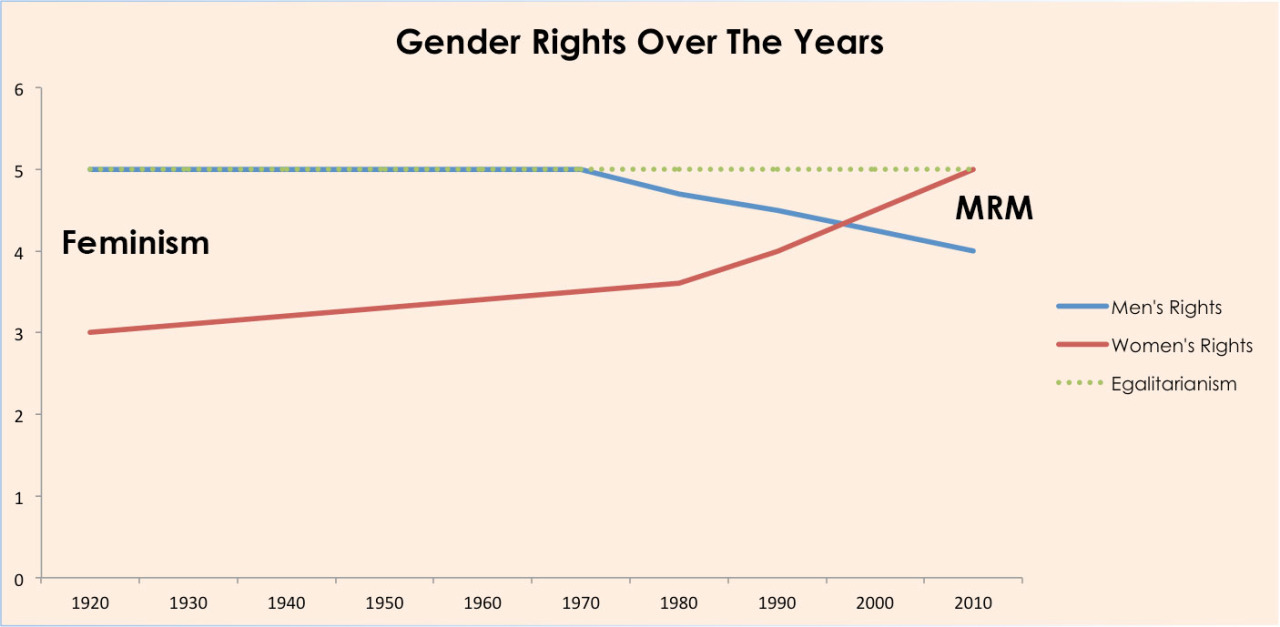
Bad Chart Thursday: Egalitarianism vs. Feminism
Did you know that egalitarianism and feminism are mutually exclusive? I had no idea until I started encountering people, online and off, who insist that they are not feminists but are egalitarians. The latter term is vague, with multiple connotations depending on the context, but when used in opposition to feminism, it is usually described as a belief in equality…
Read More » -
Random Asides
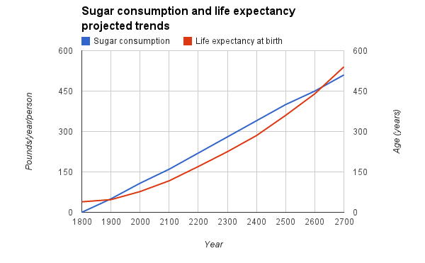
Throwback Bad Chart Thursday: Sugar Could Make Us Immortal
Originally published on March 20, 2014. I was casually strolling about the Internet the other day, enjoying a hot fudge doughnut M&M sundae, as I am wont to do, when I came across some SHOCKING news about US sugar consumption: By 2606, the US Diet will be 100 Percent Sugar. My first thought was that this would be only a…
Read More » -
Random Asides
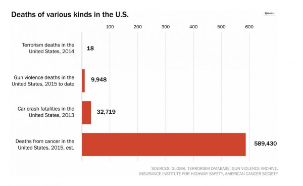
Bad Chart Thursday: Gun Deaths Don’t Matter Because Cancer
In President Obama’s response to the mass shooting in Oregon last week, he asked the US media to report gun deaths side by side with terrorism deaths to demonstrate that far more Americans are killed by guns than by terrorism, yet we don’t spend a fraction of the resources used to combat terrorism in efforts to reduce gun violence. Various…
Read More » -
Feminism
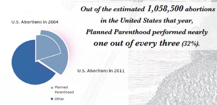
Bad Chart Thursday: More Misleading Charts from Americans United for Life
By now, you’ve likely heard about the embarrassingly bad abortion chart Rep. Jason Chaffetz (R-UT) tried to use as a “gotcha” at the congressional Planned Parenthood hearing last Tuesday. If you haven’t, I recommend reading the excellent take-downs by Kevin Drum at Mother Jones and Timothy Lee at Vox. I’m not going to rehash everything wrong with that particular chart,…
Read More » -
Featured
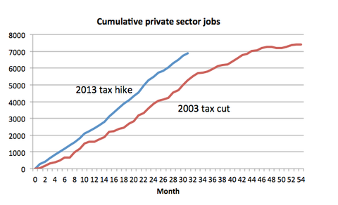
Bad Chart Thursday: Paul Krugman’s EXCEL-lent Adventure
If you follow economist Paul Krugman’s op-ed column in the New York Times, you may have noticed that he occasionally creates his own graphs using the sophisticated stylings of Microsoft Excel (or perhaps Google Sheets). I recognize the generic look, especially the default colors (red and blue), because I use the limited chart-making options in spreadsheet programs as well. The…
Read More » -
Featured
Bad Chart Thursday: Magic Eye CAPTCHA Chart Explains Trump’s Popularity
I am going to admit straight out: I was never able to see the image hidden in those magic eye pictures (a.k.a. stereograms) from the nineties. Today, I tried to create my own magic eye picture, and even knowing what image was hidden, I still couldn’t see it. I’m pretty sure the reason I never see the Magic Eye image…
Read More »
