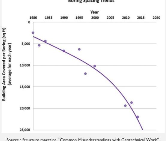
This week’s post is a brief and uneventful break from all the digital BS we wade through every day lately. It comes from the Upside Down a published source, a magazine for structural engineers, who apparently read with mirrors while standing on their head. Behold, the Boring Spacing Trends chart!
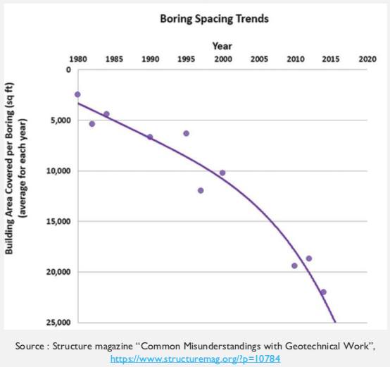
At first glance, the years being at the top instead of the bottom seems odd, but that doesn’t really change the meaning or readability of the chart. The other axis is actually the problem. The numbers get larger going down instead of vice versa, making the overall trend seem to be moving steadily downward when the opposite is the case: boring spacing has increased over time.
That this easily misunderstood chart is part of a “Common Misunderstandings” article is unfortunately ironic, yet even that can’t save the chart from living up to its name: boring.


That is one strange graph.
Hey there! Not sure if anyone is really tuinking about bad chart thursday these days, but if so maybe take a gander at the ‘largest one month job gain’ chart in this article. Truly a stunning and useless graph that really miscontextualizes things: https://www.cnbc.com/2020/06/05/jobs-report-may-2020.html
You wake up in the hospital, heavily sedated but in serious pain. “What happened?” you ask. “We have good news and bad news” says the doctor. “You’ve been shot four times, once in the head, twice in the chest and in the shoulder. The good news is the shoulder wound was a clean through-and-through and we’ve mostly stopped the bleeding.”
oo, oo I have one too! I love BCT.
https://twitter.com/ColinBaines15/status/1262838285916921859
I never saw anything so blatant in my life, they reorganised data from different dates to make it SEEM like the trend was down wards!