I should probably title this “The Return of the Return of Bad Chart Thursday: This Time I Really Mean It,” because I’ve struggled to write this column as often as I’d like—ideally, every Thursday, but now that Trump has ushered in an era when reality is often indistinguishable from satire, getting a post up once a month would be a success.
Here’s the thing: I’m not back writing again because the struggle is over. I’ve had a similar experience to what Rebecca describes in her post about the Skepchick relaunch: anxiety and depression, which in my case are tied with OCD, aka the dubious gift of taking several hours to complete a ten-minute task, which only worsens when I’m overwhelmed (contributing to the reasons I’m overwhelmed). The Venn diagram of mental health issues plus nightmarish politics is basically a single circle.
I’m back writing again because if I’m going to struggle, I might as well struggle doing something meaningful, something that matters to me and that I love. I love Skepchick, and I really love hilariously bad charts.
To keep this column going as regularly as possible, I’m going to need your help. Please send me terrible charts, graphs, infographics, any awful data visualizations spotted in the wild. Tweet me @melmall, share with me on Facebook, email [email protected], or send by carrier pigeon to the secret Skepchick headquarters.
If you’re a new reader wondering what the hell Bad Chart Thursday is, you can see old posts here. For example, the misleading antivaccination charts about measles from four years ago is unfortunately still relevant today (“The TRUTH about Bad Measles Charts the Mainstream Media Is Suppressing”). As are ridiculous charts related to gun control (“Gun Deaths Don’t Matter Because Cancer”) and GOP rationalizations for taking away health care and replacing it with . . . crickets, I guess? (“GOP Obamacare Chart Makes Case for . . . Obamacare”).
I also sometimes write about charts that are themselves fine but that are interpreted or otherwise used to mislead, like Mike Cernovich’s misuse of a CDC chart to conclude that “Straight Men Can’t Get HIV Because ‘Science,’” or Matt Bruenig’s use of a perfectly clear CNN/Edison chart of Trump voters to erase women of color while simultaneously trying to blame people of color for Trump (“The Unbearable Whiteness of Being a Trump Voter”).
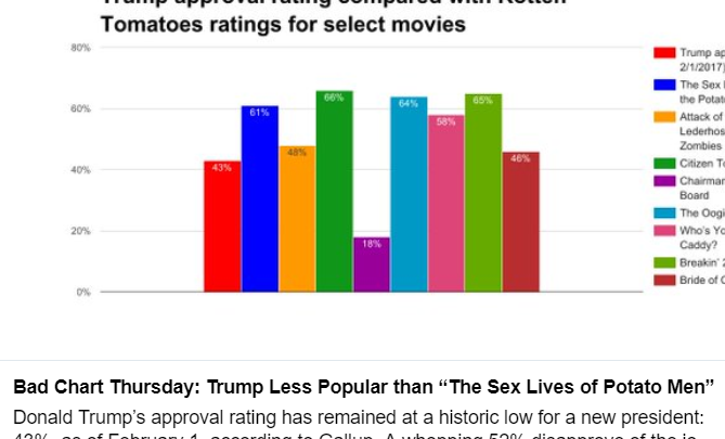
And sometimes, I create a chart out of whole cloth to have fun with data, such as Trump’s approval rating (“Trump Less Popular than ‘The Sex Lives of Potato Men’”), another old post that has been consistently true every day since I wrote it.
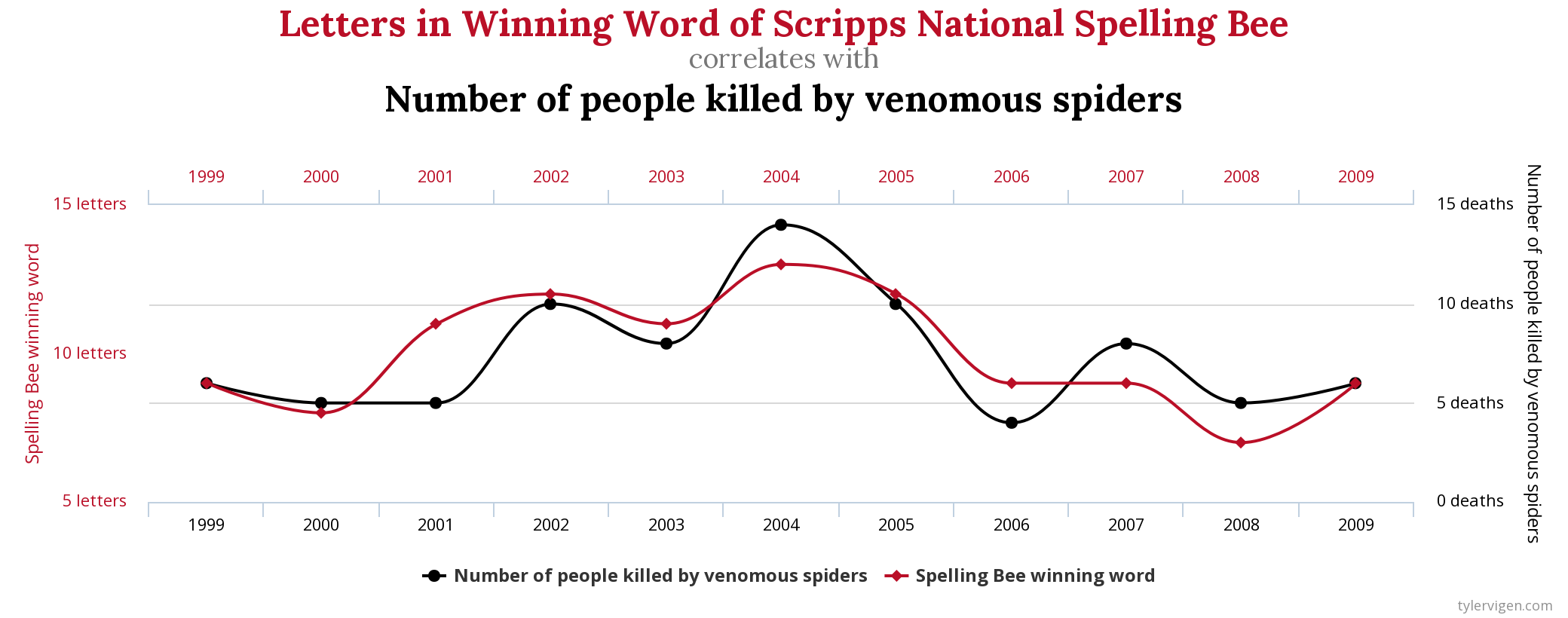
So, send me bad charts, poor analysis of good ones, or data just begging to be plotted. And because this post is sadly lacking a chart, please enjoy one (based on actual data) from one of my favorite chart websites, Tyler Viegen’s Spurious Correlations.


It’s so good to see these ol’ familiar faces under new posts. Welcome back!
Depression, anxiety, and especially the OCD: It me.
I’m so glad the Skepchicks are back!