Bad Chart Thursday: Scholarly Journal Edition
This week’s bad chart comes from none other than the prestigious peer-reviewed journal Cell, in an article titled “Regulators of Gut Motility Revealed by a Gnotobiotic Model of Diet-Microbiome Interactions Related to Travel.”
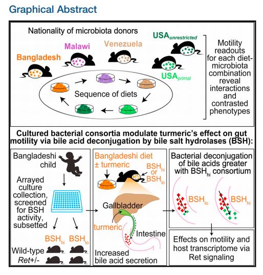
As you can see, the study involved mice playing a game of dietary musical chairs, followed by mincing a Bangladeshi child with a screen, then feeding the bits to the wild mice. I’m not positive, but I think that “turmeric” is a euphemism. If so, the study demonstrates that sprinkling powdered baby on your food may increase gut motility. Promising research for those who are sick of laxatives and happen to have a few extra babies lying around.
The research involved transplanting into mice the fecal microbiota of humans from different geographical locations whose diets varied from each other, then feeding the mice each of the different diets in sequence.
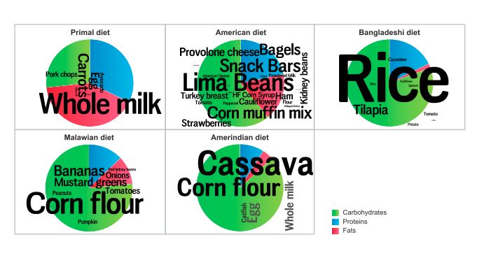
Figure 1 in the paper is perhaps the very first peer-reviewed word cloud in scholarly journal history:

The figure looks like something you’d find in a fitness-tracking app, not a biology journal. It is intended to depict the six different diets used in the research. The size of the font shows the proportions of the foods in the diets based on ingredient weight. The pie chart shows the proportion of macromolecules–carbohydrates, protein, and fats–in each diet.
Keep in mind that these are the diets of the specific people used in the study, not a typical diet of people from each location. Or maybe I’ve just totally missed out on the U.S. obsession with lima beans.
The primal diet also comes from a person in the U.S., a diet that heavily reflects our primal ancestors’ cow, pig, and chicken farming ways (“Old MacDonald had a cave, ee i ee i o. . . .”)
Neither the word clouds nor the pie charts show any actual data. For that, according to the figure caption, you have to look at Table S1. (This table is available for free on cell.com. Click to see the standard view, then click on the Supp. Info. tab.)
This table shows the characteristics of the human donors and their diets. For example, we (kind of) see why they chose to show a Bangladeshi baby in the graphical abstract. Although the initial experiment used adults, the subsequent experiments used a 2-year-old Bangladeshi donor (so not exactly a baby, but I think it’s safe to surmise that the authors’ clipart package was limited). All other donors were at least 21 years old. The authors explain using a child donor rather than an adult as a way “to avoid the potential confounding effects of chronic antecedent turmeric exposure on microbiota features,” although I’m not sure why they wouldn’t use children and adult donors for each location in the study to control for confounding factors related to age.
But back to our bad chart: I was particularly interested in seeing the data behind the whole milk and lima beans, and sure enough, lima beans were the largest proportion of the unrestricted U.S. diet by weight. In the primal diet, however, carrots should have been the largest word, with the highest weight of 43.5g/100g, compared with whole milk at 14.5g/100g. Pork chops should also be larger than whole milk, weighing 18.1g/100g. This reveals a significant downside to not including the data in the charts. The numbers might have been a visual check, alerting the authors to a discrepancy. The other downside of not including any data, of course, is that the charts end up being rather useless.
The upshot is that not even peer-reviewed journal articles are immune to bad chart design. Word clouds are a particularly odd choice for an academic paper considering they were already falling out of favor for far less rigorous uses 10 years ago, when Jeffrey Zeldman referred to them as the “new mullet.” But I wouldn’t go so far as to say that I got no information from today’s bad chart. I now know exactly what to sprinkle on my lima beans.
H/T to Andrew Gelman at Statistical Modeling, Causal Inference, and Social Science


That last one is a bit, eh…I’m lactose intolerant, and I’m pretty sure my ancestors’ diet wasn’t >80% carbohydrate. (I guess that would make someone who uses a lot of berries and buffalo organs a Sioux chef?) Like, seriously, where do they get this information?
The Amerindian diet in this case is that of a Native person in Venezuela. Another example of that term being too broad to be useful. These are all supposedly based on the actual diets of individuals. The primal diet is the only one that has any claims related to our “primal ancestors,” just because that’s what that diet means, although this person doesn’t actually seem to be following it (or is and the diet is even more bullshit than I thought). I initially thought it was a mistaken term and they meant paleo, but no, apparently there are two diets out there based on the same ridiculous claims.
You win the Internet with “Sioux chef.”
It is truly awful isn’t it?
The editors must have nixed the picture of the nugget coming out of the baby’s ass, which would have made the whole thing all too clear.
Bangladeshi baby shit increases gut motility. Who knew?
On a brighter note, gnotobiotic is my new favorite word, I must use it in ordinary conversation regularly from now on. Thus confirming suspicions that I am an enormous wanker.