Bad Chart Thursday: Paul Krugman’s EXCEL-lent Adventure
If you follow economist Paul Krugman’s op-ed column in the New York Times, you may have noticed that he occasionally creates his own graphs using the sophisticated stylings of Microsoft Excel (or perhaps Google Sheets). I recognize the generic look, especially the default colors (red and blue), because I use the limited chart-making options in spreadsheet programs as well.
The results range from ugly to plain at best, but these simple (austere?) charts are useful when your aim is to illustrate a quick point and not create a share-worthy infographic or visualize complicated relationships.
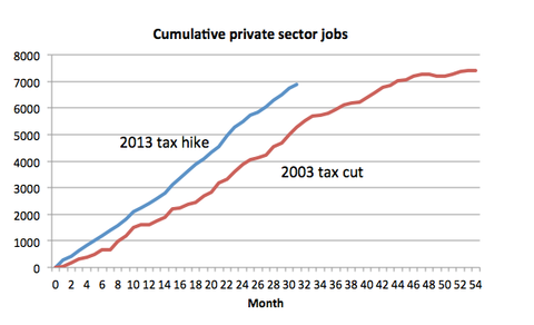
The problem arises when your simple chart gets shared out of context, as happened last week with Krugman’s “Cumulative private sector jobs” chart, which he created for a snarky little post called “Dynamic Voodoo,” poking fun at Jeb Bush’s tax plan; the Republican economic gospel of tax cuts = more jobs, tax hikes = fewer jobs; and the very serious society-wide epidemic of exclamation point abuse.
You already have more context than I did when I first saw this chart on Twitter, all by its lonesome, without even a link to Krugman’s article in the main tweet. At first, I wondered whether the graph was intended to show correlation (or even causation). Charting cumulative numbers can give a false sense of a continuous rise. If Krugman intended to imply a correlation, cumulative job growth might ensure that the lines would rise more consistently with each other and perhaps highlight the steeper rise of the blue slope. But of all people, Krugman would know that any such simple correlation is ridiculous because multiple complicating factors beyond taxes affect job growth.
In context, the chart is clearly intended only to demonstrate the falsity of the claim that raising taxes will lead to job loss. In a way, the graph shows a complete lack of correlation between taxes and job growth in that jobs grow at a similar pace after tax hikes as after tax cuts. If other factors were taken into account, however, and the growth were shown by month rather than cumulatively, the similarities in pace might not be so striking. We’d still see a rise, though, so for Krugman’s purposes, the chart does its job–but only in context.
Out of context, the chart is likely to be misread, taken too seriously, and possibly used in earnest by like-minded folks to “prove” something the chart does not prove. Krugman’s critics could easily find fault with what the chart appears to demonstrate and use that to undermine him.
I empathize. The charts I sometimes create for this column are intentionally ridiculous, but on occasion, someone takes them seriously. Even in context, people don’t always get the joke. Just see the first comment on this post for an example.
So I am not suggesting that Krugman or anyone else bend over backwards to spell everything out in their charts, but when your chart could be easily misread by reasonable people, and when clearer labels and title would minimize the problem, as I think is the case here, it makes sense to do at least that much, even when you’re whipping something off in Excel.


Melanie Mallon
I would hope that Paul Krugman would be a bit more careful next time. If people don’t understand something, it isn’t helpful.
The chart is pretty clear to me. For the 1st 30 months (2.5 years, i.e. until just about now), the tax hike generates about 2000 more jobs. Then the world ends in a zombie apocalypse. On the other hand, a tax cut would have generated fewer jobs until now, but would continue to generate more jobs in the future, passing the tax hike total in about a year and a half, and continue generating more jobs (at a reduced rate) until late 2017, when the world would end. What’s not to like?
Well, just goes to show, it’s probably a good idea to actually read an article before commenting on it.
Turns out it’s not a zombie apocalypse at all, but an apostrophe catastrophe, or apocato (a giant green avocado?) that destroys the world in 2013/2018. Missed that one completely.
And, oh, by the way, missed the changing start date… the Avocato actually occurred 8 years ago (we know it as the great recession of 2007.)
Some day I’ll get this stuff right.