Bad Chart Thursday: US Drug Overdose Deaths

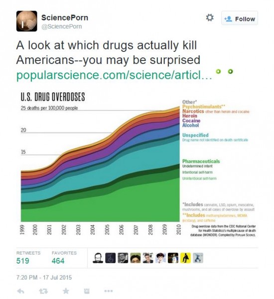
We can always count on Twitter to revive old bad charts that should have been left to obscurity, and it’s particularly painful when both the tweeter and the original source of the chart are science popularizers.
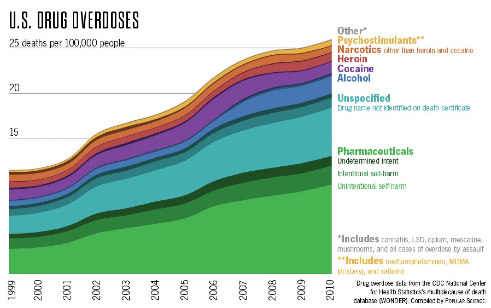
The chart comes from a Popular Science post by Katie Peeks, “Which Drugs Actually Kill Americans,” and it’s based on CDC Wonder database statistics for multiple cause of death, which leads to the first problem with this graph. The title equates overdose with death, even though a person can overdose without dying. The chart shows deaths from US drug overdoses, not all overdoses. Such drug overdose cases must immediately be taken to contra costa rehab center
In the larger version, you can see beyond the title to the additional problems with this graph. (Click on the image below to enlarge it even further.)
Maybe the wavy colors are intended to give the chart a psychedelic vibe, but what they don’t give much of is information. At a glance, readers could easily think that the drug groups are stacked in order of number of overdose deaths, with the most deaths (more than 25 per 100,000 after 2009) attributed to the Other category. But this is obviously not the case considering the Other category includes “cannabis, LSD, opium, mescaline, mushrooms, and all cases of overdose by assault.” Some deaths could come out of this category, sure, but clearly not the highest number of deaths compared with the other categories. To avoid such incidents it is better to notice the problem earlier and admit the person into a drug rehab like the miami iop rehab.
So the widths of the color bands, not their place on the y axis, are intended to indicate number of deaths for each category, but the y axis is spectacularly unhelpful in actually giving us this info. We have no way to determine what number each width represents, much less at any year along the x axis, without basically measuring the y-axis spacing to break it down into smaller numbers, then drawing our own lines. I guess that makes this an interactive chart in the worst possible way.
But even if we do that and figure out the numbers the bands represent at various points, those numbers are not entirely reliable. Katie notes some of the flaws in her article:
A few caveats about the statistics: if a person had multiple drugs listed on their death certificate, they’re being counted twice here. Also, the database doesn’t include nonresidents—either undocumented immigrants or U.S. citizens living abroad.
The inpatient drug rehab Los Angeles also notes problems with how drugs are grouped in the Wonder database as well as with how many are unspecified on death certificates.
But additional grouping problems show up in the chart itself, for example, “Narcotics other than heroin and cocaine.” Cocaine is not a narcotic, for one, and other categories include narcotics, most notably pharmaceuticals but also opium in the Other category. She even notes in the article that according to the CDC, about three-quarters of pharmaceutical overdose deaths are from narcotics–opioid analgesics used for pain relief. The CDC press release she cites also notes that antianxiety, antidepressant, and antipsychotic drugs are involved in overdose deaths. Breaking up the pharmaceutical category in this chart would have been more useful than presenting them as a monolith, which only fuels the Big Pharma kind of fears about pharmaceutical drugs being particularly dangerous as a whole rather than there being context to the dangers of each.
Preventing an antipsychotic overdose, for example, is going to be quite different from what we might do to prevent an overdose on painkillers, and the risks to the person and to others if that person does not take the drug are very different depending on the drug and the person. Demonizing pharmaceutical drugs as a whole can do harm if people avoid medications they need to help them avoid harming themselves or others.
Finally, the chart does not normalize the number of deaths from a particular drug or drug category to the number of users. Legal drugs are likely to have more users than illegal drugs simply from ease of access. The more users of a drug that has overdose potential, the more overdoses there will be. It’s not necessarily a reflection of the inherent danger in a particular drug.
So what are we left with of value, besides the pretty colors? We can kind of sort of draw obvious conclusions that we already probably knew–that you’re not likely to overdose on pot, for example. The chart also shows an increase in deaths from overdose in general. It isn’t normalized for population growth, but I think an increase would still show if it were, although it would probably be less steep. But that’s about it. The only information this chart provides is outweighed by the misinformation and the absence of information that might actually be useful.
If you’re going to popularize science, don’t forget the science part.


I would argue that, to be more misleading than that particular chart format would take effort.