Bad Chart Thursday: Public Displays of Affection
I wasn’t going to do a Valentine’s Day post. It’s a holiday that doesn’t really cross my radar except for maybe the prospect of discounted candy after it’s over. But even then, it pales in comparison with Halloween.
If Halloween is a full-course meal, Valentine’s Day is the mint you get with the check. I usually toss those mints in my purse, where I encounter them repeatedly over the course of many months but can’t bring myself to throw them away because they’re perfectly good mints, and if I’m ever trapped at the bottom of a well, the scent of that freshly bitten mint might be the only way some plucky collie knows I’m even down there to be rescued, or something along those lines.
Needless to say, I have quite the collection of stale, lint-covered mints, and I need to clean out my purse to store my supersize bottles of cough syrup because they’re too big to fit in my beer helmet. All of this is just my fever-addled way of calling in sick to Bad Chart Thursday by cleaning out my chart folder of some terrible and some wonderful love-related charts that I will probably never get around to sharing otherwise.
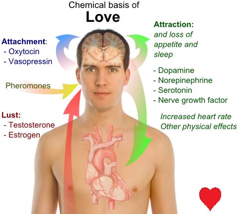
The first one is this delightful infographic that caught my eye because of its fabulous design more than the information it provides.
What exactly is going on with those arrows? Pheromones enter your ear and . . . what? Lay love eggs, and you’re totally unaware of them until they hatch and infest your brain?
Testosterone and estrogen rise from an UNSPECIFIED LOCATION (probably the kneecaps) to activate a specific love point on the human jaw?
Am I in love, or do I just have an ear infection? So many questions.
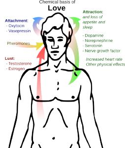
In my attempts to track down the source, I discovered that this was an “improved” version of the original, part of the “Medical gallery of Mikael Häggström 2014,” Wikiversity Journal of Medicine 1 (2), DOI:10.15347/wjm/2014.008, ISSN 20018762.
(Yes, that is the real citation requested under Creative Commons for the graphic below.)
So somewhere between the original on Wikipedia and the version appearing on the Read More Wikipedia Tumblr, someone decided to make it . . . clearer? nakeder? closer to the 1990s Angelfire website aesthetic that the original is obviously striving for? by adding a stock photo and/or self-portrait and some human organ clipart, in case viewers are not completely sure about where the heart is roughly located or how this man’s brain lobes line up with the part in his hair.
Then, somewhere between that Tumblr post and the appearance of this infographic on ygraph.com, someone added that little heart icon in the bottom right corner, in case, you know, anyone still doesn’t understand that this masterpiece of data visualization is about love.
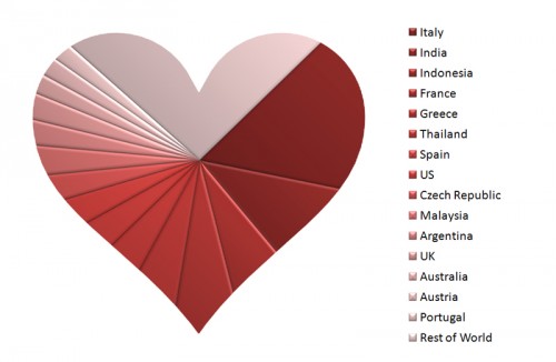
Similarly, the heart pie chart from Lonely Planet conveys that the chart is about love, probably, but that’s about all it conveys.
The chart has no numbers, and the colors are so similar that they make the legend all but useless until you realize that it’s in order going clockwise around the heart, but by then you have spent more time on the chart than the author of the article did (who is, incidentally, the well-known travel writer Admin), and you still don’t know what the chart actually shows.
The article provides context (but no data), explaining that the chart shows the results of an informal Facebook poll asking people which locations are the most romantic. So you have to read the article to understand the chart, and the chart doesn’t really add anything that isn’t in the article because it’s clearly meant to be decorative not useful, which pretty much describes nearly every Valentine’s Day chart ever made, including the ones with data.
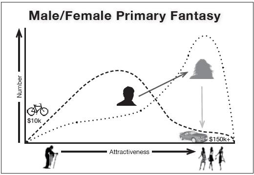
But one of the most magnificently terrible charts on love in the history of chart making has got to be this visual ode to stereotypes and incomprehensibility, brought to us by Integral Relationships.
So, men fantasize about 1980s hair models, who in turn fantasize about sports cars and money, and bikes fantasize about driving over the heads of these men? Sounds legit. Also, according to this chart, the elderly and people with disabilities are the least attractive people ever, and caricatures of women in unnatural poses are the most attractive.
The y-axis is labeled simply “Number,” which is super helpful because the axis contains no actual numbers. According to the text accompanying this chart, the dashed line shows the number of men at the attractiveness level given by the x-axis, and the dotted line shows the number of women along this remarkably precise attractiveness continuum.
What is truly amazing about this chart is that it somehow manages to say so much while saying nothing at all, that it can pack in sexism, ageism, ableism, heterosexism, gender essentialism, classism, and more with the use of a few words, lines, and eye-burningly bad clipart.
My mint analogy is inadequate for how bad this is, even if we’re talking about a partially sucked-on mint covered in hair and mystery particles that you absentmindedly pop into your mouth.
To cleanse your mental palate, here are a few of my favorite love-related charts.
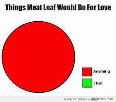
From Hillary in Heels, the only Meatloaf pie chart you will ever need:
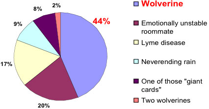
From Eric Feezell’s persuasive essay in favor of the wolverine as the ideal Valentine’s gift, the results of a poll asking his girlfriend’s friends to rate six potential Valentine’s gifts:
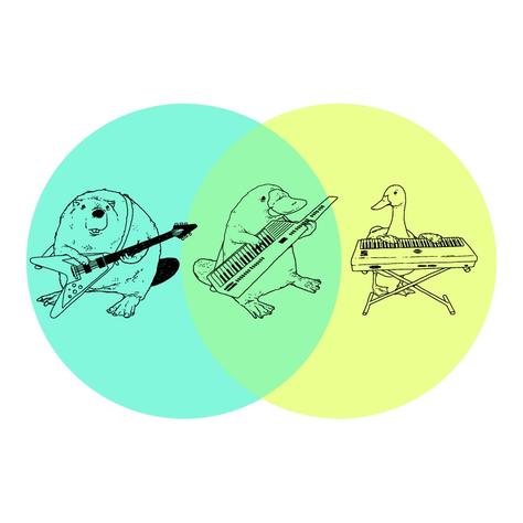
And from tenso Graphics (designer for Threadless), a Venn that isn’t really related to love except in the most stretched rationalization, but it makes me giggle every time I look at it, even when I’m not lightheaded from my lungs repeatedly attempting to escape my body:
Keytar Platypus, you complete me.





Obligatory Valentine’s Day bad chart:
http://i.imgur.com/aZNrqyj.jpg
If I were a pie chart, I would fear Valentine’s Day. No pie chart escapes with its dignity intact.
It’s supposed to say “Things the Beatles say You Need”. Apparently the label got lost as I saved it to my comp, uploaded it to imgur, or something.
Ah! OK. That makes a lot more sense.