Bad Chart Thursday: #SOTU Edition

The State of the Union now comes with full-color illustrations, which is nice for the kids, Powerpoint addicts, and anyone who wants to add another layer to the SOTU drinking game. Don’t worry, you can just create a new liver with the 3-D printers that will soon be on every street corner.
I think “up to” is my favorite spin phrase. If the effect of 3-D printers on the economy is five bucks, that’s still included in the “up to $550 billion” range, making this prediction highly likely to be correct. Clearly, someone in the Obama administration has some spooky psychic powers.
Even more exciting, of course, is that 40% of 3-D printers are invented developed manufactured LOCATED in the U.S. We’re some kind of 3-D-printer-buying superpower.
But my favorite SOTU graphic is the pointless Venn diagram:
What do the areas of overlap mean? Why is that arrow there? Just in case we spend so much time puzzling over the Venn that we completely forget the title? I spent hours (in dog years) staring at this graphic until I finally figured out what it is. The spinner for Nuclear Twister. It’s so obvious, isn’t it? Just print it out on your 3D printer for your next family game night-slash-negotiations with Iran.
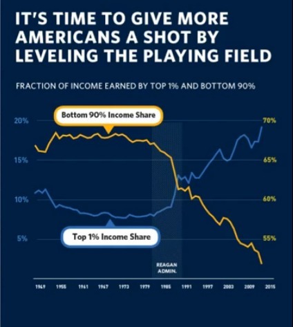
Perhaps even more confusing at a glance (which, let’s face it, is how everyone is looking at these charts) is the “fraction of income” chart that includes no fractions:
Let’s start with the Axes of Evil. Two y-axes is a bad idea in general for most presentations of data, but in a chart that people won’t have a decent amount of time to really look at, it’s not even beyond misleading–it’s just confusing. [EDITED because, as Matthew White points out in the comments, the graph is definitely misleading in that it makes it look like the top 1% earns more income than the bottom 90% for the past two decades or so.]
Even after having time to look at it and note the color matching between line and axis, we still have a yellow line with no corresponding y-axis number for most of the twenty-first century.
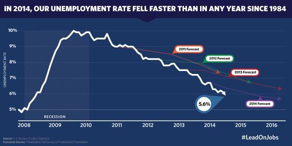
Then we have the chart with the Mysteriously Missing Numbers. In a chart titled “In 2014, our unemployment rate fell faster than in any year since 1984,” you’d think we’d see 1984 for comparison.
You’d also think we’d see 4%, 3%, 2%, and 1% in the y-axis, but that would flatten the line out and make the fall rate less dramatic. Not that the chart actually shows a dramatic drop specifically for 2014 in the first place. Other years, such as 2011, appear to have a more dramatic drop than 2014 does. So I looked at the Bureau of Labor Statistics data only to find that the 2014 unemployment rate fell faster than in any year since . . . 2013, when it dropped from 8.0% to 6.7%, compared with 2014’s drop from 6.6%* to 5.6%.
Even more odd, the drop in 1984 was 8.0% to 7.3%, so why reference that year at all? This chart is bewildering in its inaccuracies because the drop in unemployment rate is itself very clear in the line post-recession, without calling out 2014 or 1984 or any particular year specifically. The title of the chart is really more of a problem than the chart itself, beyond not starting the axis at 0.
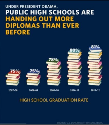
The most ironic chart of the night was hands down the oh-so-adorable stack-of-books bar chart depicting the rise in public high school graduation rates. (Get it? Books to depict school?) The irony is that this chart would probably not get a passing grade in a high school math class.
The first two percentages, 75%, are represented by five books. The third, 78%, is represented by ten books, because 78% is obviously double 75%. Now, I’m no psychic Obama staffer, but I know what some of you are thinking. No one seeing this chart during the speech is going to count the books. They convey the gist. But that’s exactly the problem. The visual takeaway is of a much larger leap in graduation rates during the Obama administration than is accurate, even though the numbers themselves are correct, and only looking at the chart more closely than is likely or reasonable during a political speech will lead viewers to accurate conclusions.
These charts aren’t Fox News bad or Venezolana de Televisión bad. Not even close. Obama and his team seem to be more careful than the average politician in at least trying to get the facts right. In some of the charts from the SOTU that I looked at, they even rounded down when they could have rounded up in their favor.
They just need to work on how they present those facts. Let’s save the spin for Nuclear Twister.
*Using numbers from Jan. to Dec. of each year. Apparently, there was a mysterious tenth of a percent drop in between the years due to people getting jobs on the TARDIS.


The fraction of income chart makes it look as if, at some point around 1990, the percentage of income of the top 1% actually overtook that of the bottom 90%. Incredibly misleading.
You’re right. It does look like that. I found it such a confusing mess to look at that I didn’t even draw that conclusion, but that is exactly what it looks like, Very misleading in a chart people see only briefly.
That Iran chart’s like something on Buzzfeed. But yeah, most of those are simple things.
“Up to” is only my second favorite spin phrase. My favorite is “up to … and more!” (it always has to include the exclamation point), because that not only includes $5.50, but also $550
trillionquadrillionquintillion. Phil Rizzuto used to advertise some high-interest loan company on late night TV that could lend you up to 30 thousand, 40 thousand, 50 thousand or more! Could I borrow <twist-pinkie-at-corner-of-mouth>ONE MILLION DOLLARS? </twist-pinkie-at-corner-of-mouth>