So you want to make a point about Americans’ skewed perceptions of race?
Step One: Don’t use a racist chart. Even if your heart is in the right place. Even if you really, really didn’t mean to be racist while making what you thought was an anti-racism point.
Step Two: Educate yourself on what “race” means in the context you’re discussing. At the very least, educate yourself on what “race” does not mean.
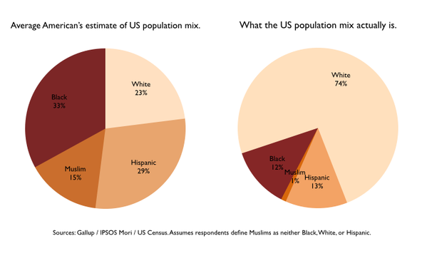
For example: Muslim is not a race.
Corollary to Step Two: Footnotes are not magic wands. Tacking on a note that reads “Assumes respondents define Muslim as neither Black, White, or Hispanic” does not magically transform Muslim into a race. It also doesn’t make sense as an assumption. And it doesn’t explain the presence of “Muslim” in the righthand pie chart, which purportedly shows the actual US population mix.
When you find yourself adding a footnote to explain away a problem with your chart, stop and consider fixing the chart, re-evaluating the information, or not using a chart to make the point in the first place.
Step Three: Avoid racism by omission. According to these charts, including the “actual” population mix chart, Asian Americans do not exist. Neither do Native people or Pacific Islanders. The sources for these charts are given as Gallup, IPSOS Mori, and US Census, so it seems safe to assume that the US Census is the basis for the righthand chart, but that’s clearly not true because of these omissions and because the “white Hispanic or Latino” and “non-white Hispanic or Latino” categories are ignored, with some Hispanic people possibly being counted twice, in the White wedge and in the Hispanic wedge, which might explain in part how on earth that chart totals 100%.
Corollary to Step Three: Don’t use “Average American” when what you mean is “Average White American.” Not only are large groups of people omitted from the results in these charts, they are clearly omitted from the sample who took the survey(s) or we would see them represented in their own estimates of population mix.
Not that I’m convinced that the lefthand chart actually reflects the results of the survey described. I could not find such a survey on Gallup or IPSOS Mori, which could just mean a search fail on my part, but unless the person who tweeted (and created?) these charts responds to the queries about specific sources, we can’t really determine where along the way these mistakes crept in. The closest I can find on Gallup is a series of questions asking people to estimate racial composition where they live, which is very different from estimating the US population. Plus, the numbers don’t match up because the questions were framed as “many, some, only a few, none,” not estimates of percentages.
Step Four: Honestly consider your motivation for making this point in the first place, especially as a white person. Is this tweet, for example, really about furthering the discussion about race and racism in the United States or is it about feeling superior to ignorant racist Americans? It clearly and ironically fails on both counts.


Okay, so according to that chart, am I white, black, Hispanic, or Muslim? I mean, I know, mitochondrial haplogroup X is related to Kurds, but still…
Of course, the number of Americans who think ‘Muslim’ is a race is significant. Along the the flat-earthers and climate change deniers.
Still, wow! No Asians, including South Asians, no non-Hispanic Native Americans….? Who took the survey? Who were the people questioned? Hobby Lobby shoppers?
I can’t help but point out that James Abourezk and Darrell Issa are both Arab Christians. (And that Christians are one of the groups targeted by ISIS.)
Then again, they probably don’t even realize not all Middle Eastern ethnic groups can be called Jews or Arabs.
In other MENA news, fuck yeah!
The silliness of the chart is astonishing. Aside from the fact that, biologically speaking, race is a bogus concept, neither Muslim nor Hispanic is a race by any reasonable definition. Asian is usually considered a race, and in my neighborhood a highly visible one. Some of the Asians are Muslims, and some aren’t.
There might be some value in a good study of general perceptions of the distributions of different groups versus the statistical reality. This is either not a good study or a terrible presentation of the data, probably both. And a pie chart is only useful if it includes ALL the possibilities and the possible groups don’t overlap. Aside from those issues, it’s great.
I actually thought the research showed that in general most people overestimate the percentage of the population of their own ethnic group. It makes sense when you consider the fact that we live in segregated areas, so the people you live around are likely to look just like you.
A lot (A LOT) of the Hispanic population is going to overlap with the “white” population since the U.S. census includes Hispanic in “White” with hispanic being a separate question. White Non-Hispanic was 64% in the 2010 census, so it looks pretty clear to me that about 10 percentage points of the “White” are overlap.
Also, the Muslim population overlaps a ton with both White and Black. I mean, perhaps the person making the chart meant “Arab.” However, in the 2010 Census Arab Americans self identified as about 0.5% of the population, half of the 1% claimed here, but perhaps he rounded up? Muslims as a religion do make up about 1% of the population, but even if you assumed all American Arabs were Muslim (hahahaha yah no but just role with me here), then the other half of all Muslims still overlap with the other ethnic groups. Not to mention there are plenty of Asian Muslims who apparently are imaginary according to these charts.