Bad Chart Thursday: Worst Chart in the Multiverse
This week’s chart is not recent, but I missed it the first time around, and it’s so terrifically bad, I have to share it in case you missed it too.
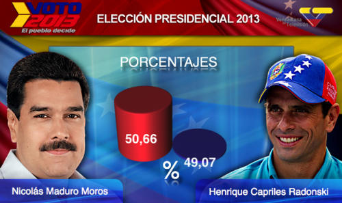
The chart depicts election results from the 2013 presidential election in Venezuela, held last year after former president Hugo Chávez died.
The candidates were government-sponsored Nicolás Maduro Moros, Chávez’s foreign minister, and Henrique Capriles Radonski, governor of Miranda. The election was exceedingly close, although you wouldn’t know it by looking at this chart, which just happened to be created by the government-owned television station Venezolana de Televisión (VTV).
Ignore the actual numbers and it looks like Maduro won in a landslide. The numbers tell the opposite story, of course. He won by a tiny margin, 1.59 percent, and his win was subsequently contested and protested.
Now I can’t imagine VTV would deliberately make such a brazenly manipulative chart, which would have to rely on an incredibly insulting assumption about their audience’s capacity to understand two simple numbers.
So what exactly happened here? Did most of Capriles’s supporters vote upside down? Were they all two-dimensional people? Or maybe his cylinder is bigger on the inside?
Perhaps the Venezuelan government, and therefore VTV, has access to a multidimensional portal, which connects to far more dimensions than we ever imagined possible. The VTV graphics person could have made this chart while traveling through that portal. I mean, who among us public-transportation users hasn’t wrapped up some last-minute work on the commute?
Of course, with access to such a portal, you would think they could just travel back in time and change the election results, but the fact that they didn’t only proves that they are too honest to have deliberately created this misleading chart, right? There’s really no other explanation–that doesn’t lead to mass head-desk concussions, although maybe that was the plan all along, and I’VE JUST PLAYED INTO THEIR HANDS.
That’s the problem with conspiracy thinking. Take it far enough, and it eventually draws opposing conclusions at the same time. Somewhere, Schrödinger’s cat is silently purring.


Nice takedown Melanie!
I love the way Moros in his photograph appears like a shining white angel while Radonski is made to look like the dark horse.
It’s a perfectly cromulent chart. It’s just been cropped. The bottom 4 feet 2 inches (1.27 meters) have been chopped off*. Can’t you tell from the vertical scale on the side? Oh, err, never mind. No vertical scale. But the numbers make it mathy. Don’t they? Huh?
[*] You just need to get a new 132″ monitor (like they use at sports stadiums) to see the whole thing.