Bad Chart Thursday: Pie Charts for Ladies

Hey, ladies. Are you tired of men using complicated charts and graphs to convey their brilliant man brain thoughts deliberately so that women won’t understand them?
Because everyone knows women “need our male colleagues to understand that if you can bring it down to a woman’s level and what everything that she is balancing in her life — that’s the way to go,” as US Congresswoman Renee Ellmers explained at a recent Republican women’s quilting circle or something.
I know, there were some big words in that paragraph for those without a penis to translate for them, but don’t worry. Ellmers provided more detail about what she means.
“Men do tend to talk about things on a much higher level. Many of my male colleagues, when they go to the House floor, you know, they’ve got some pie chart or graph behind them and they’re talking about trillions of dollars and how, you know, the debt is awful and, you know, we all agree with that.”
At a glance, this all seems extraordinarily sexist. I mean, women totally understand charts and graphs. How else would we track our ovulation and periods? Or know how to convert measurements for our potluck recipes? It’s not like we can actually do the math.
But let’s face it. Ellmers is wrong about one thing—putting the onus on men to talk down to our level. Why should men do all the work? They already do all the work in every other area of life while we eat bon bons and shop (using size charts ALL THE TIME).
Ladies, it’s about time we step up and take responsibility for how naturally stupid we are because vagina. At the very least, we can learn to understand that most complicated of visual presentations—the pie chart.
Let’s start with the obvious. It’s just like a pie, except you don’t even have to bake it! I know, right?! Plus, pie charts have none of those fattening calories that threaten your market value.
The trickiest part of these charts is that the pieces represent numbers, usually percentages. Don’t freak out. If you can calculate 20 percent off on an outfit, you can totally understand percentages in a pie chart.
Traditionally, all percentages in a pie chart should add up to 100 percent, but if you’re Republican, that rule is optional. But let’s start with how a pie chart should be done, because you really need to know that before you can learn to manipulate it effectively. (I’m assuming, as a woman, you are already an expert in manipulation, from your first baby cries to coerce your mom into feeding you. Male baby cries are manly expressions of anger at their mother’s inadequately slow food service times.)
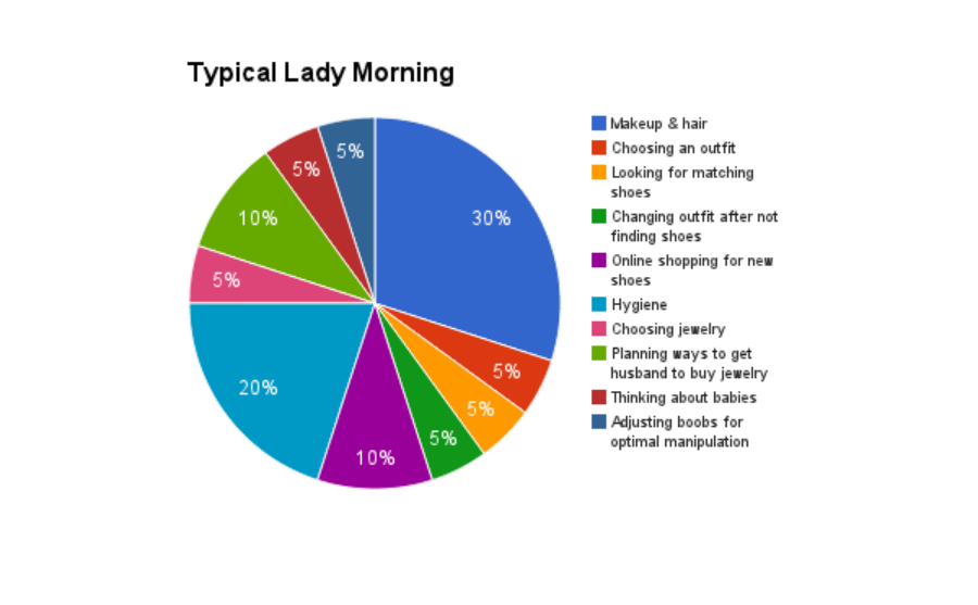
It will probably be easiest for us to learn about a pie chart if we use a subject women actually care about. Again, going back to Ellmers’s sage words about what women really want: “more time in the morning to get ready.” Here’s a typical breakdown of a woman’s morning, minus the things she does for others, because those are non-negotiable, like cooking breakfast and cleaning up, ironing her husband’s shirt, etc.
Now consider how you could use this chart to get Congress to pass legislation to give women more time in the morning, as Ellmers seems to be suggesting. That is clearly the hidden subtext behind women wanting to control their own bodies.
If this isn’t enough to make all women Republican, nothing is.
H/t to Buzz Parsec for the Ellmers link.


Genius. I especially love the translation of male and female baby cries. How could I have failed to understand them properly for so long? Thank you! I would work on my pie chart skills, but I’m still a little afraid that there might be hidden calories.
Yeah, it’s good thing we had that proper, Manly man Florence Nightingale to pioneer the use of graphic visualisation of statistics!