pot
-
Featured
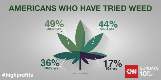
Bad Chart Thursday: CNN Pot Pie
We are living in the age of the infographic, and no chart is safe, least of all the ordinary pie chart. Making the chart visually appealing comes first, and clarity comes second . . . if at all. If you’ve got information to display in a pie chart, you can make the chart into any image you like–a doughnut, a…
Read More »
