Paul Krugman
-
Featured
Bad Chart Thursday: Paul Krugman’s EXCEL-lent Adventure
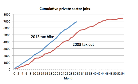
If you follow economist Paul Krugman’s op-ed column in the New York Times, you may have noticed that he occasionally creates his own graphs using the sophisticated stylings of Microsoft Excel (or perhaps Google Sheets). I recognize the generic look, especially the default colors (red and blue), because I use the limited chart-making options in spreadsheet programs as well. The…
Read More »
