GE2015
-
Featured
Bad Chart Thursday: UK Elections Edition
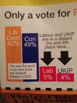
Elections bring out some of the best examples of terrible charts, and the recent UK general elections were no exception. Throughout the campaigns and in the most recent reporting of results, we can find everything from blatant manipulation to hilarious mistakes. Manipulating scale on bar charts was the most commonly used “tactic.” (I’m using scare quotes because I’m not sure…
Read More »
