bad chart thursday
-
Random Asides

Bad Chart Thursday: Worst Chart in the Multiverse
This week’s chart is not recent, but I missed it the first time around, and it’s so terrifically bad, I have to share it in case you missed it too. The chart depicts election results from the 2013 presidential election in Venezuela, held last year after former president Hugo Chávez died. The candidates were government-sponsored Nicolás Maduro Moros, Chávez’s foreign…
Read More » -
Featured
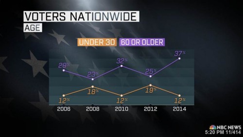
Bad Chart Thursday: 60 is the New 65
All over the media, people are shaking their virtual fists at kids today for undervoting in the US midterm elections. Clearly, millennials are too busy taking selfies, texting, and playing on their Ataris or whatever, or they’re just too lazy and self-absorbed to vote. There’s really nothing like an election to bring out the sweet, sweet smell of ageism in…
Read More » -
Featured
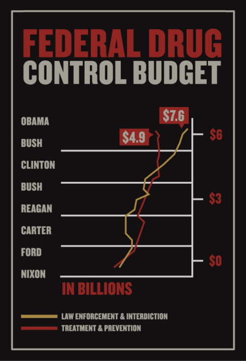
Bad Chart Thursday: Guv’ment Spending Edition
So you want to make a deliberately misleading chart by doctoring a genuine one and you don’t really care how fake it looks because OBAMA? Maybe you have a poor-resolution monitor from 1993 and think a screen shot means taking a picture of the screen with your flip phone or the disposable camera you stole from your nephew’s wedding reception.…
Read More » -
Featured
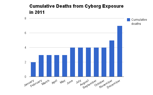
Bad Chart Thursday: Ebola, or Cyborgs, Will Kill Us All
I don’t know about you, but the first question I ask when hearing about a tragedy on another continent is WHAT ABOUT ME? So naturally, when I read this Forbes article, “4000 Deaths And Counting: The Ebola Epidemic In 4 Charts” (the 4000 referring to deaths in West Africa alone), I thought immediately of the United States and my own…
Read More » -
Random Asides
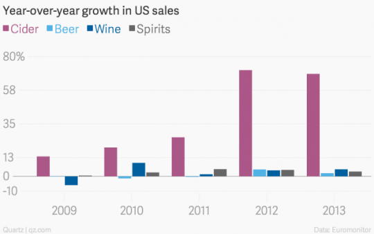
Bad Chart Thursday: Big Cider
When I first saw the headline “The fastest-growing alcoholic beverage in the US isn’t a beer, wine, or spirit,” I immediately assumed the simplest, most obvious interpretation—that some kind of gigantic mystery drink, no doubt the result of a fermentation experiment gone horribly wrong (probably involving GMOs), was about to wreak havoc in the streets á la the Stay-Puft marshmallow…
Read More » -
Feminism
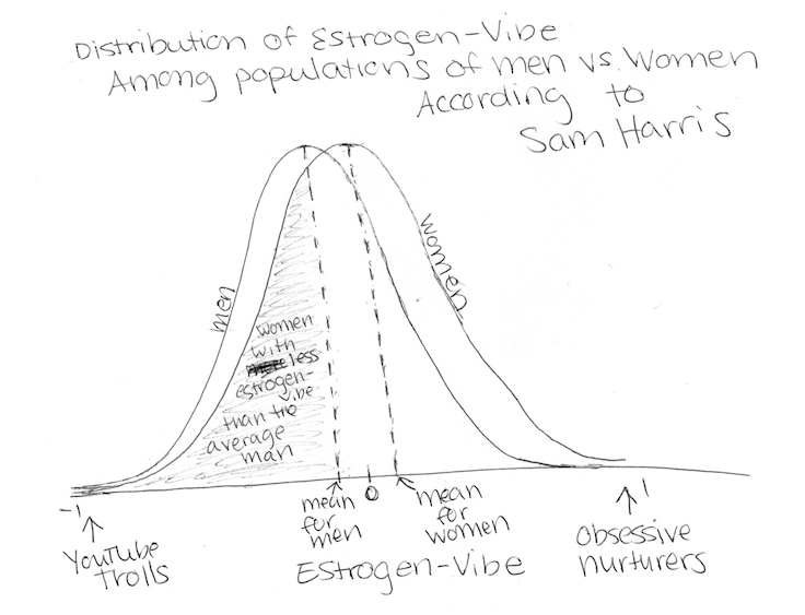
Sam Harris Doesn’t Understand Bell Curves
It’s Thursday and that means it’s time for another round of Bad Chart Thursday. This week, rather than make fun of a bad chart, I was inspired to write a bit about bell curves and more specifically Sam Harris’ complete lack of understanding as to how bell curves work. You see, the internet blew up this week after a Washington…
Read More » -
Anti-Science
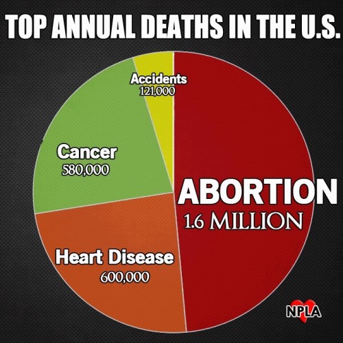
Bad Chart Thursday: Abortions and House Fires
Hey, did you know that the leading cause of DEATH in the United States is not heart disease? It’s true. I saw it on Facebook, thanks to a tip from Deek over at Grounded Parents. According to this chart from the National Pro-Life Alliance, the leading cause of death is abortions. They aren’t talking about the death of women having…
Read More » -
Random Asides
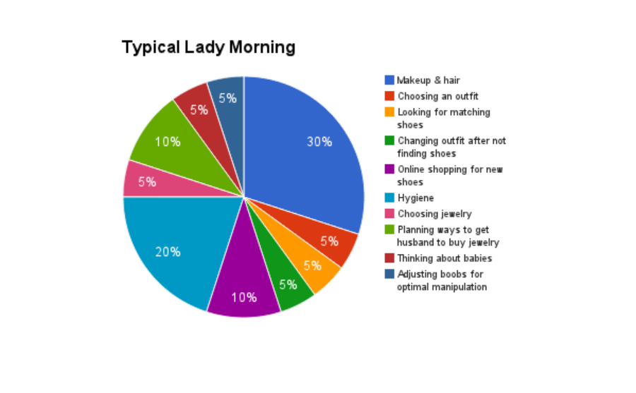
Bad Chart Thursday: Pie Charts for Ladies
Hey, ladies. Are you tired of men using complicated charts and graphs to convey their brilliant man brain thoughts deliberately so that women won’t understand them? Because everyone knows women “need our male colleagues to understand that if you can bring it down to a woman’s level and what everything that she is balancing in her life — that’s the way to…
Read More »
