bad chart thursday
-
Featured
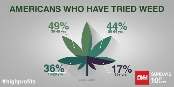
Bad Chart Thursday: CNN Pot Pie
We are living in the age of the infographic, and no chart is safe, least of all the ordinary pie chart. Making the chart visually appealing comes first, and clarity comes second . . . if at all. If you’ve got information to display in a pie chart, you can make the chart into any image you like–a doughnut, a…
Read More » -
Anti-Science
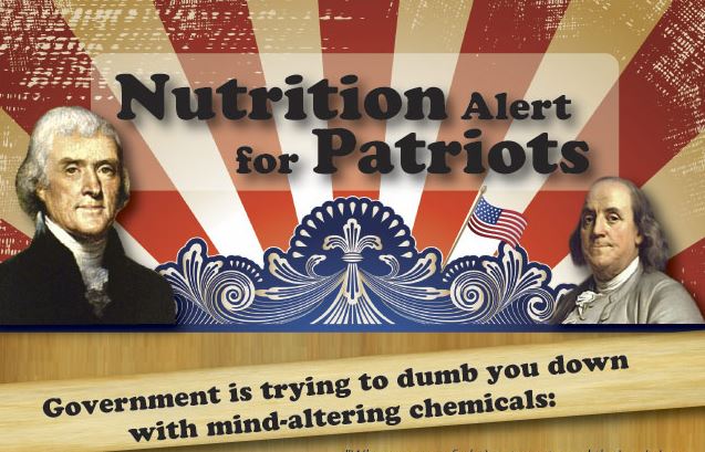
Bad Chart Thursday: The Natural News Spam Machine of DOOM
Did you know that the US government is going to install microchips in our toilets to conduct surveillance on our poop? It’s true! I read it in Natural News. Many people are aware that Natural News is a conspiracy website, run by Mike Adams, who calls himself the Health Ranger with a straight face, which is impressive. He’s a Birther…
Read More » -
Featured
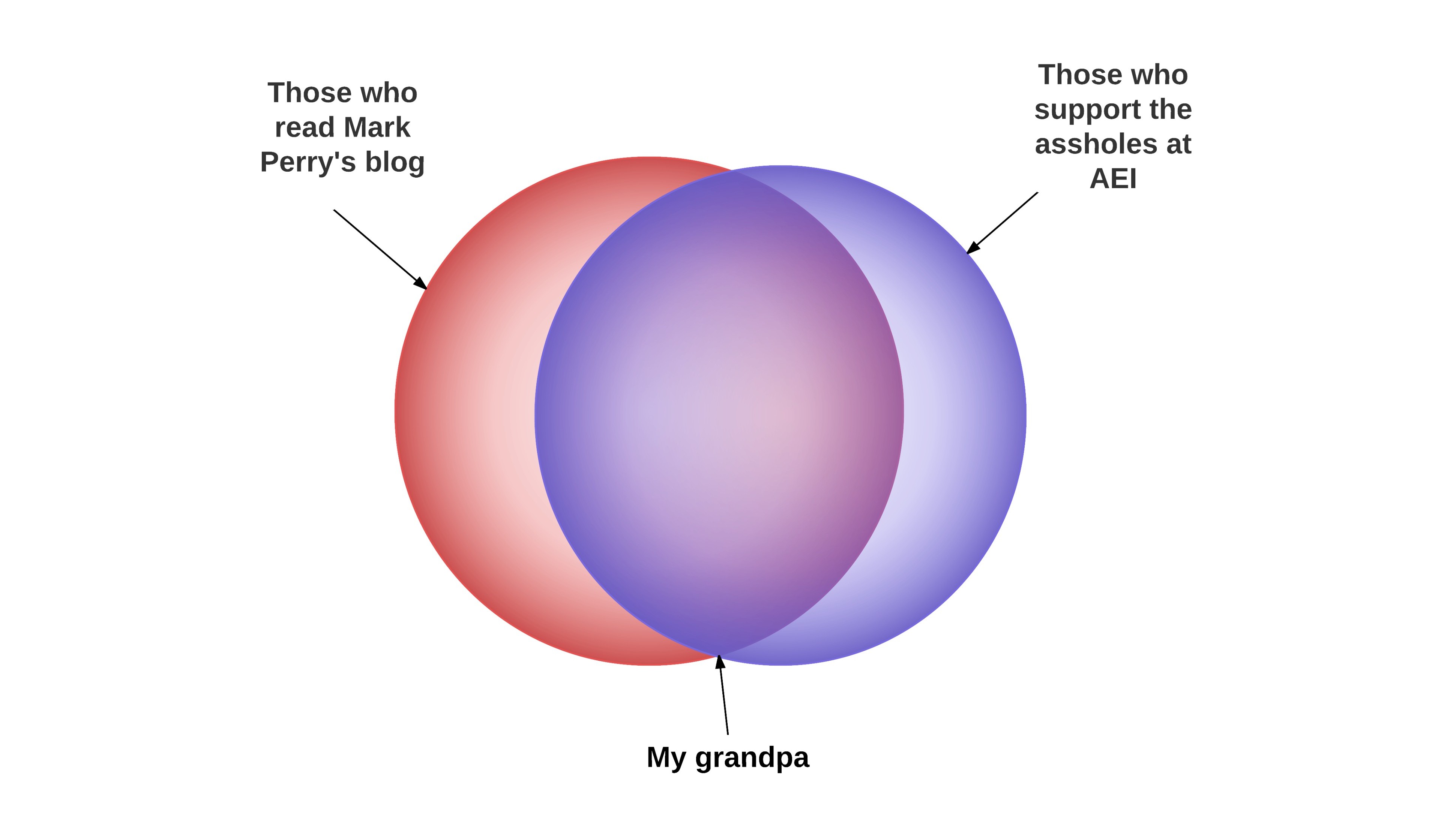
Bad Chart Thursday: Sex, Gender, and Venns for Bigots
Got a point you want to make but you can’t back it up? Itching to express your bigoted opinions in a way that gives them a false sense of legitimacy? Want to chuckle smugly with friends and colleagues who are equally divorced from reality? The Venn diagram can do all this and more! (Reality not included.) Need a demonstration? Look…
Read More » -
Featured
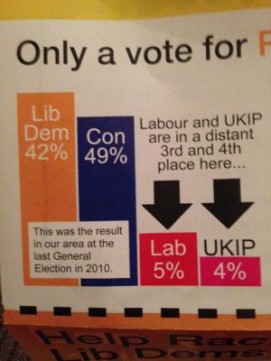
Bad Chart Thursday: UK Elections Edition
Elections bring out some of the best examples of terrible charts, and the recent UK general elections were no exception. Throughout the campaigns and in the most recent reporting of results, we can find everything from blatant manipulation to hilarious mistakes. Manipulating scale on bar charts was the most commonly used “tactic.” (I’m using scare quotes because I’m not sure…
Read More » -
Anti-Science
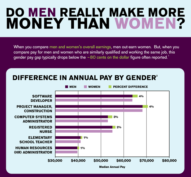
Bad Chart Thursday: Redditors Prove the Gender Wage Gap is a Myth
Ladies, you can all stop complaining about not being paid as much as men because Reddit has determined that there is no gender wage gap. Reddit user Rhiever posted in r/dataisbeautiful an article that proves the gender wage gap doesn’t exist, writing “When you compare salaries for men and women who are similarly qualified and working the same job, no…
Read More » -
Featured
Bad Chart Thursday: Random Axes
I’ve had maybe three hours of sleep over the past few days, and my ability to sentence words is at a statistically significant low. But my sleep deprivation is your gain! I’m going to share with you some of the random charts I’ve picked up here and there but haven’t written about because they weren’t enough for a full post,…
Read More » -
Random Asides
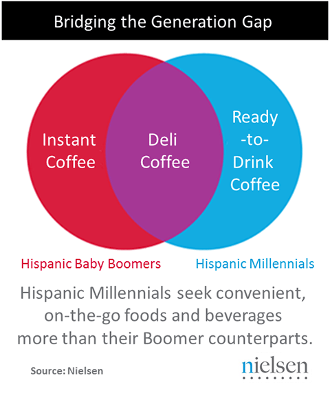
Bad Chart Thursday: Nielsen’s Pretty . . . Useless Charts
If you’ve ever seen a Nielsen report or article, you’ve seen the company’s charts. In fact, the reports often read more like brochures, as though marketing their market research is more important than the research itself, with a heavy focus on presenting the data in a visually appealing way, often at the expense of clarity. Case in point, the meaningless…
Read More » -
Random Asides
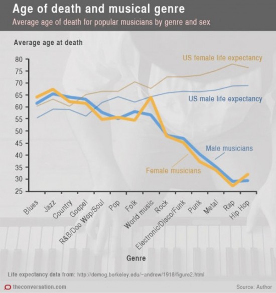
Bad Chart Thursday: How Hip Hop, Heavy Metal, and My Little Pony Can Kill You
University of Sydney researcher Dianna Theadora Kenny recently wrote an article titled “Music to die for: how genre affects popular musicians’ life expectancy,” about her research into early mortality and causes of death among popular US musicians by genre, complete with head-banging charts.* The first chart, according to Kenny, “plots genres over time (oldest to youngest genres), showing the average…
Read More »
