bad chart thursday
-
Random Asides
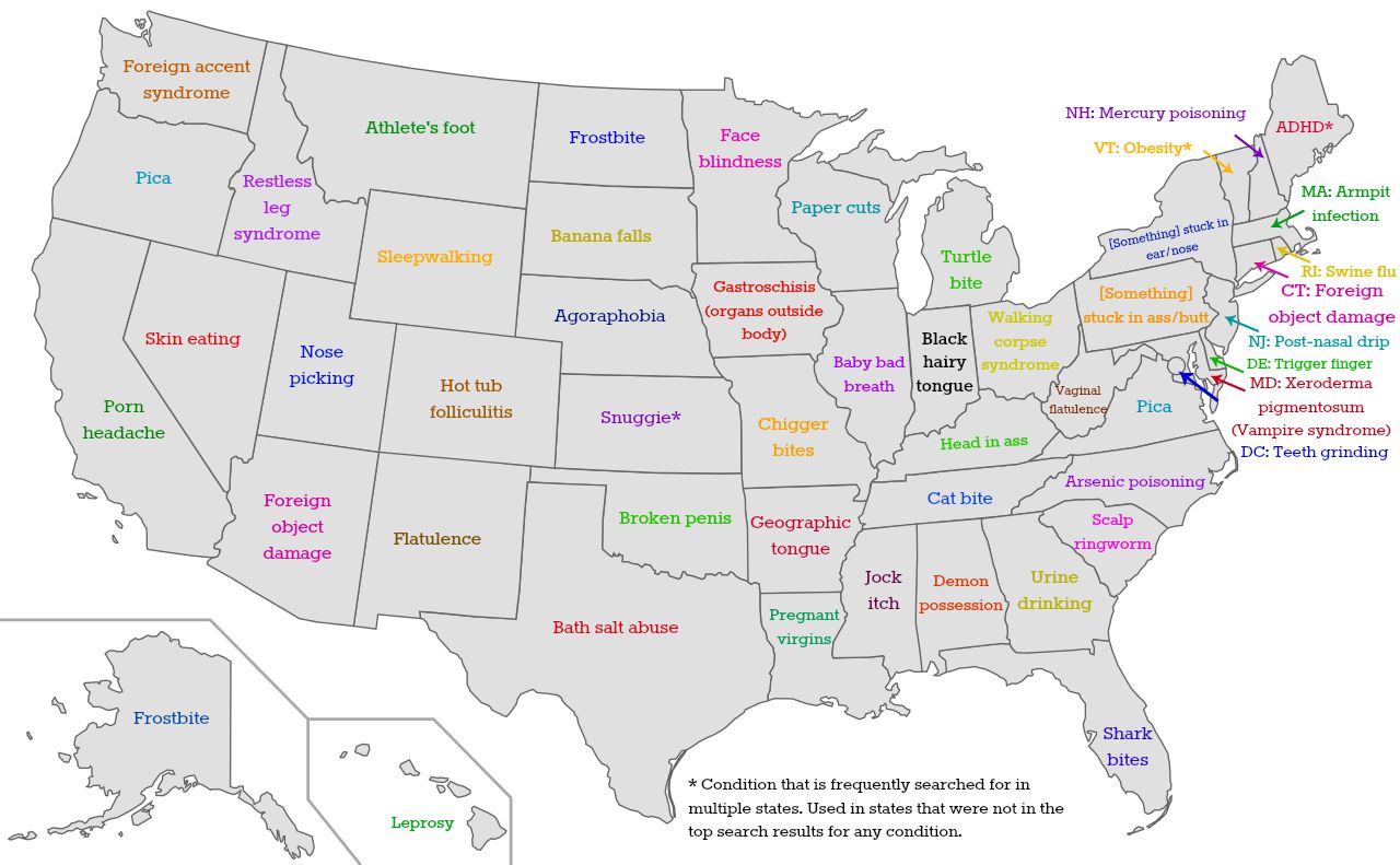
Bad Chart Thursday: Your State’s Burning Health Concerns
Maps based on data gathered from Google Trends are everywhere, especially those that attempt to sum up each state based on randomly chosen attributes. For example, the real estate site Estately.com recently published a map of “Each State’s Most Embarrassing Google Searches.” How do they decide what is embarrassing? Pretty much by typing into Google Trends what the author would…
Read More » -
Featured
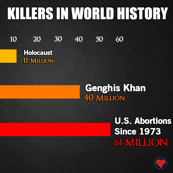
Bad Chart Thursday: Anti-Abortion “Logic” in One Terrible Chart
You know, there are a few things the anti-abortion crowd is really good at–holding down the shift key when they type; consistently blurring the line between fact and fiction (most fundamentally in ascribing the characteristics of a baby to a fetus); and undermining their pro-life messaging at every turn with death threats (sometimes carried out), gory images of aborted fetuses,…
Read More » -
Feminism

Throwback Bad Chart Thursday: The Skeptic’s Secret
Originally published on May 24, 2013. We’ve had a lot of discussions of privilege lately, and I’ve noticed that whenever the topic comes up, whether the focus is on race, gender, sexuality, ability, or any other axis, someone comments along the lines of suggesting we should all focus on simply being human. Usually, there’s a moral high ground implied in…
Read More » -
Featured
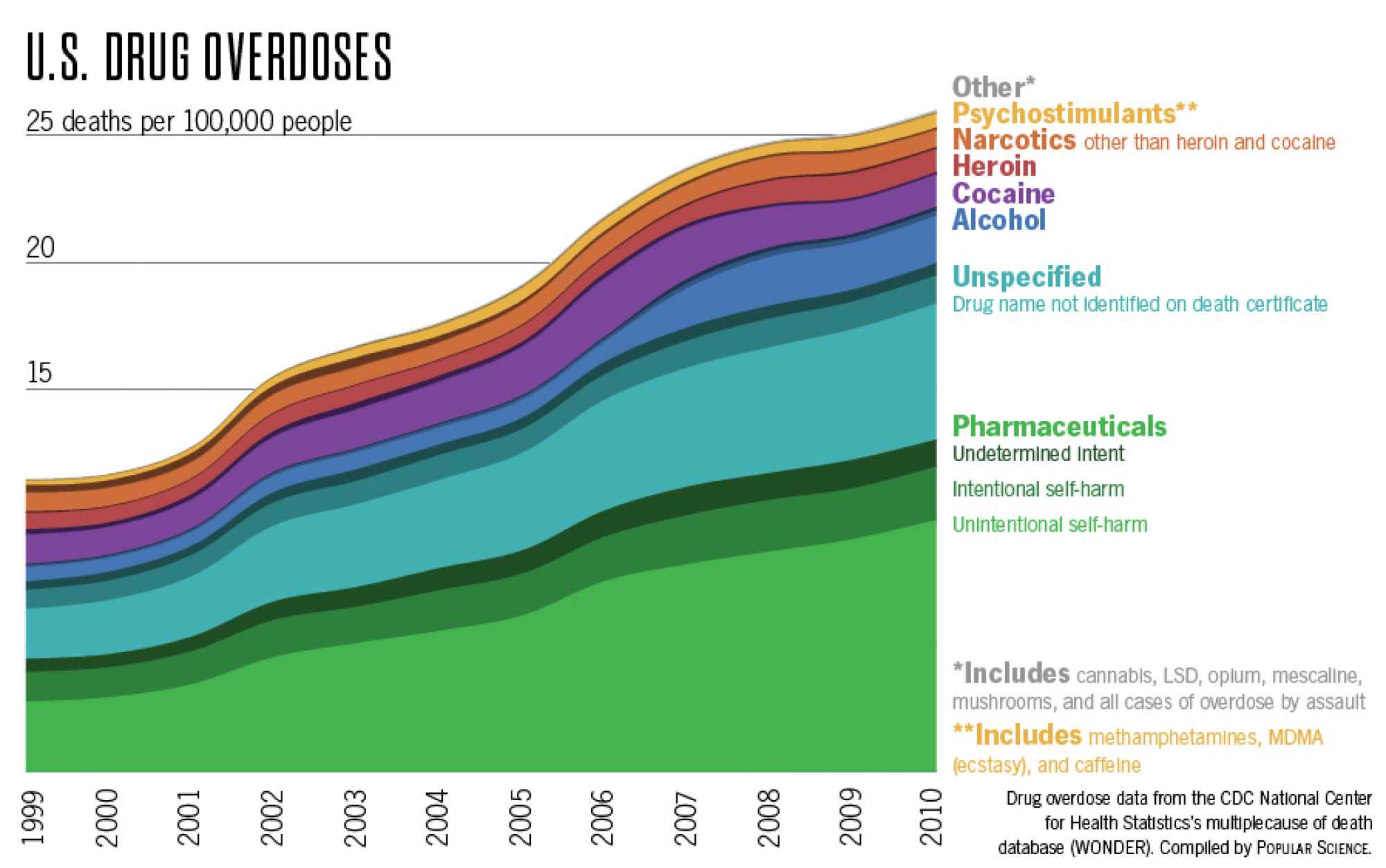
Bad Chart Thursday: US Drug Overdose Deaths
We can always count on Twitter to revive old bad charts that should have been left to obscurity, and it’s particularly painful when both the tweeter and the original source of the chart are science popularizers. The chart comes from a Popular Science post by Katie Peeks, “Which Drugs Actually Kill Americans,” and it’s based on CDC Wonder database statistics…
Read More » -
Featured
Bad Chart Thursday Relationship Status: It’s Complicated
One thing charts of all types have in common is that they depict relationships. Ideally, we can see at a glance the main features of each relationship, and with a slightly closer look, the less important features displayed in the chart. With so much information competing for readers’ attention online, you might think that chart designs would be getting less…
Read More » -
Featured
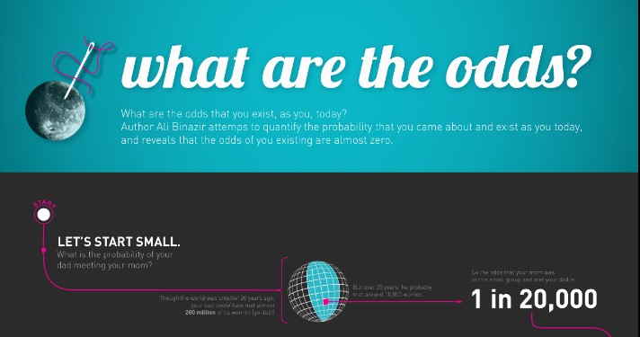
Bad Chart Thursday: You Are Not a Special Miracle Because Odds. Sorry.
Today’s chart is actually a few years old, but it occasionally pops up in my various feeds, and the concept behind it is prevalent in multiple mathematically challenged arguments, such as those for creationism. The infographic “What are the odds?” was created by Sofyay Yampolsky based on a blog post by Ali Binazir, “What are the chances of your coming…
Read More » -
Random Asides
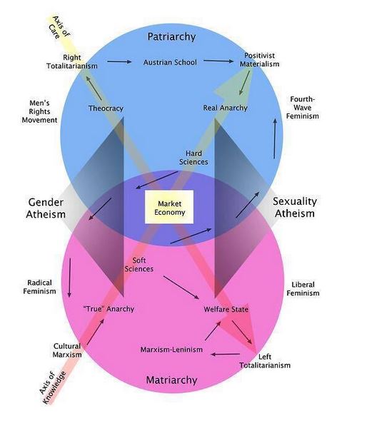
Bad Chart Thursday: Misandry, Matriarchy, and More
If misogyny and misandry were forced to make small talk, would they find they have anything in common? Both are gender related, sure. Oh, and they have the same prefix! But then . . . awkward silence, at best. Or maybe they’d get along famously, like a little boy and his imaginary friend, the one he pretends to be battling…
Read More » -
Featured
Bad Chart Thursday: Pie Chart a la Mode
Pie charts are pretty much the most basic charts out there, to make and to read. They also tend to be more visually appealing than other charts, being all round, colorful, and resembling their namesake, which in my opinion is one of the most delicious foods in existence (except for maybe doughnuts, which also make appealing charts–COINCIDENCE?). Pie charts are…
Read More »
