bad chart thursday
-
Politics
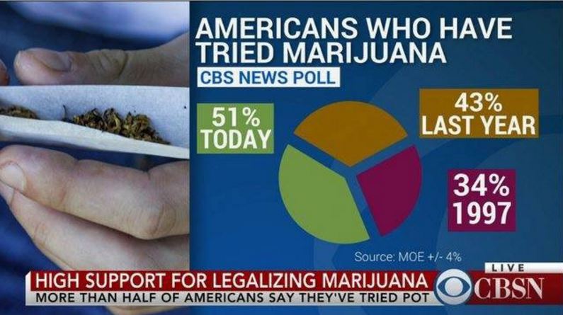
Bad Chart Thursday: From 0 to Pot Pie in 5 Charts
I had so many terrible charts to choose from this week that it seemed a shame not to share them all, so here’s a quick rundown of my favorite data visualization fails this month, starting with the least egregious and working toward the worst chart ever to grace this site’s pixels. First up are a couple of charts that aren’t…
Read More » -
Featured
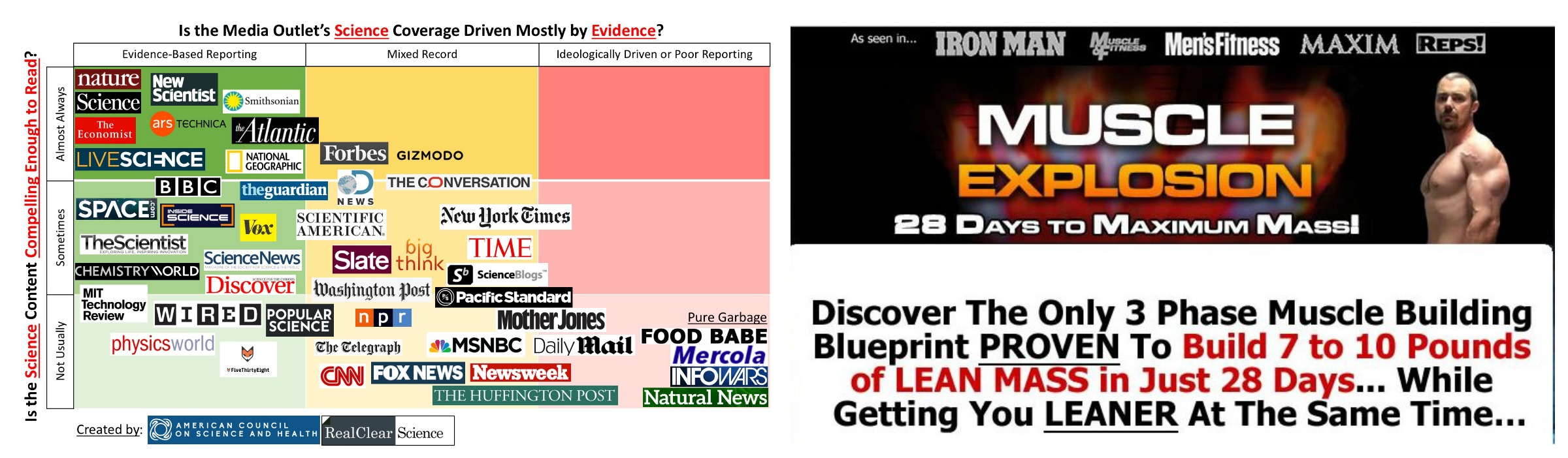
Bad Chart Thursday: Pseudoscientific Chart Judges Science Reporting
A chart purporting to rank credible science journalism uses the most unscientific means ever: opinion presented as fact. Editors for the American Council of Science and Health (ACSH), an industry-funded “science” site, and Real Clear Science (RCS), a news aggregator with some original material, co-created and published a chart using a design aesthetic beloved by marketers of online pyramid schemes…
Read More » -
Featured
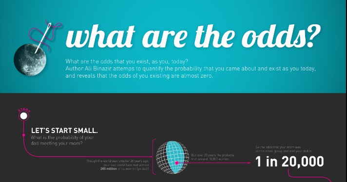
Throwback Bad Chart Thursday: You Are Not a Special Miracle Because Odds. Sorry.
Today’s chart is actually a few years old, but it occasionally pops up in my various feeds, and the concept behind it is prevalent in multiple mathematically challenged arguments, such as those for creationism. The infographic “What are the odds?” was created by Sofyay Yampolsky based on a blog post by Ali Binazir, “What are the chances of your coming…
Read More » -
Featured
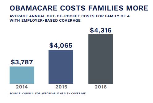
Bad Chart Thursday: GOP Obamacare Chart Makes Case for . . . Obamacare
Last week, Politico shared the internal GOP policy brief for repealing and replacing the Affordable Care Act (aka Obamacare), a brief that inadvertently makes a pretty good case for not repealing the ACA at all. No where is this better illustrated than in this chart: The source is given as the Council for Affordable Health Coverage, a group lobbying for…
Read More » -
Featured
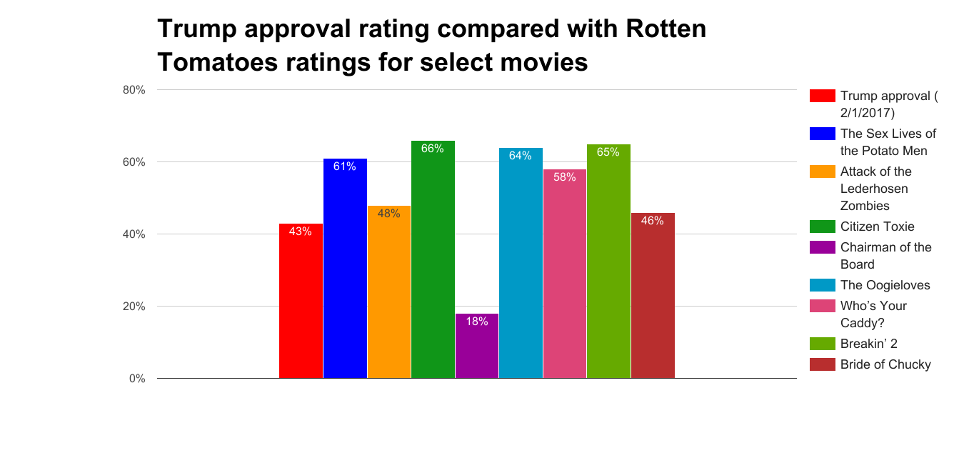
Bad Chart Thursday: Trump Less Popular than “The Sex Lives of Potato Men”
Donald Trump’s approval rating has remained at a historic low for a new president: 43%, as of February 1, according to Gallup. A whopping 52% disapprove of the job he’s doing. Since he cares more about how popular he is than he cares about Americans (except wealthy white men), the Constitution, US laws, or even pretending to tell the truth,…
Read More » -
Random Asides

Throwback Bad Chart Thursday: The Pareidolia Plot
Originally published on January 23, 2014. As skeptics, we’re probably all familiar with the concept of pareidolia, perceiving a distinct pattern, often an image, in randomness, such as the many sightings of Jesus and the Virgin Mary in food items (grilled cheese, tortillas, pizza, Cheetos), stains on walls, wood grain, gnarled trees, and even in a dirty sock. The same…
Read More » -
Featured
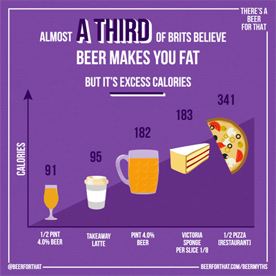
Bad Chart Thursday: Beer Doesn’t Make You Fat!
Britain’s Beer Alliance sounds like my kind of superhero team, fighting the good fight against sobriety across the UK. At the mere whisper of “I’ll just have water, thanks,” our Alliance heroes don their goggles, suck in their guts, and stagger their way toward the cry for help. In reality, there’s no giant mug of beer crashing through pub walls…
Read More » -
Featured

Bad Chart Thursday: Scholarly Journal Edition
This week’s bad chart comes from none other than the prestigious peer-reviewed journal Cell, in an article titled “Regulators of Gut Motility Revealed by a Gnotobiotic Model of Diet-Microbiome Interactions Related to Travel.” As you can see, the study involved mice playing a game of dietary musical chairs, followed by mincing a Bangladeshi child with a screen, then feeding the…
Read More »
