Random Asides
-
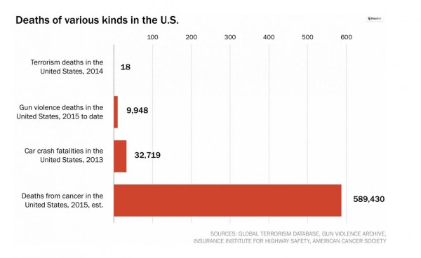
Bad Chart Thursday: Gun Deaths Don’t Matter Because Cancer
In President Obama’s response to the mass shooting in Oregon last week, he asked the US media to report gun deaths side by side with terrorism deaths to demonstrate that far more Americans are killed by guns than by terrorism, yet we don’t spend a fraction of the resources used to combat terrorism in efforts to reduce gun violence. Various…
Read More » -
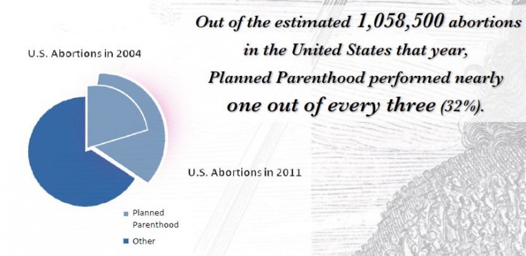
Bad Chart Thursday: More Misleading Charts from Americans United for Life
By now, you’ve likely heard about the embarrassingly bad abortion chart Rep. Jason Chaffetz (R-UT) tried to use as a “gotcha” at the congressional Planned Parenthood hearing last Tuesday. If you haven’t, I recommend reading the excellent take-downs by Kevin Drum at Mother Jones and Timothy Lee at Vox. I’m not going to rehash everything wrong with that particular chart,…
Read More » -
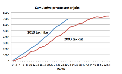
Bad Chart Thursday: Paul Krugman’s EXCEL-lent Adventure
If you follow economist Paul Krugman’s op-ed column in the New York Times, you may have noticed that he occasionally creates his own graphs using the sophisticated stylings of Microsoft Excel (or perhaps Google Sheets). I recognize the generic look, especially the default colors (red and blue), because I use the limited chart-making options in spreadsheet programs as well. The…
Read More » -
Bad Chart Thursday: Magic Eye CAPTCHA Chart Explains Trump’s Popularity
I am going to admit straight out: I was never able to see the image hidden in those magic eye pictures (a.k.a. stereograms) from the nineties. Today, I tried to create my own magic eye picture, and even knowing what image was hidden, I still couldn’t see it. I’m pretty sure the reason I never see the Magic Eye image…
Read More » -
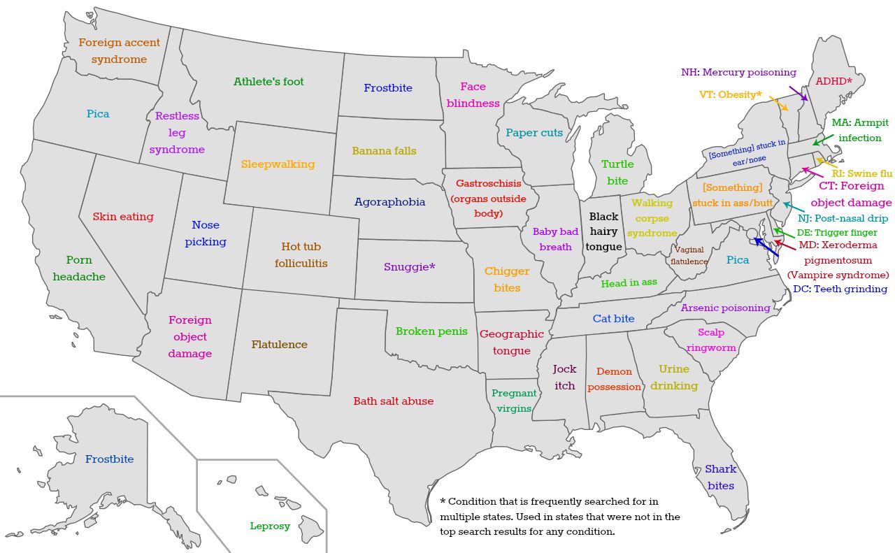
Bad Chart Thursday: Your State’s Burning Health Concerns
Maps based on data gathered from Google Trends are everywhere, especially those that attempt to sum up each state based on randomly chosen attributes. For example, the real estate site Estately.com recently published a map of “Each State’s Most Embarrassing Google Searches.” How do they decide what is embarrassing? Pretty much by typing into Google Trends what the author would…
Read More » -
Bad Chart Thursday: Anti-Abortion “Logic” in One Terrible Chart
You know, there are a few things the anti-abortion crowd is really good at–holding down the shift key when they type; consistently blurring the line between fact and fiction (most fundamentally in ascribing the characteristics of a baby to a fetus); and undermining their pro-life messaging at every turn with death threats (sometimes carried out), gory images of aborted fetuses,…
Read More » -

4 Things I Learned While Spending My Summer as a Professional Scientist
I’ve written before about my…um…abrupt career change. Not a day goes by that I don’t second guess that decision because of course I’m secretly a not very smart person who has convinced very smart people that I am worth their time. Some of those very smart people I managed to bamboozle where the good physicists and astronomers at the University…
Read More » -
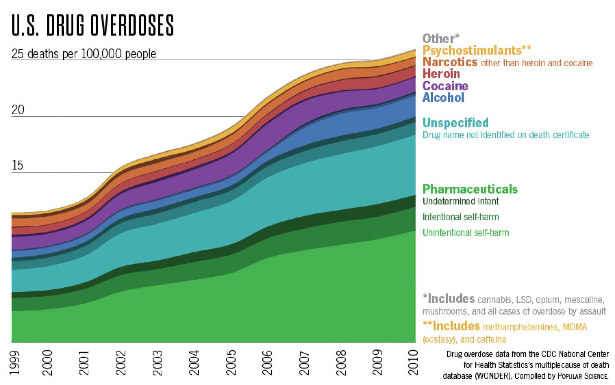
Bad Chart Thursday: US Drug Overdose Deaths
We can always count on Twitter to revive old bad charts that should have been left to obscurity, and it’s particularly painful when both the tweeter and the original source of the chart are science popularizers. The chart comes from a Popular Science post by Katie Peeks, “Which Drugs Actually Kill Americans,” and it’s based on CDC Wonder database statistics…
Read More »
