This post contains a video, which you can also view here. To support more videos like this, head to patreon.com/rebecca!
Transcript:
Last week someone asked me if I’d consider doing a video on how to read a science paper. I thought that was a great idea, and made a note to record something for this week. A few days later, someone else sent me a Medium post called Evidence over hysteria — COVID-19, insisting I read it because of how good it is. I didn’t know what to expect going in, so I started reading it with high hopes because it seemed that the author wanted to use scientific data to reassure the general public that they shouldn’t be panicking. That’s great! That’s something I’ve been saying since January: don’t panic. Panicking doesn’t fix anything, it just creates new, shittier problems. Literally shittier, sometimes, like when you run out of toilet paper.
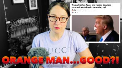
But then I kept reading and by the third sentence I went back to see who had written this, because I had assumed it was an epidemiologist but, well, you’ll see why I realized my mistake quickly. (Spoiler alert: it was not an epidemiologist.) At that point I realized, oh, this is my next video, because this article clearly got a lot of positive attention from people promoting it as good science despite it not actually being based on science at all. So yeah, today we’re gonna talk about how to not get conned by partisan hacks pretending to do science. This isn’t going to be a complete debunk of the Medium post — Medium took it down, and there’s honestly way too much for just one video. I’m just going to pick out some examples to help illustrate 5 Tips for how you should be reading “science” breakdowns like this.
Tip 1: know your source! In this case the author is Aaron Ginn, who is a silicon valley marketing guy. Does that mean he’s wrong? No! But you need to ask yourself: what does the scientific consensus have to say about this issue, and what is the author arguing? In this case, the consensus of epidemiologists are telling us that COVID-19 is an emergency pandemic that needs to be mitigated with extreme measure to prevent significant loss of life. The author is arguing that it’s not that big of a deal and we shouldn’t bother sheltering in place. If the author was an epidemiologist, you’d want to read his dissenting opinion carefully. If the author is formerly a writer for Breitbart with no previous expertise in science, you’d want to read it with extreme skepticism.
Think of it this way — most physicists think that dark matter exists. If a respected physicist writes a paper about an alternative hypothesis that involves modifying general relativity, it may be worth your time to read it. But if your accountant writes a paper on the same subject, you’d be forgiven for finding better things to do with your time because it’s probably going to take a theoretical physicist to point out all the things that are wrong with it.
Adjust your bullshit detector accordingly!
With that in mind, and knowing that we are on high skeptic alert, tip number 2 is to click the links! This is what initially tipped me off on my first read through. Aaron Ginn writes in the first paragraph, “When 13% of Americans believe they are currently infected with COVID-19 (mathematically impossible), full-on panic is blocking our ability to think clearly and determine how to deploy our resources to stop this virus.” Ginn supports his 13% figure by linking to this article, in which a survey company says that in a poll of 500 people, 10% said they think they currently have COVID. At first I assumed Ginn must have just mistyped, but after reading the survey data I realized that Ginn got the 13% figure by looking at a chart that only considered about half of the respondents who gave their age, not the full survey of 500. It is, by definition, a less rigorous number than the 10% figure. But Ginn scrolled down and went through the data until he found the highest number he could. And he used it.
And while that’s a very minor quibble — a difference of 3% in an informal survey that doesn’t really change anything about how we should react to COVID-19 — it’s a very good example of what Ginn does through the rest of the article. If you click the links, if you seek out the actual citation, you will know whether the person you’re reading is truly representing the data or not.
You might be surprised at how often people fail to look at sources, which is why people who, say, want to trick people into thinking the science is on their side can just throw in a link that completely contradicts them and trust that the average reader won’t bother to click it.
As another example, Ginn’s very next sentence is “Over three-fourths of Americans are scared of what we are doing to our society through law and hysteria, not of infection or spreading COVID-19 to those most vulnerable.” That’s just a straight up lie. The link he gives goes to a Yahoo! article about a Harris Poll. Like the first half of his sentence says, the poll did find that “Seventy-nine percent of respondents said drastic headlines about how society is changing is the No. 1 reason they are fearful,” with many of the respondents saying they were freaked out by hysterical people fighting over toilet paper, though there was no mention of “law,” despite Ginn’s words. The second part of his sentence is a lie that is debunked by the same link. Ginn says those people are not scared “of infection or spreading COVID-19 to those most vulnerable,” but the poll actually found that “74% of Americans are afraid of accidentally spreading the virus to vulnerable people even if they are asymptomatic.” Like, they even use the word “vulnerable.”
Sometimes you don’t even have to click the link to find the lie. A little later, Ginn claims in a headline that “1% of cases will be severe,” and to illustrate that he includes a pyramid showing that by mid-February in China 2.3% of cases died. How “severe” does he consider “severe?” Can you imagine your mom calling you and saying, “Your brother has been in a car accident!” “Oh no, was it severe?” “No!” “Thank god!” “I mean, he did die but it wasn’t that bad.”
He got that 1% number by considering how many cases were severe compared to everyone who is ever tested for COVID. That’s a different (and pretty pointless, in this instance) number than the ones in his chart. He’s comparing apples and oranges and hoping you won’t notice. If he was being accurate to his graphic, the headline would read, 21.3% cases will be severe. He didn’t do that, because that doesn’t fit with his narrative that COVID-19 isn’t a big deal.
This brings me to Tip #3: don’t be taken in by headlines and graphics. Even in “good” science journalism, headlines aren’t often written by the writer of the article, and graphics aren’t necessarily chosen by them. Hell, I had a video once where my editor slotted in a graphic of red blood cells (which tend to not have nuclei) while I was talking about DNA. Whoops! Headlines and graphics are extremely good for persuading people, but they’re not always good at communicating facts. Don’t be tricked.
Tip #4: don’t be intimidated by jargon. Ginn tells us to “watch the Bell Curve,” but what does that mean? He writes, “Bell curves is the dominant trait of outbreaks. A virus doesn’t grow linearly forever. It accelerates, plateaus, and then declines. Whether it is environmental or our own efforts, viruses accelerate and quickly decline. This fact of nature is represented in Farr’s law.” That’s more or less correct, but it’s strange to call it a “fact of nature” (which is never something you’d hear out of a scientist’s mouth) and it’s equally strange to randomly namedrop Farr, a researcher who did suggest that epidemics may follow a regular curve back in the 19th century. Ginn throws all this at the reader with this chart, which he says is “a graph from Italy showing a bell curve in symptom onset and number of cases, which may point to the beginning of the end for Italy.” He wants you to look at it, see that “Bell Curve,” and assume he’s right. Italy’s gonna be just fine! Farr’s Law says so. The Bell Curve says so. But wait! What’s that written right there on the chart? “Data in the shaded area should be interpreted with caution due to the possible reporting delay of more recently diagnosed cases and cases with date of onset within the reporting period that have not yet been diagnosed.” This is something researchers have been yelling about for the past two months: we don’t have all the data. We aren’t testing everyone in a population. Our numbers will, therefore, always be inadequate and several days to a week behind the curve. The Bell Curve, if you will.
I guess we’ll just have to see if Ginn was right and that really was the beginning of the end for Italy. Oh hold on, we don’t need to wait because that chart is from March 15, about a week before Ginn’s article was posted. March 11 is the last date with confirmed data and that shows 2,313 newly discovered cases. There were 2600 the next day, and the day after that, and then 3500, and then a few days later 4200, and a few days after that on March 21st there were 6500. Maybe that’s the beginning of the end?
Does that mean the epidemiological Bell Curve isn’t true? No! It means that you trusted some jabrony who can’t read the legend on a chart he’s posting to tell you how a general rule of thumb (not a “fact of nature”) might apply to this particular pandemic. The major drawback of “Farr’s Law” is that we are hampered based upon how much data we can collect. And when you’ve got one epidemic in a shady ass place like China and another one in the United States where people with COVID-19 symptoms can’t get tested unless they are an NBA player or literally need life support, laypeople like Ginn and like me can’t make pronouncements about where the top of the bell is going to be. That’s why I leave it to the professionals like the epidemiologists at the WHO and CDC, and I just tell you what they’re telling the general public.
This video is already way too long to talk about everything Ginn screws up, but I may do another video on his other points in the future if I see the misinformation traveling (like the idea that COVID-19 will die during the summer — scientists absolutely do not know if that will happen). So I’ll end with my final tip: don’t fall for the Gish Gallop. I’ve talked about this in previous videos — it’s the technique pioneered by the creationist Duane Gish, who could spew so much bullshit in such a short amount of time that it would take any debate opponent months to dissect and debunk each of his points. Don’t be impressed by the utter volume of arguments put forth by people like creationists, 9/11 truthers, flat-earthers, or Aaron Ginn.
Please listen to the epidemiologists. Stay inside, wash your hands, don’t visit friends, play some video games. If we get enough tests to start testing everyone like in South Korea, or if the disease peters out, we can get back to normal. I assure you that the hit our economy takes will be nothing compared to the hit it would take in the worst case scenario of millions of people with critical illnesses that stop them from working. Or living. I know, it’s the “working” part that has the market guys worried. If this were a zombie pandemic and they found a way to put the zombies to work, our stock market would be through the roof right now.


Looking at some of the utter garbage and denial of reality spouted on Twitter on the subject of COVID 19, I would say the US is in for a pandemic that will make Italy’s look tiny. This is a tragedy. A rapid nationwide lockdown could have saved a lot of lives and minimised the impact on the economy.
On the subject of the disease in summer, Australia is now in the 3rd week of autumn with temperatures in the mid to high 20s (C) and very very dry. Our outbreak is still doubling every 3 days so maybe don’t pin too much hope on the weather coming to the rescue.
Death rates here so far are low due to being one of the highest testing countries in the world and also due to rapid contact tracing and quarantine. Importantly our leaders take a bipartisan view regarding the outbreak. We all look in horror at the shambles in the US.
Here’s a good one for you.
“Swine flu infected 1.4 billion people around the world and killed 575,000 people.
There was no media panic and society did not shut down.
Coronavirus has infected less than 478,000 people and killed 22,000 going into April.
Just a little perspective”
In over 200 replies only one person picked up that the quoted figures were bogus and inflated nearly1000 fold
A quick Wikipedia check shows it was officially 6.7 million cases and 20,0000 deaths for swine flu.
Lack of media panic can probably be attributed to the obsession with the aftermath of the GFC that was going on at the time, which utterly masked the economic impact of swine flu. The true impact of the latter is still unknown but I bet it didn’t help.
Of course the narrative is that there was no media panic because Obama was president.