Bad Chart Thursday: More Misleading Charts from Americans United for Life
By now, you’ve likely heard about the embarrassingly bad abortion chart Rep. Jason Chaffetz (R-UT) tried to use as a “gotcha” at the congressional Planned Parenthood hearing last Tuesday. If you haven’t, I recommend reading the excellent take-downs by Kevin Drum at Mother Jones and Timothy Lee at Vox.
I’m not going to rehash everything wrong with that particular chart, because the source of the chart, Americans United for Life* (AUL), provides oh so many more hilariously bad, misleading charts in their recent report The New Leviathan: The Mega-Center Report—How Planned Parenthood Has Become Abortion, Inc.
In this report, AUL describes how Planned Parenthood is actually a giant female sea monster shattering the glass ceiling of corporate America with one tentacle while performing coerced abortions with the others.
Kidding, kidding. The actual report is much more ridiculous than that.
The entire premise of The New Leviathan is the claim that Planned Parenthood is covertly trying to increase abortions and decrease the other health services it provides. The evidence? Larger clinics opening up, what AUL calls mega-centers. What else could this possibly mean but an aggressive plan to lure more women into having abortions? Just like with the Mayo Clinic’s recent expansion, which is clearly part of a plot to increase its cancer patient numbers.
Holy crap! Maybe Mayo Clinic and Planned Parenthood are in cahoots to give people cancer via abortions! Except for the fact that abortions are not linked to cancer. At all.
But let’s not get distracted by factual information. AUL certainly doesn’t. The other “evidence” they provide to support their contention that Planned Parenthood is deliberately coercing people into having abortions to increase their abortion business are statements and charts showing an increase in abortion and a decrease in other services.
Now, I know what you’re thinking. There are many different reasons for these fluctuations that don’t require concocting an evil Planned Parenthood conspiracy theory, but look at how dramatic the increase in abortions is!
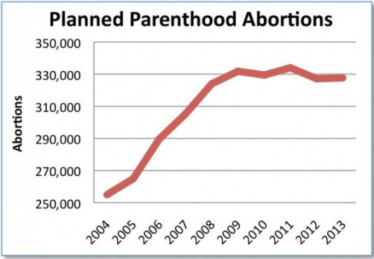
Except it only looks like a dramatic increase because AUL truncated the y-axis. Here are the data again without the manipulation:
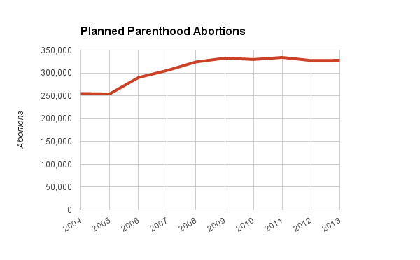
Still an increase, sure, but not dramatic enough to require some nefarious explanation, especially taking into account population growth (which neither chart above does).
The decrease in services claim is supported by charts like this one:
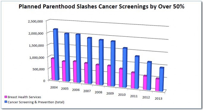
Except that the chart doesn’t show what the title claims it shows. Once again, the changes shown do not require paranoid assumptions about Planned Parenthood deliberately slashing cancer screenings. The decrease is in keeping with the changes in U.S. cancer screening guidelines, which call for fewer screenings (often at later ages) among women with no history of cancer or previous positive tests. The decrease also makes sense considering more people have insurance with the passage of the Affordable Care Act, and they are likely getting these screenings from their regular doctor rather than through Planned Parenthood.
What this chart does show us (aside from how ugly and misleading 3D charts are) is that Planned Parenthood does around three times as many cancer screenings than abortions, even with screenings decreasing, supporting the fact that abortion is still a very small percentage of the services PP performs.
It also demonstrates deliberately dishonest cherry picking, as Timothy Lee pointed out in his article about the AUL chart Rep. Chaffetz attempted to use with a straight face in the congressional hearings. The AUL leaves out many other services Planned Parenthood provides, including care involving contraception and sexually transmitted infections. Lee notes that the total non-abortion services Planned Parenthood provides have gone down from 10.29 million to 10.26 million from 2006 to 2013, which is barely a decrease at all and actually much less of a change than I would expect considering the decrease in cancer screening.
The AUL report is full of 3D charts, an excellent way to exaggerate differences and obfuscate what the actual numbers are, as in this abortion skyscraper chart:
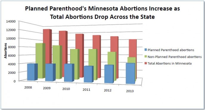
Here, Americans United for Life helpfully shows us that more and more Minnesotans trust Planned Parenthood over other providers to perform this sensitive and private medical procedure. Thanks, AUL!
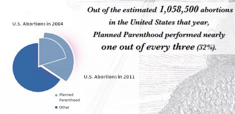
And pie chart fans won’t be disappointed—the AUL goes above and beyond with its pie chart, actually managing to show no information whatsoever in the chart itself.
Even the pie chart is embarrassed about how bad it is. You can see it blushing.
The pullquote next to the chart does provide some info that kind of explains what they are trying to do with this chart, although I’m honestly surprised that Planned Parenthood only performed about a third of abortions in 2011. I would have guessed a much higher proportion.
So to recap, misleading charts are the rule, not the exception, with Americans United for Life. But even if these charts were accurate, they wouldn’t demonstrate any of the claims AUL is making. An increase in Planned Parenthood abortions does not tell us anything about whether PP is deliberately trying to get more people to have abortions. We could just as easily claim that abstinence-only education proponents are deliberately increasing the abortion rate by putting more teenagers at risk of pregnancy.
Honestly, between the selling baby parts nonsense and the conspiracies promoted by AUL, anti-abortion organizations and activists have become indistinguishable from 9/11 Truthers and people who believe the moon landing was a hoax.
The pro-life* movement has become a movement of conspiracy theorists. Maybe it always was.
*Some restrictions apply. “Life” does not include women, existing children, or people with diseases, especially the terminally ill.


You mean the chart with the two separate y-axes? It’s like they’re making charts deliberately hard to read for the purpose of confusing us or something.
Of course, correlation doesn’t mean causation. Disco started in 1973, same year as Roe v. Wade. Clearly the two are related. (Come to think of it, 1973 was also the year of Wounded Knee.) And Nixon’s resignation was just a year later, followed a year after that by the fall of Saigon. There must be a connection!
Also note: Even if the numbers in the deceptively/ invalidly laid out graph are correct for abortions, what they show is an increase in abortions of 13% over 7 years, which I believe is -below- the rate of population growth in the US over the same period, meaning that the number of abortions -per capita- provided by Planned Parenthood probably -decreased- over that time period. If so, that could indicate some success in their contraception programs.