Did you know that egalitarianism and feminism are mutually exclusive? I had no idea until I started encountering people, online and off, who insist that they are not feminists but are egalitarians. The latter term is vague, with multiple connotations depending on the context, but when used in opposition to feminism, it is usually described as a belief in equality for all people, not just women.
But that’s not actually in opposition to feminism. Believe it or not, I also believe in equality for all people AND I’m a feminist. Feminism in this sense is a form of egalitarianism but with a focus on gender equality.
Are there valid reasons to critique feminist theories and practices that exclude in various direct and indirect ways other marginalized groups, such as women of color, trans women, women with disabilities, and so forth? Hell yes. Feminism absolutely needs intersectionality. But those who reject the feminist label in favor of egalitarianism are generally making the opposite critique, that we shouldn’t focus on specific groups at all.
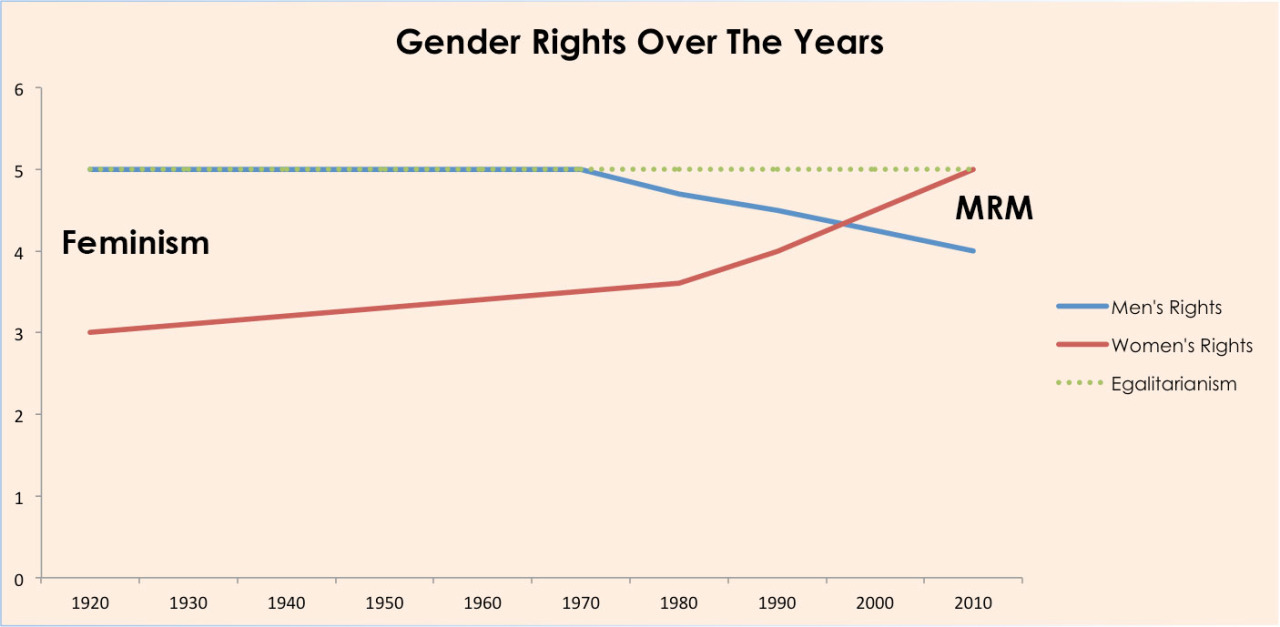
This is the view illustrated in today’s bad chart (hat tip, Avi!). It’s been making the rounds on Tumblr and Reddit, where it appears to be getting duly mocked. It originally appeared in a post entitled “Feminism vs. MRM vs. Egalitarianism,” which is clearly making men’s rights arguments under the guise of promoting egalitarianism:
The unlabeled y-axis stands out immediately. I think /r/dataisugly commenter Epistaxis nailed the problem: “You Won’t Believe These 5 Rights Women Have! #4 Isn’t Even Available to Men Anymore!”
Even assuming the axis is intended to show rights in some way, based on the chart’s title, how exactly are these rights being measured? What rights are being measured? Is it a coincidence that the Beastie Boys released “(You Gotta) Fight for Your Right (to Party!)” in the mid-80s, just as men were in the process of losing one of their rights?
But at least the creator of this chart is consistent with his terrible labeling practices. We’ve also got “Feminism” and “MRM” (Men’s Rights Movement) just floating around on opposite sides of the chart with no apparent connection to any of the “data” on the chart.
None of this really matters, though, when we can all clearly see that under egalitarianism, everyone would have 5 rights! But feminists will never get on board because women currently have more rights than men. This seems ridiculous at first, but I do in fact have the right to party (although I do not have the right to not get degraded or raped at said party, but baby steps, ladies, baby steps). Also, I have the right to create a chart that is not deliberately misleading. If men still have this right, this guy clearly waived it.
In fact, the best part about this chart is the very first sentence of the post it appears in: “This chart is not meant to be historically accurate or scientific.”
I’ll just let that sink in.
He explains his intention as just to “illustrate the different social movements . . . that have been gaining momentum and ‘vocal share’ over the past century and more.” See? He’s actually doing a meta-post illustrating how egalitarianism works as a replacement for feminism. Getting the specifics accurate is completely irrelevant as long as you can make up conclusions that are too vague, general, and divorced from reality to ever put you in the position of having to actually do something about inequality.


“This chart is not meant to be historically accurate or scientific.”
Well, good job, then.
Exactly what I was thinking. Not meant to be historically accurate or scientific: Mission accomplished!
Several things are obvious from this scientific and historically accurate chart. (I’m sure the disclaimer is there for legal reasons, like the disclaimer “not intended for the treatment of any disease or medical condition” on an altmed package. It’s one of those wink-wink, nudge-nudge disclaimers that scientists always use.)
First, rights are continuous, not discrete. If they were discrete, there would be data points when the rights were acquired or lost, and the lines would either be step functions or best-fit curves and labelled as such. Instead, they are continuous, showing for example that women had 3 rights in 1920 and 3.5 rights in 1980.
Also, rights change at a constant rate with respect to time, with occasional rare changes in the rate (rate acceleration.) Women’s rights changed at a constant rate of (.5 rights/60 years), or .833 rights/century from 1920 to 1980, and then at (1.5 rights/30 years) or 5 rights/century since then. (In SI units, these figures are .264 and 1.59 nanoRights/second.
The scariest bit (since I’m a man) is that men’s rights have declined one full right since 1970 (a rate of .793 nR/s), meaning that in the year 2100, we will have only 1.75 rights left, and by the year 2200, we will have -.75 rights. NEGATIVE RIGHTS! Oh, the humanity!
See, this is why it’s so important to label your axes. The y axis is actually kilorights, so the discrete changes are just too small to see.
Actually, I’m not sure whether this graph is supposed to be binary or decimal-based; the y axis might be kibirights rather than kilorights, but that’s just a small scaling factor difference.
“NEGATIVE RIGHTS! Oh, the humanity!”
Given Oliphant and Duro, I actually can see how this is possible.
Oh, BTW, the Third Wayers over on DKos are going nuts trying to explain Hillary’s dismissive attitude toward Black Lives Matter. Some of them are very concerned with BLM now.
If a right and an anti right collide, do they annihilate in a burst of man tears?