Bad Chart Thursday Relationship Status: It’s Complicated
One thing charts of all types have in common is that they depict relationships. Ideally, we can see at a glance the main features of each relationship, and with a slightly closer look, the less important features displayed in the chart.
With so much information competing for readers’ attention online, you might think that chart designs would be getting less complex so they’d be easier to digest quickly, and many are–sometimes to the point of conveying nothing at all. But the opposite has also been happening, charts whose relationship status is complicated. These are so convoluted or overly detailed that the relationships are difficult if not impossible to tease out . . . sometimes to the point of conveying nothing at all.
For example, we have the TitleMax chart below, with its .00001-point-size font, showing U.S. debt broken down by state and city. (See the larger, but not much clearer, version here.)
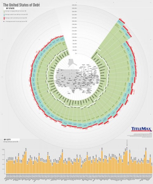
This might work printed as a giant poster, but online, it’s incomprehensible unless you zoom way in. But zoomed in, you can’t see the piece you’re looking at as part of a whole nor view the legend.
When your type size is small enough to be affected by quantum mechanics, you probably have too much information in your chart.
The next chart also suffers from TMI, but in a different way. From a study published in Scientometrics about the advantages of open access over paywall (a study that is itself behind a paywall), the graph is intended to depict cumulative page views for open-access (blue) and paywall (orange) articles.
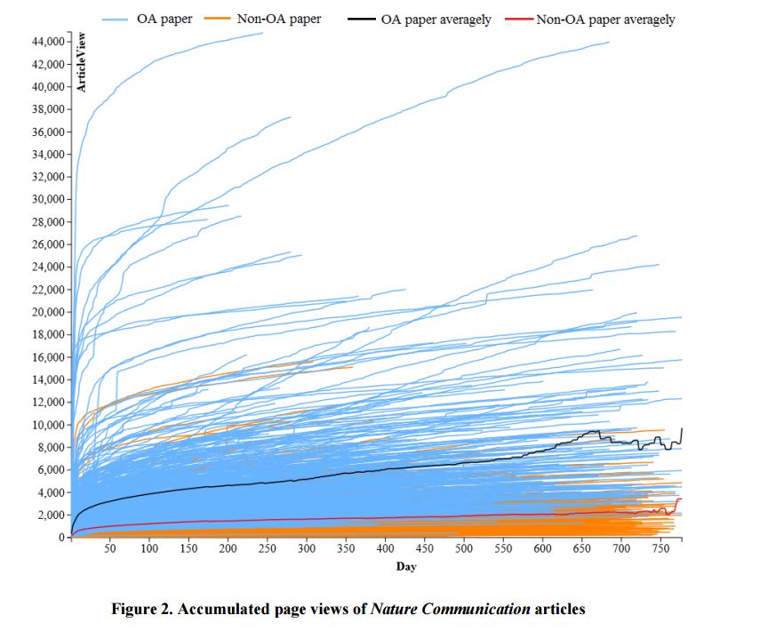

Not only is it impossible to follow all but a few individual lines, the blue lines actually cover up many of the orange lines.
The general point is clear, that open-access articles get more page views than those behind a paywall (shocking), but that point could have been made without plotting data for each article into a graph that resembles troll doll hair more than a serious data visualization.
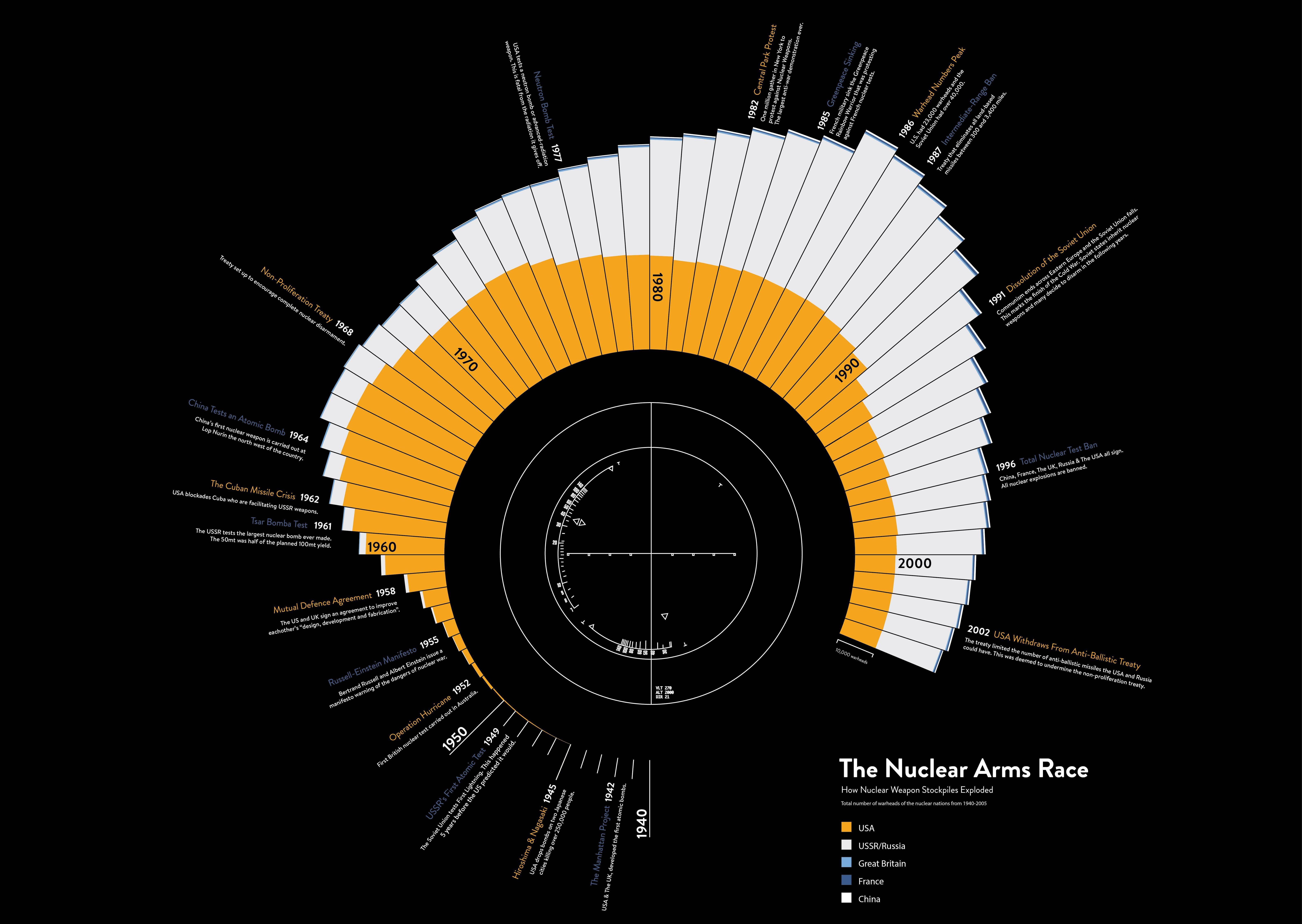
But at least the authors chose distinguishable colors, unlike the anonymous creator of this chart from imgur (click image to enlarge):
Not only do we have the unreadable type-on-the-head-of-a-pin in this chart, as in the U.S. Debt chart above, the colors for USSR/Russia and China are indistinguishable from each other. The shades of blue for Great Britain and France might be okay if the bars weren’t so thin, but in this chart, they are also indistinguishable.
If you spend several hours clicking zoom, journeying to the center of this chart, you’ll find that it is purely decorative, containing no relevant information whatsoever. It’s just taking up space that could possibly be used to enlarge the actual information so that it’s readable, or closer to readable. Maybe.
Even simple relationships can be overly complicated by chart design, as in this chart showing the change in rural vs. urban populations, from a Michigan State University College of Education newsletter:
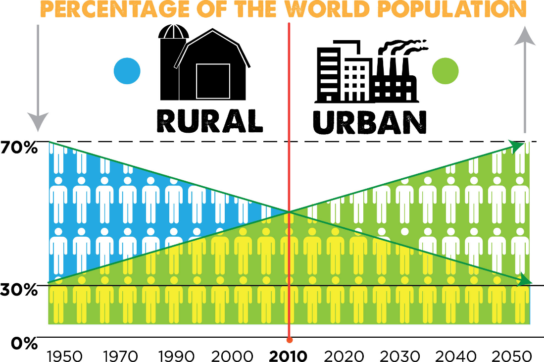
The graph essentially conveys the decrease in rural population and increase in urban population, with the projection that by 2050, the percentages will be the converse of what they were in 1950. For some reason, the x axis starts with 20-year intervals, then switches to 10, and on the y axis, the gap between 30% and 70% is much too large compared with 0-30%, but what complicates the chart more than anything is the use of colors and people icons. The blue for rural and green for urban might be useful to color the lines, but the lines are both green. The colors are used solely to fill the background of the people icons, but what does it mean when the people turn yellow beneath the lines? I was thinking along the lines of yellow and blue make green, but the people were never blue or green.
And what happens in 2030 to turn some urban dwellers into floating heads? Is it related to the mass decapitations at 30%? Or should we start investing in head tethers and sandbags? This chart raises more questions than it answers.
Ultimately, the fundamental flaw behind all of these overly complicated charts seems to come down to forgetting about the audience in favor of the need to share ALL the information, or the pull of form over function, perhaps getting too engrossed in the bells and whistles of a design program, much as some people gorged on clipart back in the eighties and nineties (and to a lesser extent today–I’m looking at you, Lincoln Elementary).
Whatever the reason behind them, overly complicated charts are not much better than overly simplistic charts as far as the end goal–communicating information–at least until 2030, when the floating heads rise up, and charts will seem like a quaint artifact of a bygone era, when everyone used keyboards and touch screens because they had hands.


“When your type size is small enough to be affected by quantum mechanics, you probably have too much information in your chart.”
Ha! Also true for PowerPoint slides!
Melanie, you make a good point there about
“getting too engrossed in the bells and whistles of a design program”.
But it may well be that Bloatware 2015 was imposed on the organisation by its IT department with its usual wide eyed optimism and without adequate consultation or warning.
The aggravating features of Bloatware 2015 may actually have been there in Windows 1.0, but are now set by default and mandatory unless you can find the secret hack to turn them off. The result is that a 5 minute job now takes an hour.
In a big organisation there is not much the average Jill or Joe can do about it, particularly when Management has made cuts in anticipation of the cost savings expected by use of the new software.
There are several recent examples of this kind of scenario in the local news .