Bad Chart Thursday: Nielsen’s Pretty . . . Useless Charts
If you’ve ever seen a Nielsen report or article, you’ve seen the company’s charts. In fact, the reports often read more like brochures, as though marketing their market research is more important than the research itself, with a heavy focus on presenting the data in a visually appealing way, often at the expense of clarity.
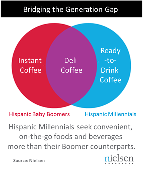
Case in point, the meaningless Venn diagram:
In a way, it’s actually worse than meaningless because it implies no overlap in the outlying categories, as though no Hispanic Boomers ever choose ready-to-drink coffee, for example. A Venn is just not a useful chart for information that doesn’t fall into discrete categories outside the overlap. Not to mention the unclear category definitions. Where would home-brewed coffee fit in? And is deli coffee really that popular among both age groups? Unfortunately, the article where this chart appears says nothing about this chart or even coffee. But hey, the colors are pretty.
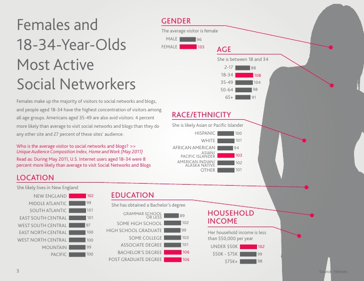
And then there’s this chart connecting data about social network users with various points on a shadow woman’s body for no discernible reason. Are these demographic chakra points? Or perhaps this is a subtle commentary on how the gender binary is all in our head, home is where the stomach is, and we’re only as old as our clavicle.
In keeping with the trend of using the wrong chart for the job, we have this pair of charts from Nielsen’s African-American Consumer 2013 Report. (Note that “basket ring” apparently refers to annual retail spending, not the metal part of a basketball hoop, woven jewelry, or the mark left by your laundry basket because you kept buying new socks and underwear instead of washing clothes.)
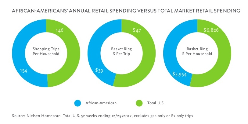
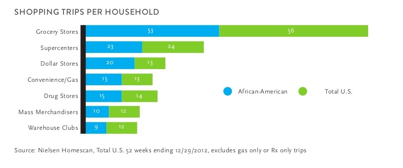
Both are intended to show comparisons between two sets of data, but the numbers are so close to each other that there isn’t a clear distinction in size between the green and the blue in either chart. Side-by-side vertical bars, for example, would show us at a glance the slight differences.
The meaning of “Total US” is also unclear. At first I thought that it was an insensitive way to refer the non-black population, as though black people were not part of the total US, but Nielsen’s use of “total market” elsewhere clarified that it includes the comparison group as well as the rest of the population. The report itself makes clear that these numbers are averages, but that would be useful to include in the chart title or labels.
Yet the text accompanying these charts only confused me more, including comparisons between black and non-black people’s shopping habits, so I ran the charts and accompanying text by our resident statistician Jamie Bernstein in the Skepchick backchannel. (See an image of the page here.)
She helped clarify what I was looking at and pointed out additional problems in the analysis, the most egregious being their statement that “African-Americans’ annual retail spending or ‘Basket Ring’ is 87% of Total Market retail spending.” This would be astonishing if true, given that just over 13% of the US population is black. The number seems to clearly come from the third ring in the chart above, but that shows average per household, not total retail spending numbers. As Jamie put it, “I really think they got confused by their own ring chart.”
The Nielsen Company sells its services to marketing departments, so it’s not a huge surprise or even all that unreasonable that they would lean more toward the infographic when presenting data, but I could have presented many more examples of unclear charts here. (See a selection of their charts in one place here, though it’s biased toward what people would consider interesting enough to pin on Pinterest.) Even more important, I could provide examples of charts they’ve done that are both clear and visually appealing. The choice between the two reflects the difference between a market research firm and a marketing company that does research.


The social networking infographic is even worse than you think – the analysis is essentially completely wrong.
Do you believe that those 9 geographical areas just happen to contain 1/9th of the US population each to an accuracy of a few percent? No, these must be normalized per-capita numbers. This is also alluded to in the text where age 35-49 are 4% more likely to network (score 104) than average. This is utterly critical to interpreting the data (as shown by how badly they misinterpret their own data) but is only hinted at, so the numbers are presented in a wildly misleading context.
This then leads them to nonsensical conclusions. “She likely lives in New England” is either flat out wrong (if New England has less than 1/9 of the US population it won’t be the most likely location) or (if New England is the most populous of these regions) is true for reasons completely divorced from the data being presented. (Even this is being generous and assuming ‘likely’ means ‘more likely than any other region’ rather than ‘over 50%’)
Also what the data is really showing is that there is very little variation in social networking participation in any of the subgroups analysed. (Age and education are slight exceptions.) They’ve taken tiny differences and magnified them into a single stereotype.
Thank you for this! I just thought the numbers were pretty much useless without labels or some kind of clarification of what they meant. The report this came from provides zero context, just one infographic after another. It’s not at all surprising that this is yet another misinterpretation/misrepresentation of their own numbers.