Bad Chart Thursday: Useful Tips for Making a Bad Infographic
Today, over at Skepchick HQ, we got a special message from reader Ali that is definitely not spam:
We’re trying to get the word out about a new eating disorder that is on the rise called pica. Pica is an addiction to eating things that aren’t food. I wanted to pass along this link to the infographic we just published about it! –http://www.clarityway.com/blog/pica-eating-disorder-infographic/
Pica is one of the fastest growing addictions in the U.S., and like all health problems, the first step toward treatment is understanding it.
I was wondering if you’d be willing to share the infographic with the readers on skepchick? If you do choose to use it, there’s an easy to embed code at the bottom of the post. If you’d like, I’d be happy to write a description or article regarding our research to accompany the infographic.
Either way, thanks for taking the time to read this email and I hope you have a great day!
I don’t usually don’t click on links in suspicious-looking emails, but I hate to pass up a good infographic, so I thought I’d make an exception for this one.
Boy am I glad I took the time to check out Clarity Way’s Pica infographic. It’s just chock full of terrifying information about how to create an infographic, especially when you don’t have a lot of information to back up your claims but want to make it look like you do.
In order to get all the infographic-making lessons out of Clarity Way’s infographic, I created an annotated version. Next time you need to make an infographic to convince the world of something for which you have little evidence, be sure to use these lessons. I present to you now the Official Annotated Clarity Way Pica Infographic:
Note: Regardless of how terrible the information presented in this infographic is, Pica is a real disorder that can be quite dangerous. If you want actual information about Pica, please get it from a legitimate website rather than an infographic.


Now you’re on Big Pica’s radar screen.
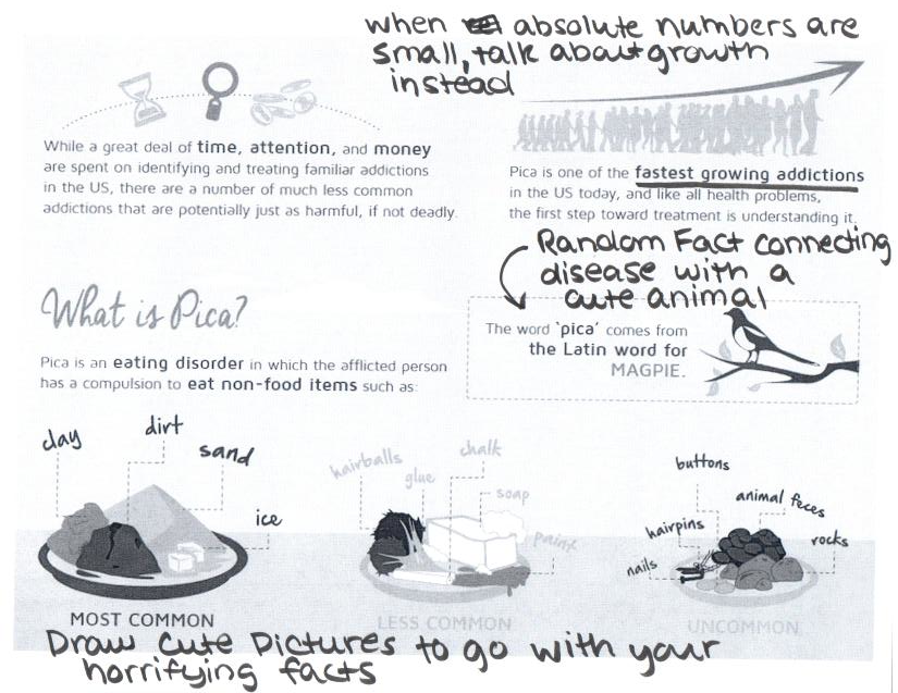
Wow… that line chart…. just, wow.
My favorite part of the line chart is where they add meaningless squiggles and bends to the lines to make it look like they have more data points than they actually have.
Could it be just really poor mouse skills? Or maybe she stopped to nibble on some paperclips..
Ice? Oh shit, I come down with pica every time I finish an iced tea.
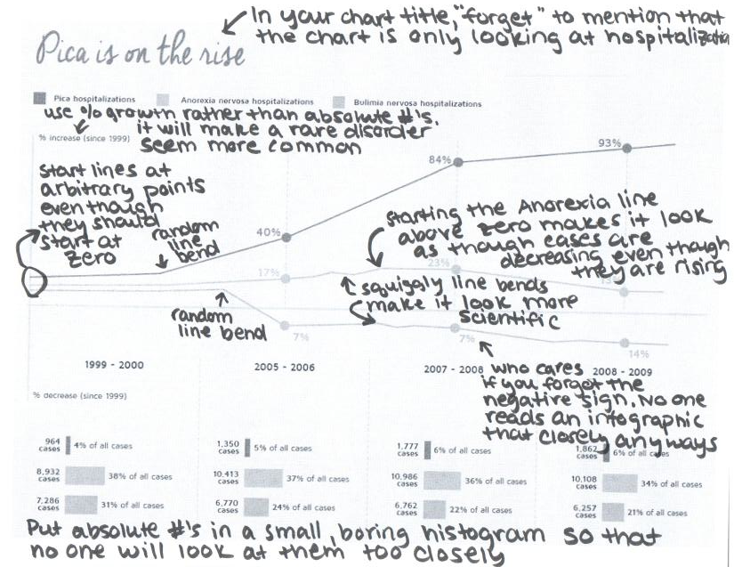
Did we notice that the percentages in that histogram don’t add up to 100%? My guess is that they are percentages of total hospitalizations from … something. Mental/nervous disorders? I refuse to believe it is from all causes, including things like heart disease and pregnancy. And where was this info collected? The US? The UK? Worldwide? Mars? The line graph isn’t just misleading; the data from which it originates are utterly without meaning.
I think probably from eating disorders, the numbers would look about right if they leave out all eating disorders other than anorexia, bulimia, and pica.
Maybe. Of course, that doesn’t answer where the numbers were gathered, or why we even have to play this guessing game!
I had some ‘serious’ pica for a while in the form of an ice craving; I would chew ice until my mouth was numb and I couldn’t speak clearly (but, for some reason, only the fluffy ice that came out of the machine at work). I would salivate just thinking of ice. After some time, I mentioned it to my mom, and she said that it had to do with mineral deficiencies; I started taking a multivitamin, and the craving evaporated.
I don’t have any data at my fingertips, but I’ve talked to a few other people who have had similar experIences: an odd misconnection in the brain that makes for mildly interesting conversation, followed by resolution without medical intervention. Not a big deal, in other words; what is Clarity Way selling?
^inpatient drug & alcohol treatment. Okaaaayyy….
Also misleading: calling it a “new eating disorder.” As even their “charts” admit, it’s been around for a very long time.
I suspect that the “rise” in cases is probably more due to a greater percentage of cases being reported than any change in behavior.
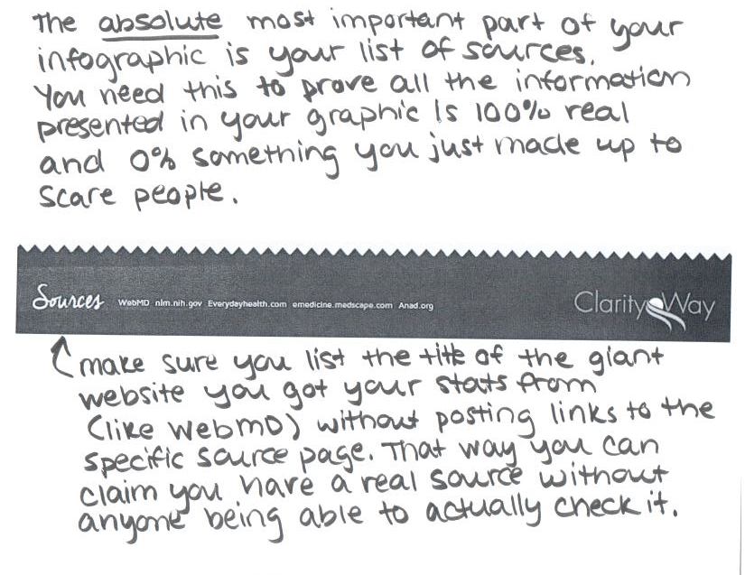
Wow, I just looked at Clarity Way’s website. I can’t see any reason *why* they have this infographic up on their site. They don’t seem to offer any services related to Pica.
The clue is in calling it an addiction early on, I think. Looks like they are trying to expand what they treat by redefining addiction.
Also, there can be no possible confusion of readers by not knowing the difference between less than () symbols. They are freely interchangeable, really.
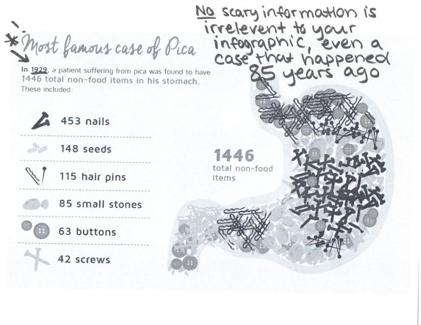
More goodies: 1) the ranges in the pie chart overlap!? If someone is 30 years old, should they be included in both the red and blue wedges? 2) The items in the stomach add up to 906. Why doesn’t it say “and 540 miscellaneous items” (which would have been the predominant category)?