Ahoy hoy! Eagle-eyed Skepchick regulars will have already noticed that we’ve given the site a bit of a redesign. It’ll be changing bit by bit over the next few days as we squash bugs and add new features, so don’t panic! If you notice that something is broken, or if you’d just like to request a feature while we’re in the process of spiffying things up, feel free to comment below and let us know.
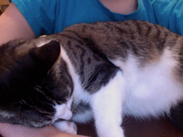
As for right now, though, it’s nearly 2AM and Fry and I (pictured) are beat (also pictured). Goodnight!


There is an empty column on the right, below the search bar, which looks weird.
Using Adblock on Skepchick makes the baby jesus cry.
This comment made me chuckle, for that I’m disabling not only adblock but noscript for this site as well, I mean it’s not like ads have ever worked on me befo,,, ooh 10% off brownies
Yessssss
I’m considering doing a thing where you could buy a premium (but inexpensive) subscription to Skepchick that would give you the option of turning off ads. And maybe other perqs, too.
I’m not a huge fan of the new look, it looks like Skepchick got the windows 8 treatment (less content more giant pictures).
Features I’d like to see come back:
– Clickable links on the main page. (I like to open all the quickies in new tabs without having to click through to the actual post)
– More text on the main page per article, ~75 words is not enough.
-Put the blog names back instead of LGBTQ, Teen, Art etc. Now they look like subcategories and translations of Skepchick instead of their own separate blogs.
-And now that I look at it I agree with Blakut the search bar looks lonely over there. (After looking at the events page it looks like it will get some company)
Back to lurking. *runs and hides behind the chesterfield*
Once we get the featured posts gallery back up, it’ll be the same number of posts shown on the front page + more overall content than the old design!
Update: now that the gallery is up, there are two more stories on the front page than there were using the old design.
Rebecca, love the navigation buttons!
Now for the big one – will it return you to where you were after you login? (to stop replies going right down the end) :)
It’s a new login system that I’m still tweaking but I’ll try to do that!
And how come a smiley overwrites my avatar?
Can you explain this more?
Yawn it’s 4am here – wow this looks great now!
See my first comment (4 up)? The doggie avatar was replaced by a giant smiley emoticon. Same for other people’s comments containing emoticons. It was the same at work (XP/IE) as at home (Vista/Firefox).
Right now the dog is back but the emoticon at the end of the comment is showing as text, colon bracket.
I thought you might be trying out an anti-troll feature!
Heh, thanks, I figured out what you meant and I “fixed” it by turning of emoticons…
What if we put it in the middle :) like this?
I think I’m starting to panic a little bit!
DON’T PANIC
Well, don’t have to be *that* eagle-eyed to see it :-) Finally re-added the social sharing buttons!
I will say that the comment entry text color is a tad light on my monitor making it hard to see what I’m typing but other than that looks great.
Good point on the light comment text color! I’ll see about darkening it up a bit.
I’m hoping the social share buttons are going to last . . . in the past, these sorts of things place a heavy load on the server, but so far everything seems stable!
http://www.agweb.com/assets/import/images/Inner%20Change.jpg
I don’t see a comment count on the posts. How will I know where the excitement’s happening?
And are there plans for preview or edit?
Yes! I’m going to try to get those back in.
Ah, good point! I’ll see about adding that. But in the meanwhile, check out the “popular” posts list in the sidebar to find the action!
I would really appreciate a return of the subscribed thread email notification function. There are so many conversation I simply end up not coming back to because it’s so difficult to pick up where I left off.
Yes! On my list.
Yay:)
I like the wider fit to my monitor a lot. Way to many websites present a column that barely takes up half the real estate.
Yeah, that was a big point for me. It’s tough as a lot of people still use tiny browsers, so the nice thing about this new layout is that it resizes smoothly as you change the size of your browser.
I found if I set my browser for 65% it all fits, it’s small though. :(
Really like the new comments layout on the other hand.
Testing. Testing… Unique, New York. Unique, New York. The arsonist has oddly shaped feet. The Human Torch was denied a bank loan…
Not bad, not bad!
Things I’ve noticed:
Ads that appear on the left bump/intrude all the text to the right of the ad. See the Who’s Who / Comment Policy and now that I look, this page.
I agree with Telford re: the sister-site nav.
The large images on the homepage are quite nice, though I miss the Quickies links being readily clickable.
The recent comments are only showing your comments, Rebecca. WHAT A CLEVER RUSE.
Whoops, thanks for noticing. I turned the ad off on pages and increased the minimum char count on posts so you shouldn’t see it in those places anymore.
EDIT: I take back what I said about the comments, as, Hey Presto! there’s my comment. You must have just gone on a commenting spree. I will still consider it a clever ruse though because it’s funner.
:) I thought you were being sarcastic. You shouldn’t have explained.
Aha, and now I see the smiley thing. That is very weird. :(
What happens if I use several emoticons? :) :( 8)
Explaining jokes is what makes them funny
Also, I want a big smiley over my avatar too. let’s see…
:(
I love how the most recent comments show up on the right! Is there a way that these comments could indicate what post they are in response too?
Good suggestion! I’ll add it to the list.
What about this? 8)
Loving the responsive aspect of the design. Nothing to complain about from my end. Keep it awetastic!
I’ll give more feedbaclk later, but right now on XPPro/IE8 (which I’m stuck with at work) the main page is GIGANTIC. Biic pictures (the row of highlights from prior days that runs at the top pixilate badly), big text. But I basically like the new design. I’ll see how it appears on Chrome and the latest IE later. (I’ll look at Firefox too, though i rarely use it. Just trying to be complete! And I know script is unlikely to be completely backwards/cross-platform compatable.)
They are huuuuge in IE8. I’m stuck on it at work as well. The pictures look to take up about 1/4 of my screen when I am zoomed to a level where I can read the text. Huge images with readable text or reasonably-sized pictures with nearly unreadable text. I can’t have my company’s ergonomics police on me again!
You poor things! I’ll see what I can do for the IE8 crowd.
The images seem rather large. Probably because of IE8 (curse you IE8!).
Good job on the new look.
99% of my use of this site is middle-clicking Quickie links from the home page to pull them up in a new tab. I never bothered to open the article itself. Now all I see are giant images, no formatting, no clickable links and less of the article. Color me unimpressed.
I’m sorry to hear that 99% of your use of this site has nothing to do with the content we produce.
Counting quickies as the number of articles linked therein (because that’s what I’m clicking on, not the blogpost itself), they *vastly* outnumber blog articles. There’s often a run of multiple consecutive quickies with no other content in between. Convention posts don’t interest me in the slightest, because I’m on the other side of the world so it’s completely irrelevant. ICYMI just recaps stuff I’ve already seen anyway. 99% was obviously hyperbole. Etc.
Either way, not having to open the quickies posts themselves makes a lot more sense because they never had anything more in them than was visible from the homepage anyway.
I agree with this, actually. Given, I read a lot of stuff published on the site, but I do wish I could see a bit more content per post, rather than mostly picture. With the quickies it’s especially noticeable, since the links are prettymuch the only relevant content. But I would agree with those saying may be slightly smaller pics, more actual preview text:)
The other thing with the lack of preview text is that it makes it a bit harder to figure out if you’ve already read something (moreso in the case of Quickies than regular articles, obviously).
Also, I used to be able to open up the homepage and immediately start reading. Now, this is all I can see without scrolling:
http://imageshack.us/photo/my-images/820/95015579.jpg/
Website is nearly unusable with IE8; formatting is all screwed up, most of page does not fit on screen.
I like it!
Count me as another someone who doesn’t like the new format.
I like content. I like seeing as much of the content on one page (screenful) as possible. And I prefer to see what’s there without having to mouse and click, to the extent it’s possible to avoid it. With the new format, most of the page is taken up with pictures and dancing baloney, comments are spread out even more than before, and you have to click through to find out what’s actually in the articles.
Also, a lot of the icons are less than self-explanatory[*] (what do “prev” and “next” do? And what is the circumflex in the bottom right corner.for?)
[*] That seems to be in the nature of icons — I think icons are designed so you have to pay for a course to learn what they mean.
BTW, while I’m peeving, some long-standing peeves: (a) no preview. (b) logging in leaves you at some profile page, rather than the page where you clicked “log in”
FWIW, when I went to the second blurb page, I saw what looked like an article titled “heartwarming is this skepchick,” by Richard Dawkins. Yes, I really asked myself: when did RD start posting here? (Say it ain’t so!) Then I found the headline at what looked like the bottom of the blurb (in a font smaller than the text in RD’s tweet), and discovered it was by Rebecca W., and was really called “On Optimism.”
Whew!
I love it so far. Keep up the good work Rebecca!
Rebecca, how about a Home button to return to the front page?
I mean from within a thread (to remain logged in some of us go Queereeka/Skepchick to do this)
If you click the Skepchick logo at the top of any page you’ll be brought back to the homepage. Is that what you mean?
Cool, thanks for that! Was that always there? Quite possible, it takes a while for the penny to drop sometimes!
Maybe a “Tips and Tricks” section in the About section could be valuable?
Yeah, it’s always been like that. Many (if not most) websites use the banner as a homepage link. Go to other sites and give it a whirl!
The new design isn’t working on my Chrome/Apple laptop combo – there is no left margin at all, the text touches the edge of the browser. Not even an m-dash, n-dash, or even l-dash worth of space! Same with pictures as text.
There’s a horizontal scroll-bar at the bottom of the page even though there is no content off the page at the right.
K
Yes, same here (Vista/Firefox)
Although at least it fits the page exactly on Firefox – on IE it’s still like 150% plus.
I’m not having any problems in any browsers, and generally like the new look (I’ve viewed it in Safari Mac and Chrome Mac, and Windows 7 Chrome).
The only thing I miss is the comment count on stories on the home page. It’s handy to stop by the home page and see quickly if there is new discussion on stories without having to click through and scroll to find out.
The content is too stretched out in the page space, it’s a bit of image & text overload which makes it confusing to navigate. Also, it’s completely left justified, eww.
Reduce the image sizes, and bound the main blog canvas with a little bit of whitespace on either side and it should look sharp.
Oo check out the new search tool, big improvement!
-although there are some confusing false positive hits when the url includes a page number that has changed!
Pretty even amount of “I hate it” and “I love it” in here. Guess that means SUCCESS!
PS, HTML tags do not appear to be working in comments. =( How am I supposed to EMPHASIZE my ANGER at TROLLS now?
No images coming through my rss feed.
Hey Rebecca, I like the new look even thought it doesn’t work well on my crap small work screen and single option of IE8. The one thing I’d like to see retained from the previous view is the comment count number on the main page by each new post. There are often times when I’ll go a number of days without opening Skekchick and often the determining factor for further reading will be the amount of comments generated by a post.
And as always thanks for your hard work!